Bow Down
Poster Triptych
Photoshop • 2025
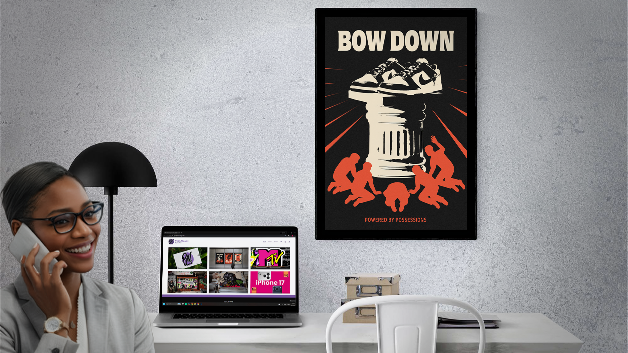
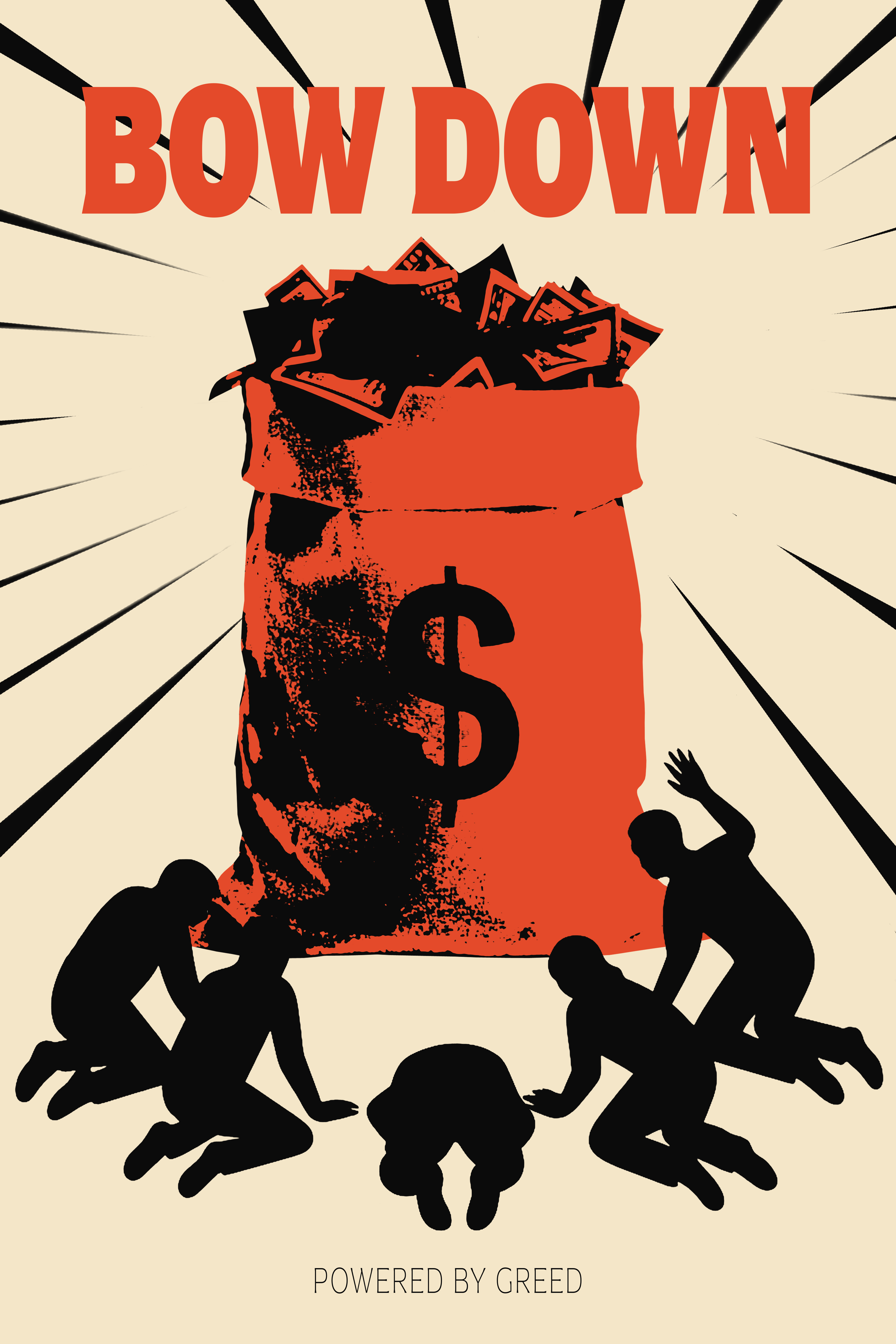
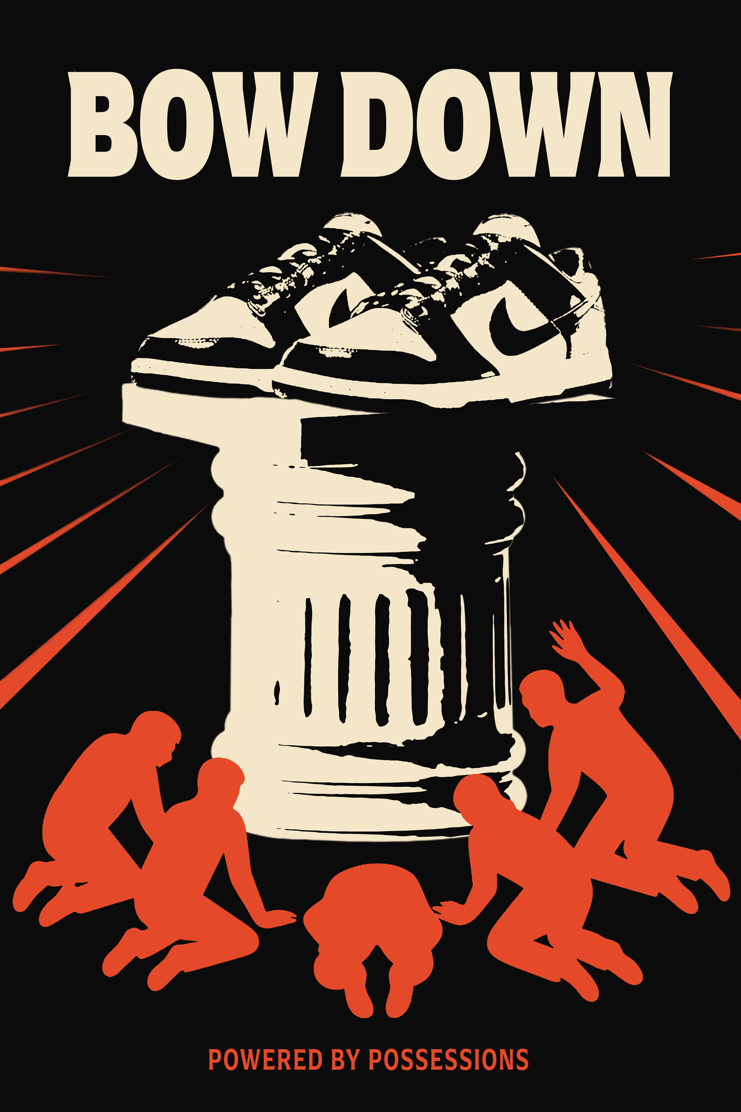
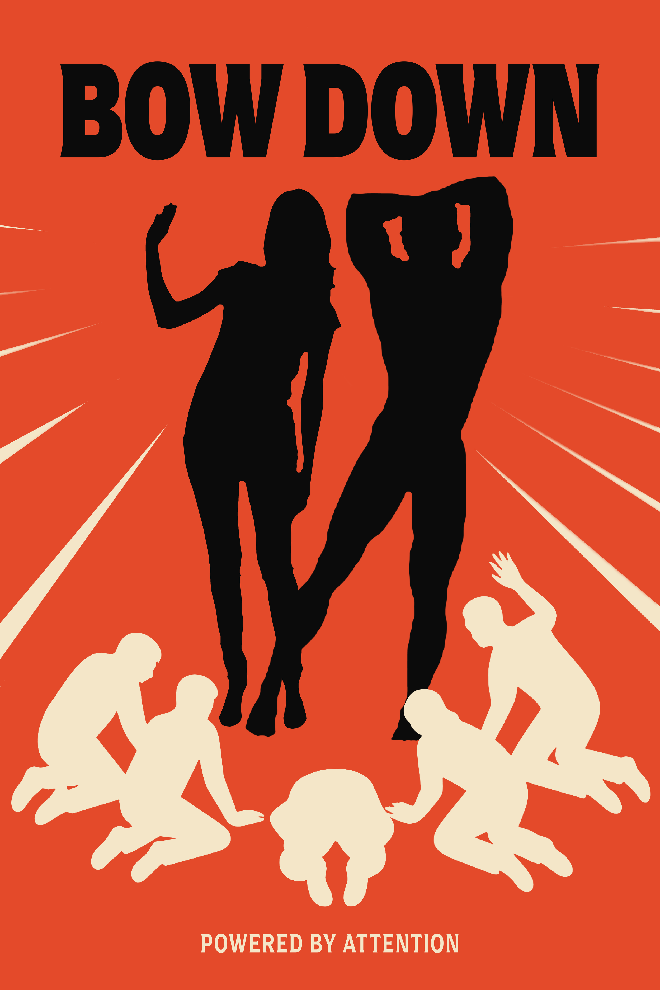
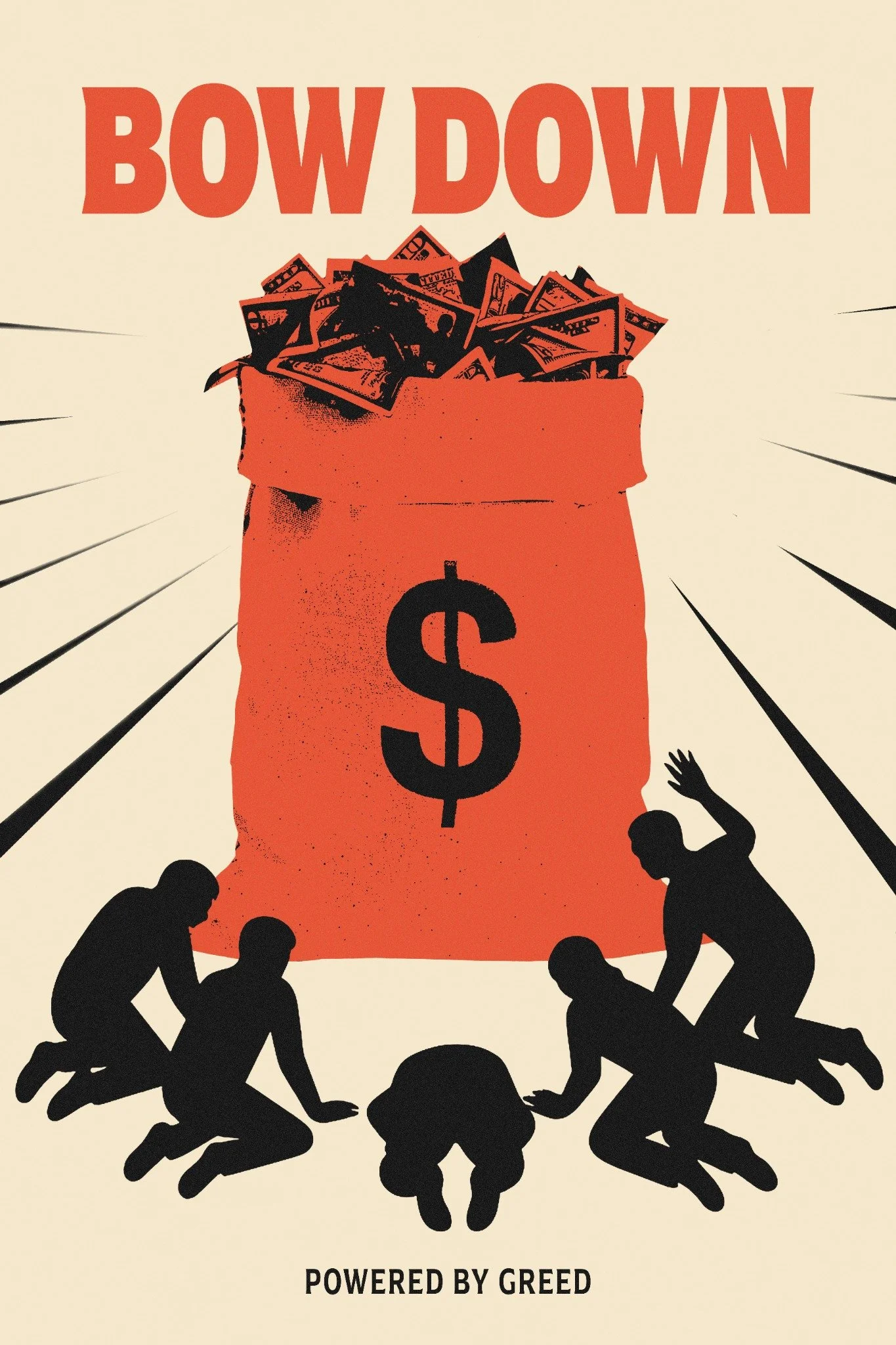
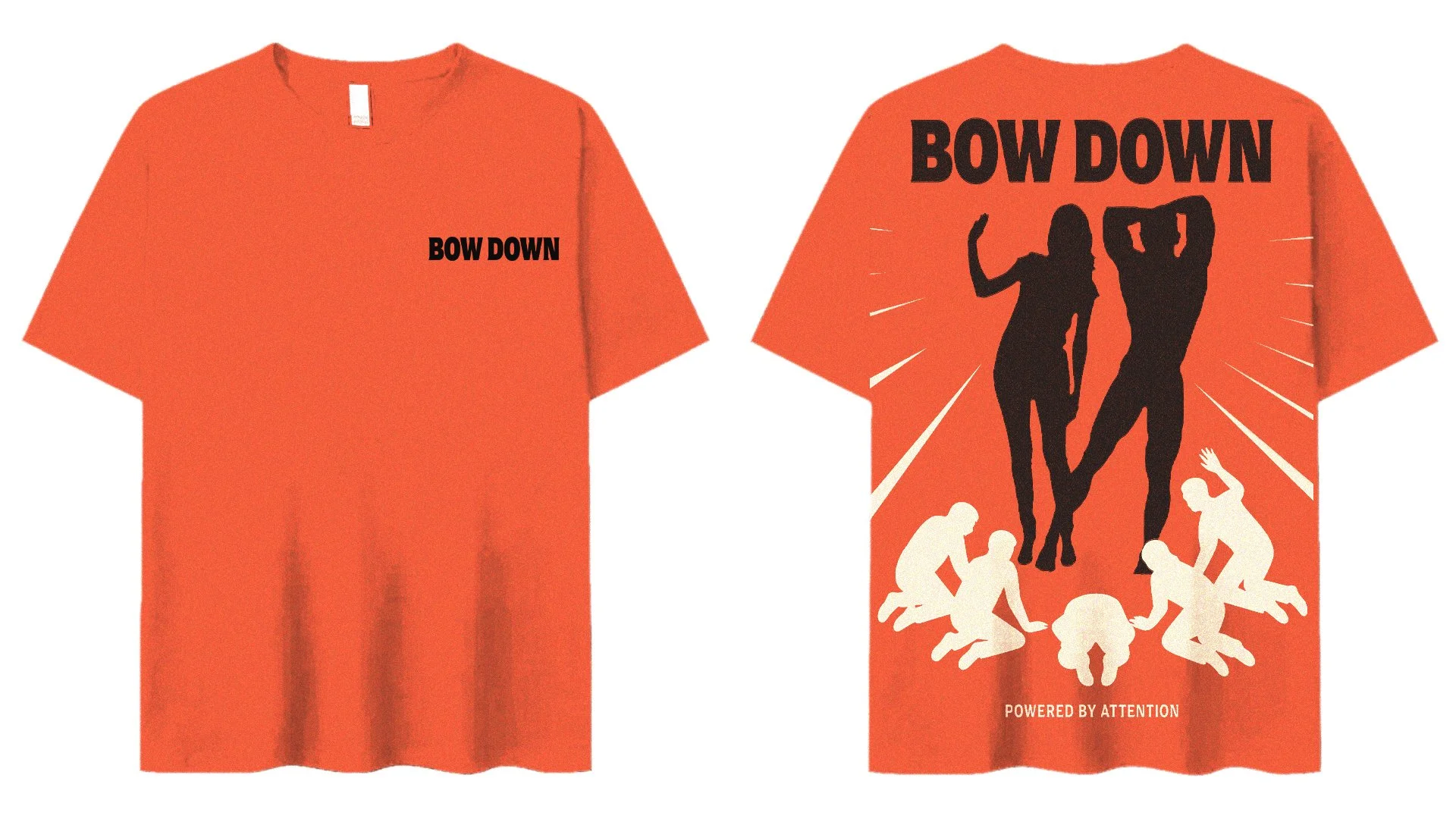
Bow Down is a poster triptych about what modern culture puts on a pedestal. Possessions, attention, and greed each get their own piece. The series pulls from propaganda art and classical imagery and pushes it into something that feels current. The tone is direct and the message is simple. What are you bowing down to?
Visual Direction
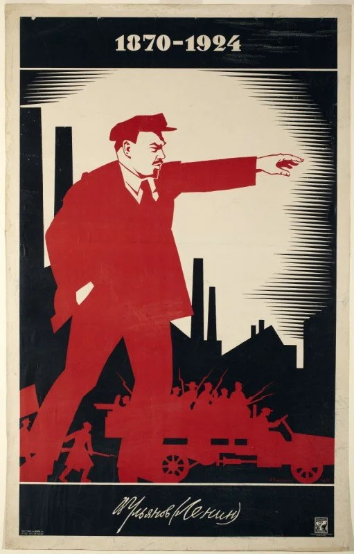
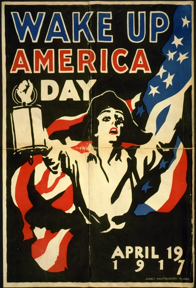
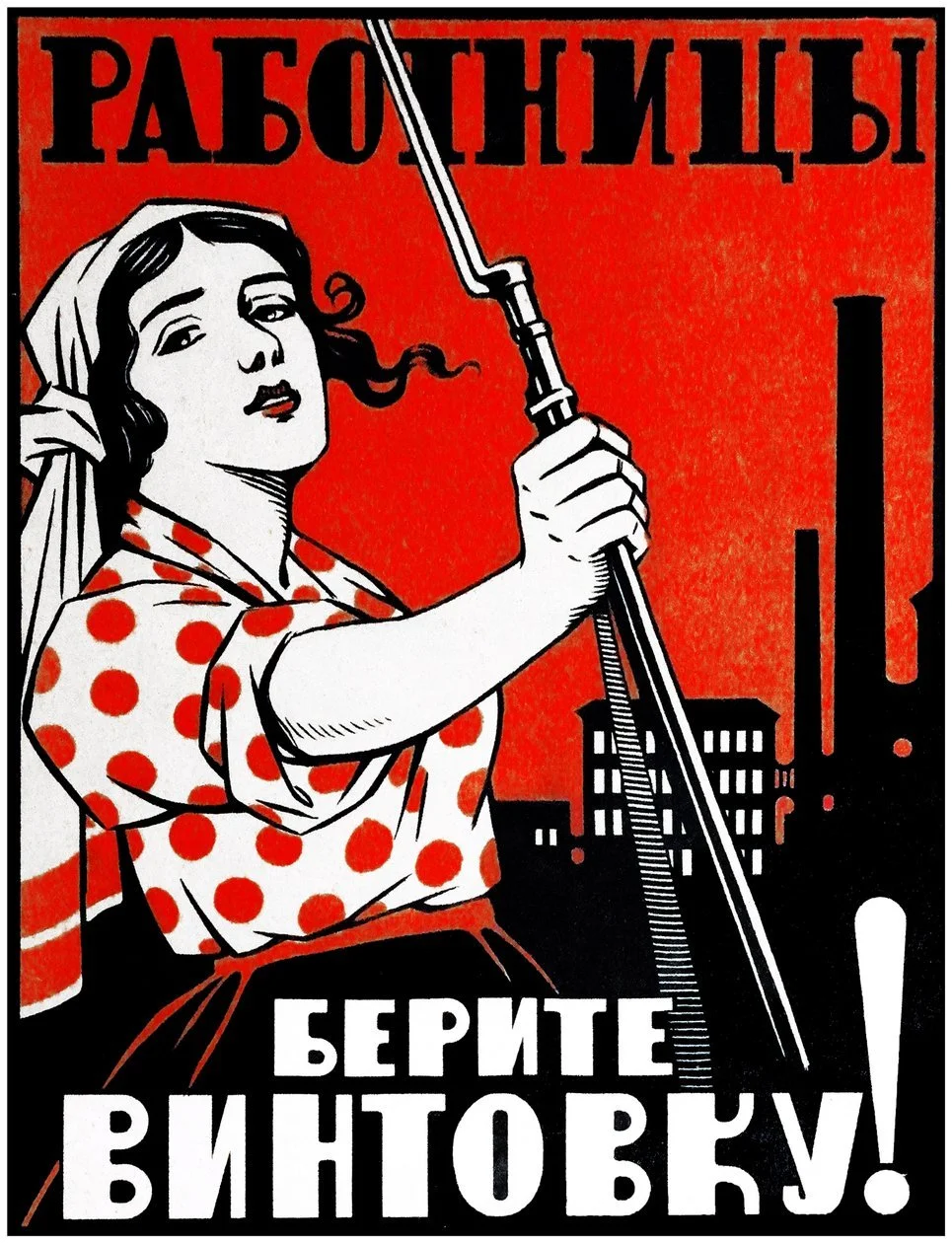
The mood draws from propaganda art, classical symbols, and modern celebrity culture. The mix of pillars, luxury cues, and worship crowds connects old reverence to new obsession. The tone stays bold and direct to match the themes of influence and control.


Sketch Development
The early sketches explored different directions about dependence and influence. Concepts included Trapped Inside a Screen, and Bow Down. Bow Down was the strongest option because of its clarity, structure, and visual balance.

Typeface Selection
Arpona – Bold
Previous Options
Source Serif Variable, FreightDisp Pro
Typeface Study
Arpona Bold was chosen for its sharp serifs and strong form. It adds authority and anchors the layout without overpowering the imagery.

Color Selection
Red-Orange, Near Black, Cream
Color Study
The palette uses red-orange, near black, and cream to create contrast and hierarchy. Red-orange brings urgency, black adds weight, and cream softens the tone for balance.
Red-Orange
HEX #E34B29
RGB 227, 63, 41
CMYK 0, 72, 82, 11
Near Black
HEX #0C0C0C
RGB 12, 12, 12
CMYK 0, 0, 0, 95
Cream
HEX #F3E6C8
RGB 243, 230, 200
CMYK 0, 5, 18, 5
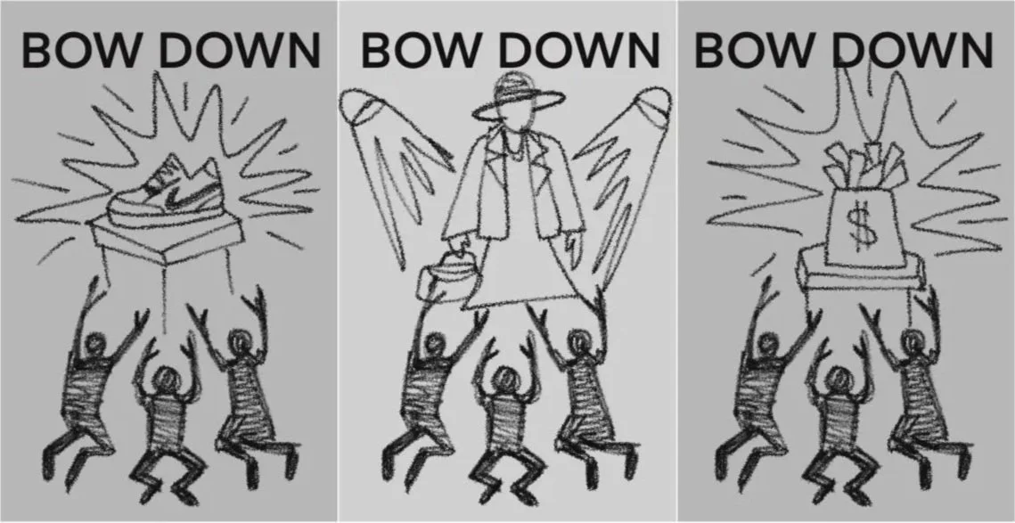
First Drafts
The first digital drafts stayed close to the sketches. Each poster kept the same composition to focus on the central object and the figures below. The early versions used heavier bursts and darker tones to test contrast before moving toward a cleaner direction.
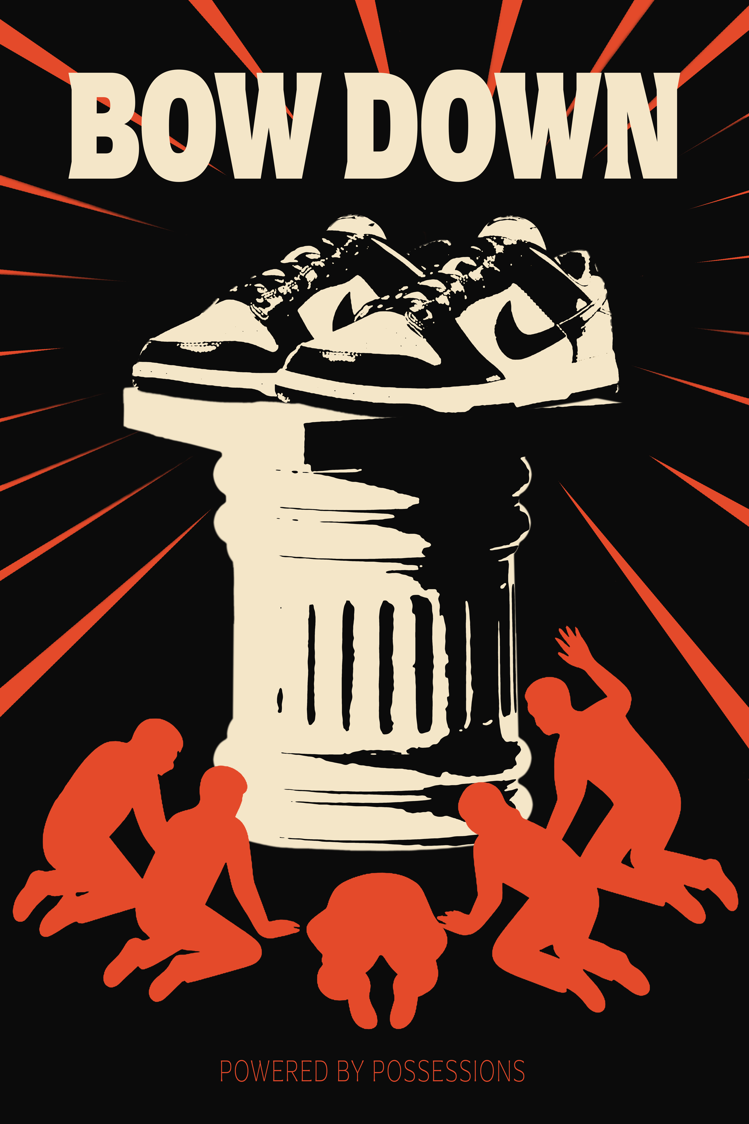
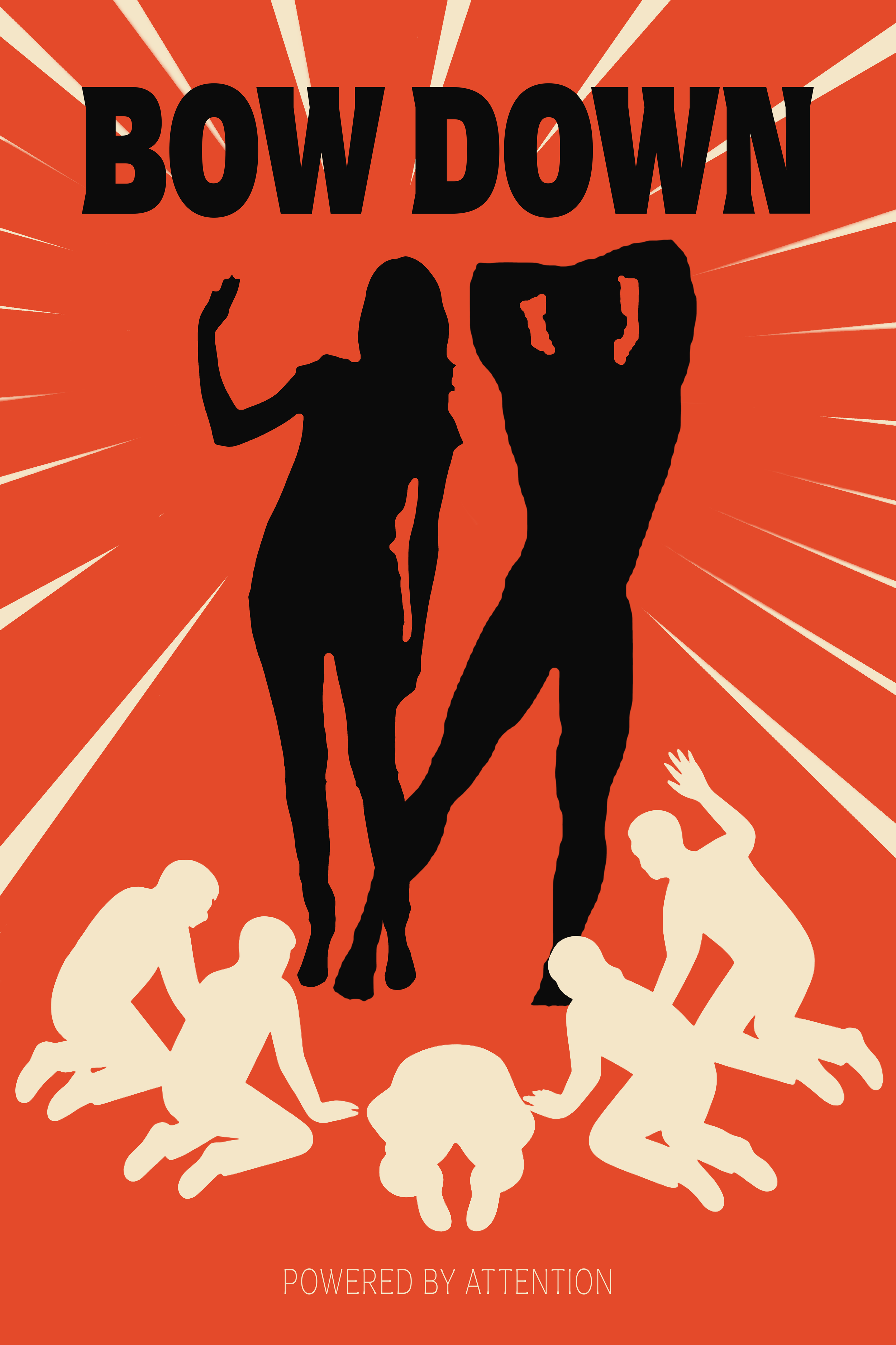
Refinement
Refinement focused on clarity and readability. I removed the bursts behind the text, adjusted the callout area, and sharpened the money-bag details. A light texture was added to tie the pieces together and give the set a polished finish.

Final Deliverables
The three pieces work together as a set but each one holds its own. The added texture ties everything together and gives the triptych a finish that feels printed and physical rather than flat digital.

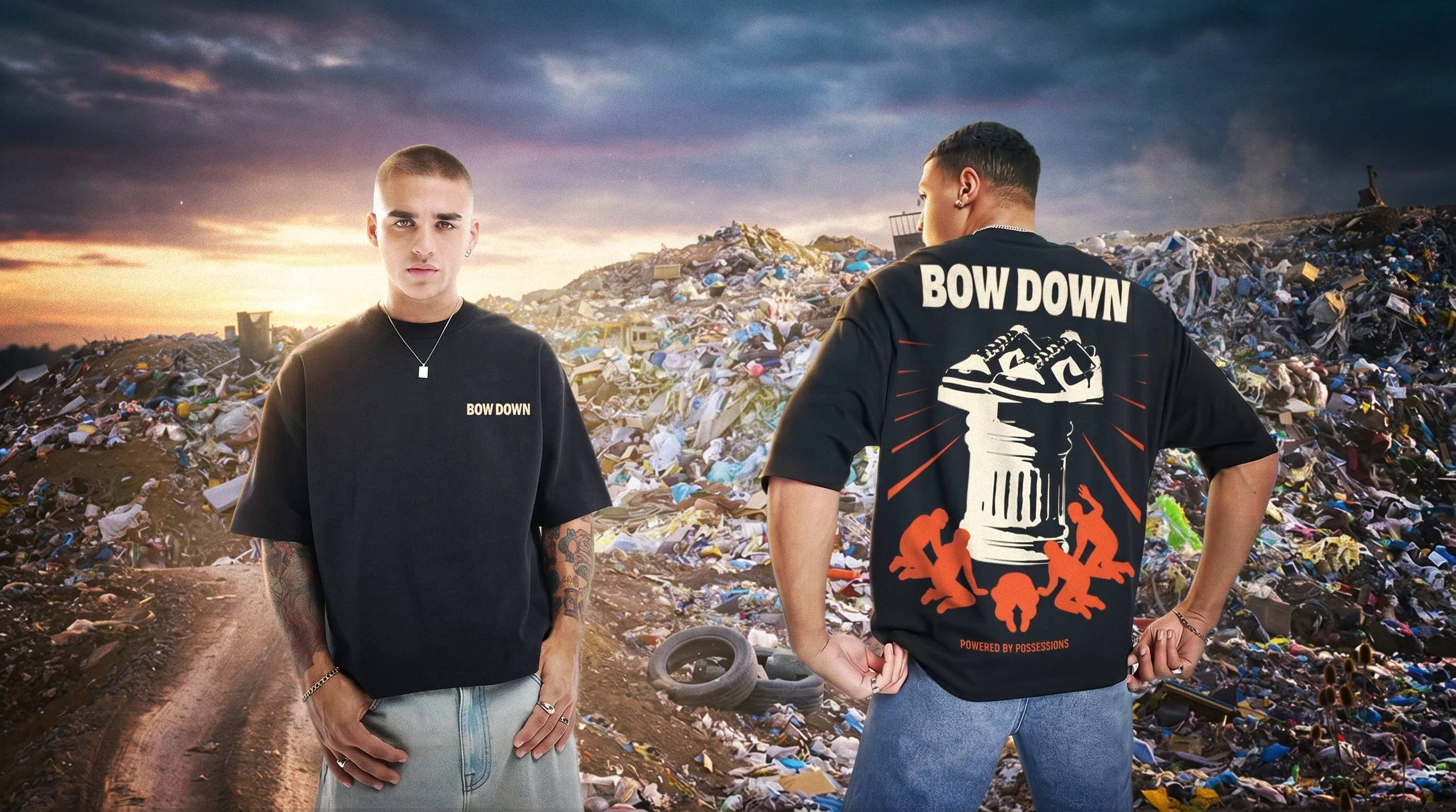
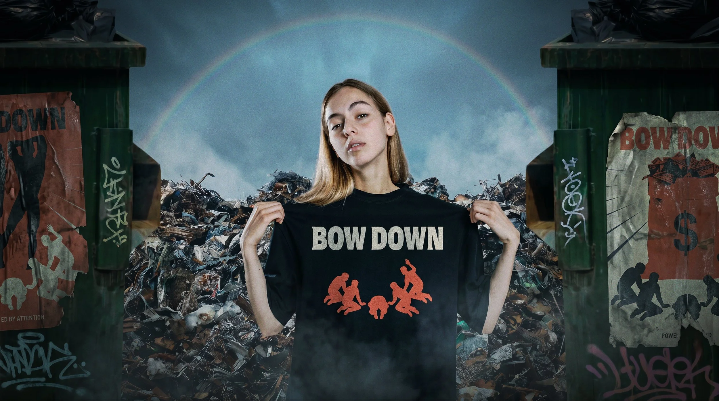
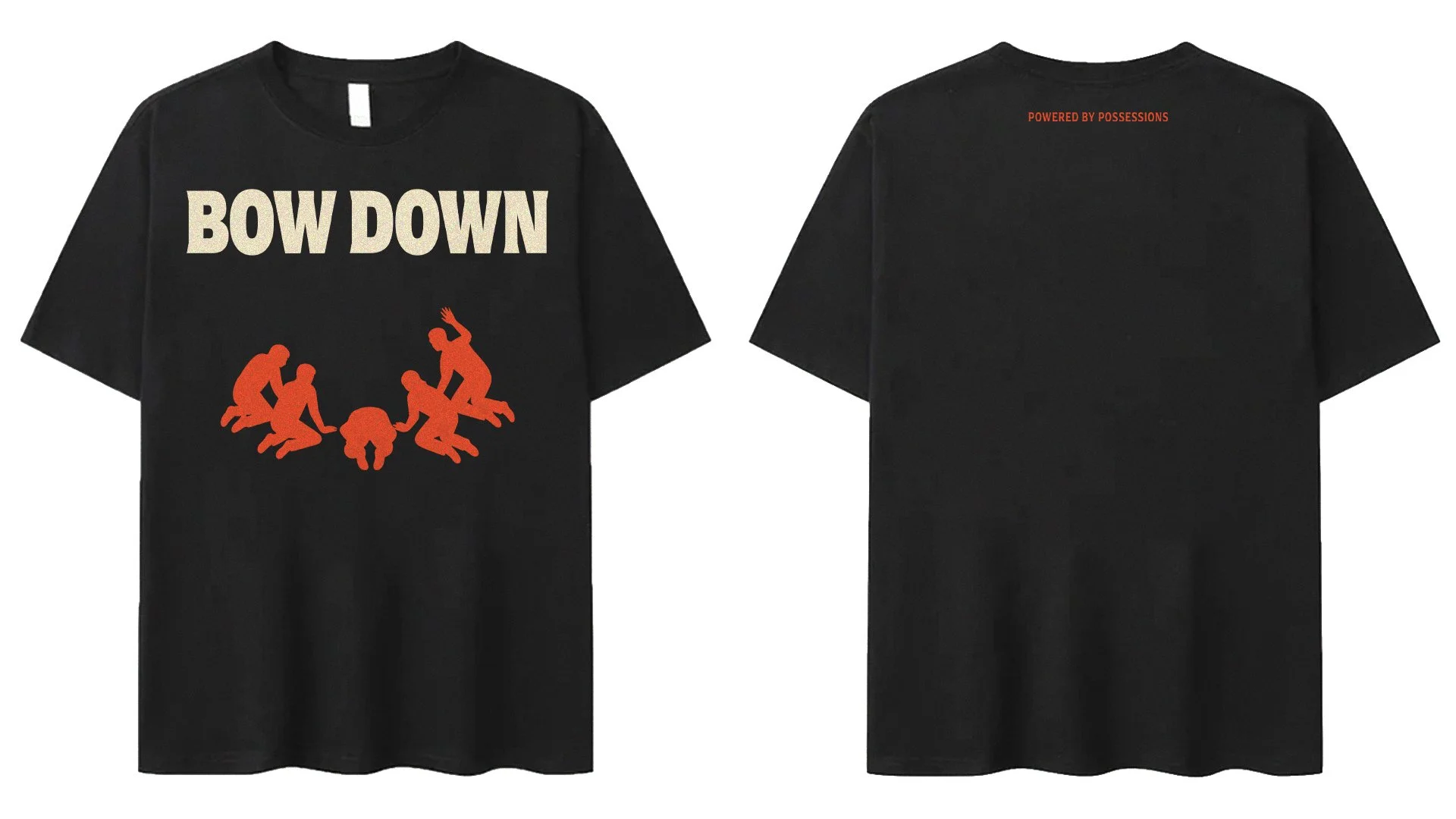
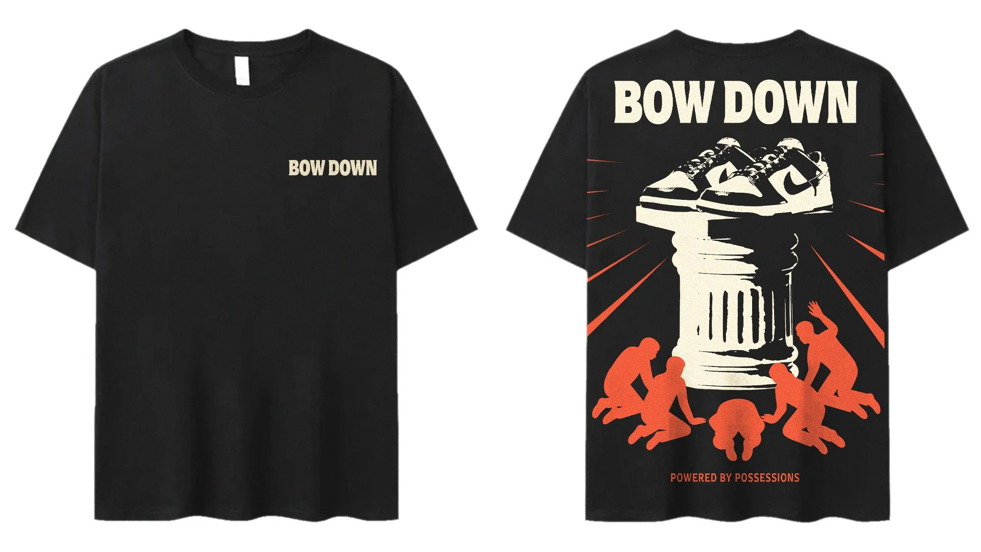
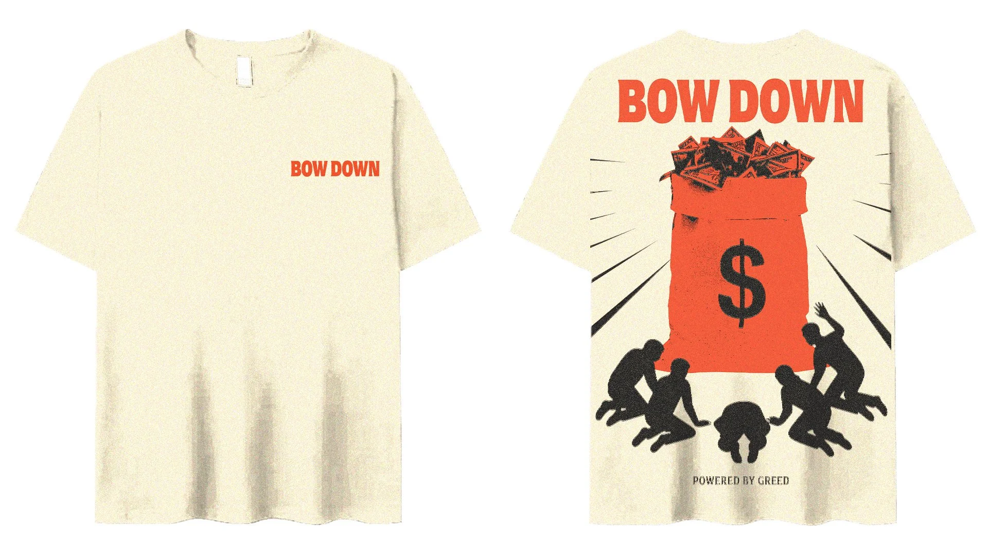
Campaign Expansion
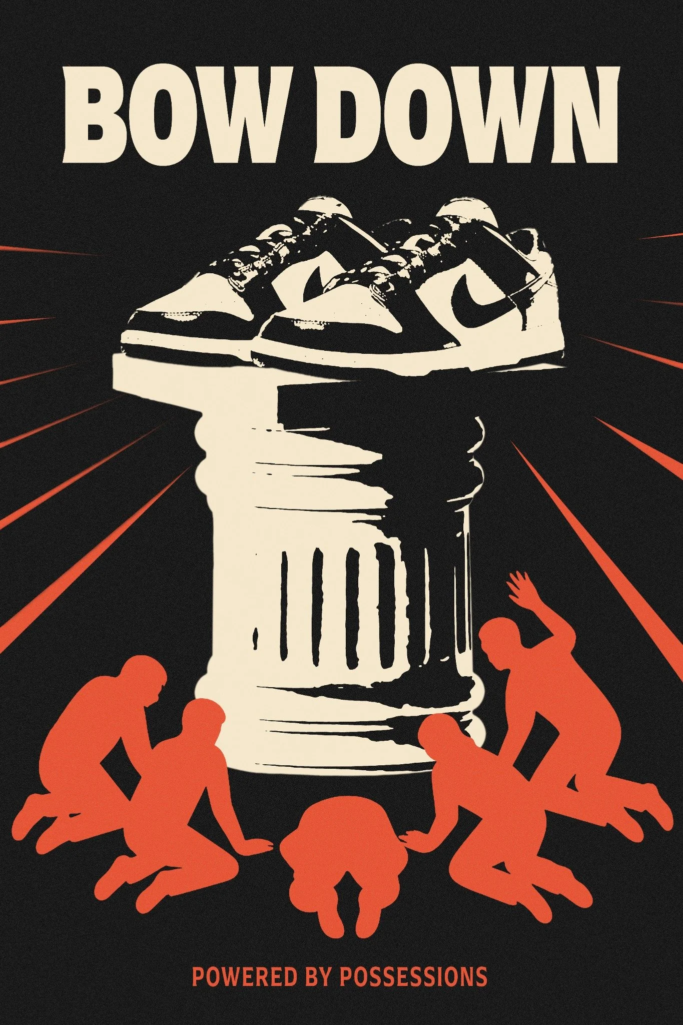
The identity extended into apparel after the posters were finished. The artwork translated well onto t-shirts and it made sense to push it further into something wearable.
Applications