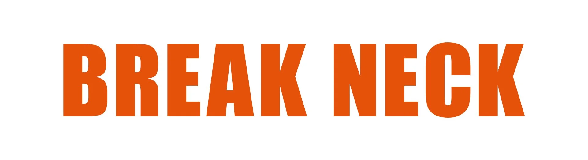
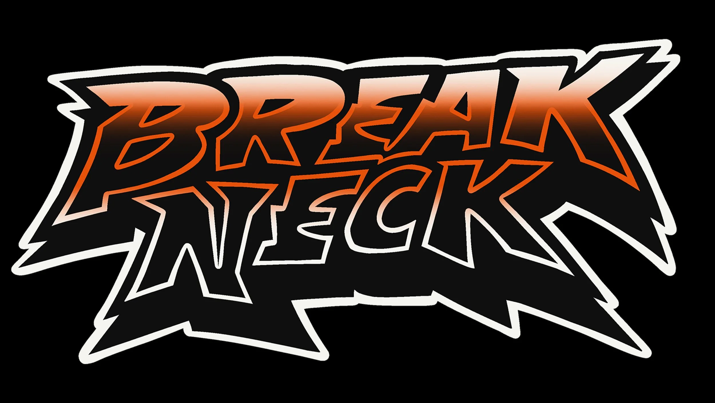
Break Neck Motocross
Brand Identity Package
Photoshop • Procreate • Illustrator • 2026
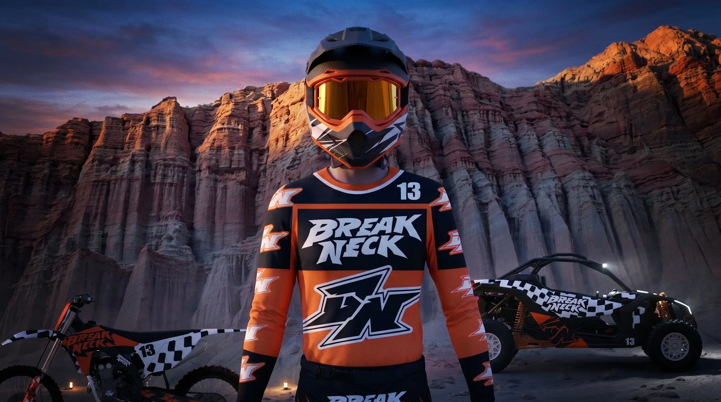
Break Neck Motocross is a full brand identity system built around the aggression and speed of modern motocross culture. The project includes hand drawn logo development, typography exploration, apparel graphics, motion graphics, bike wraps, tour bus, dune buggies, glove designs, and sixteen complete race kit colorways designed to function as a unified visual system across multiple applications.
Brand Direction
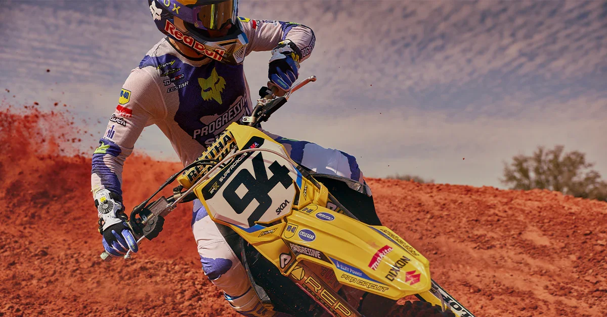
The identity was designed to feel aggressive, fast, and highly visible on the track. Influenced by motocross brands rooted in racing culture and heavy graphics, the visual language focuses on bold typography, sharp contrast, and high-impact color placement built for movement and visibility.
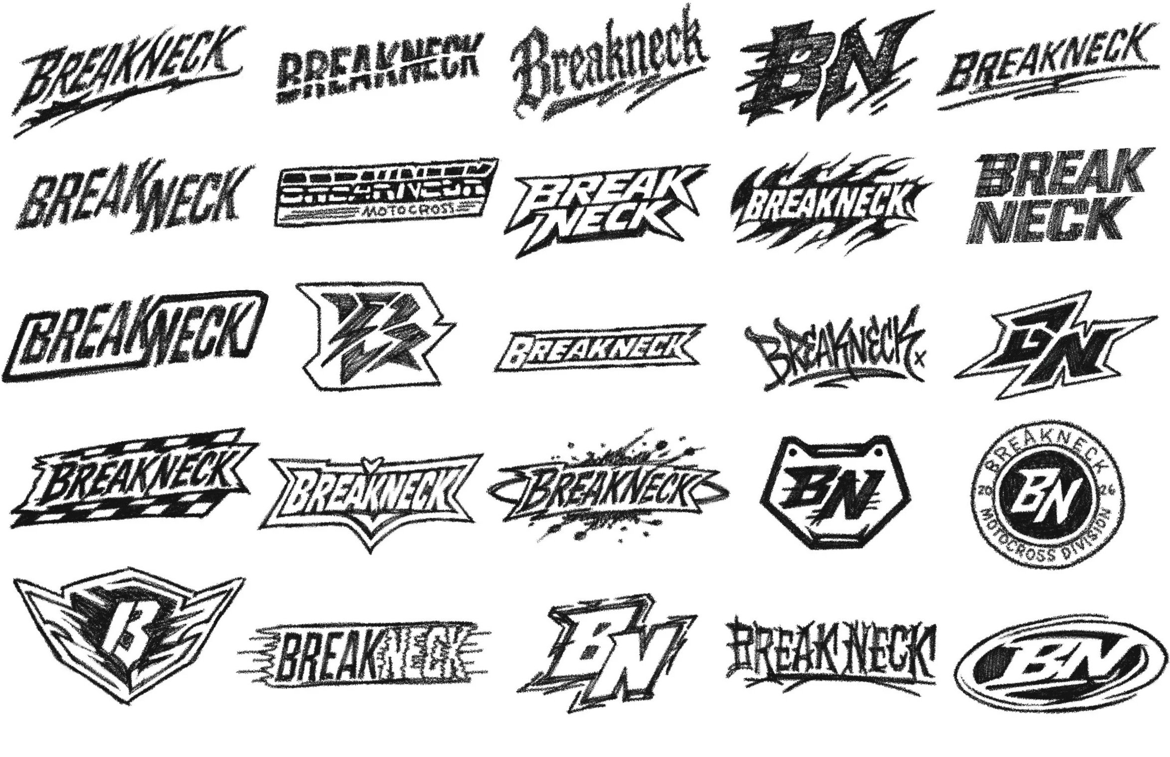
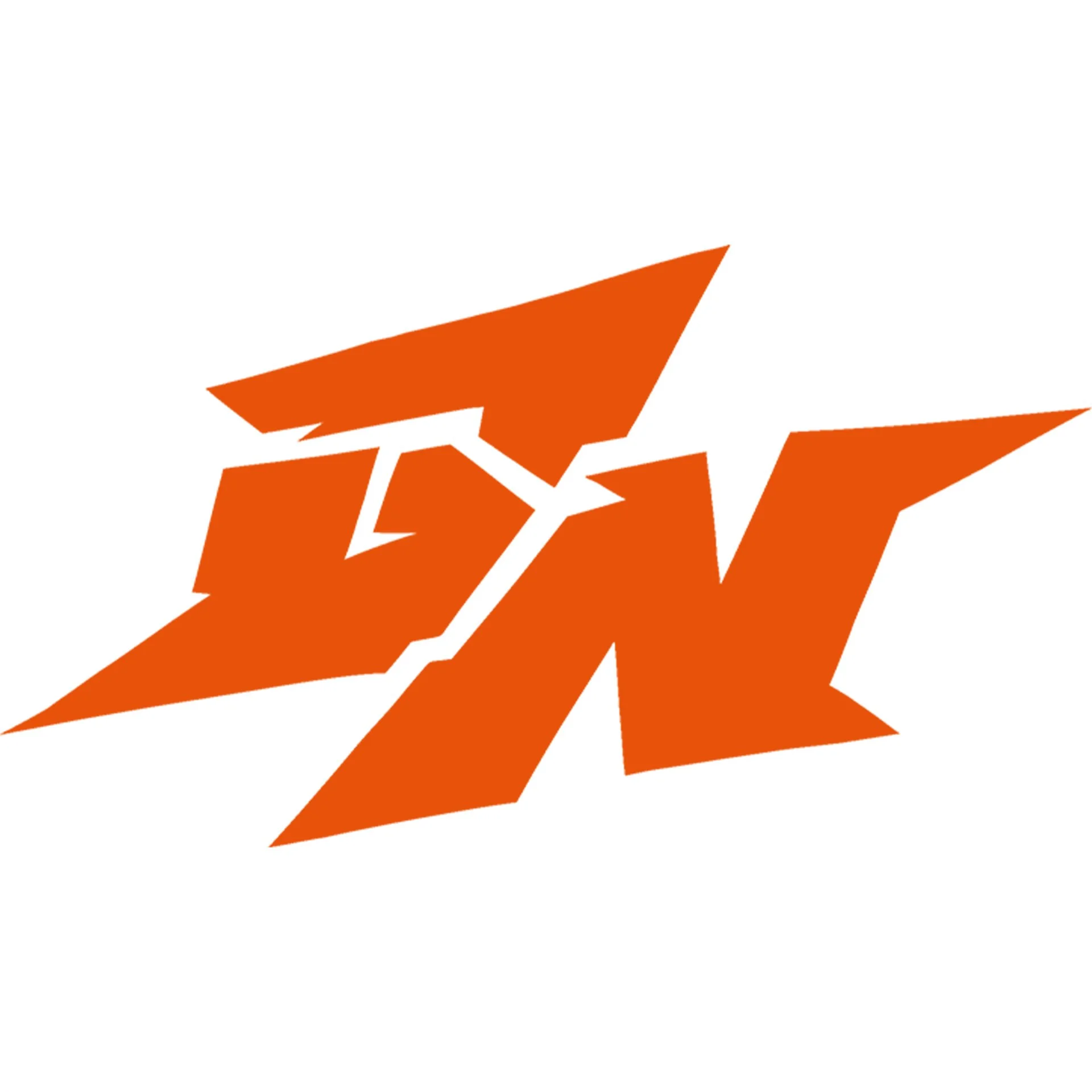
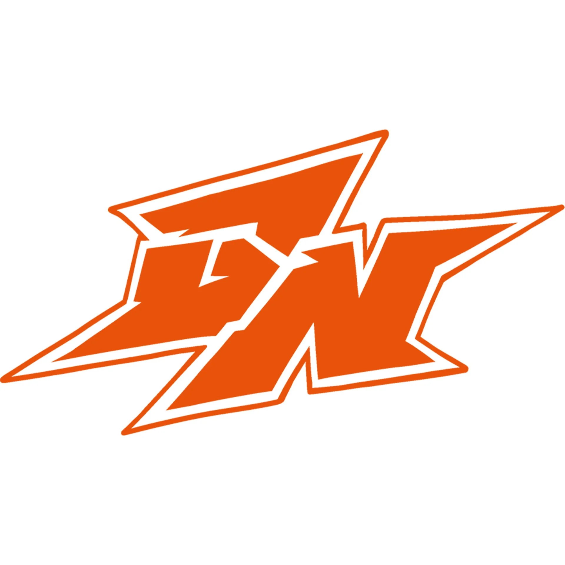
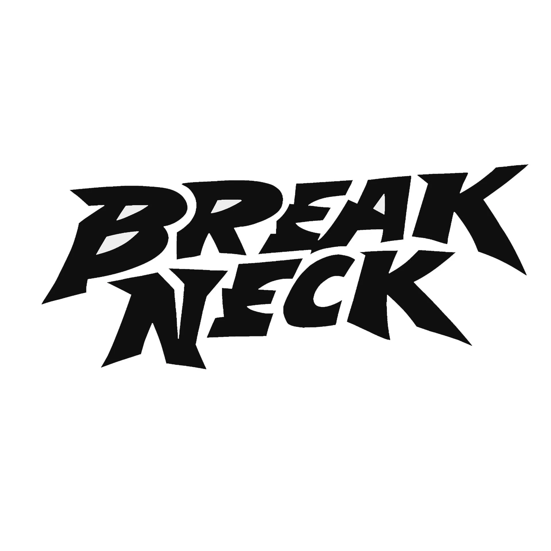
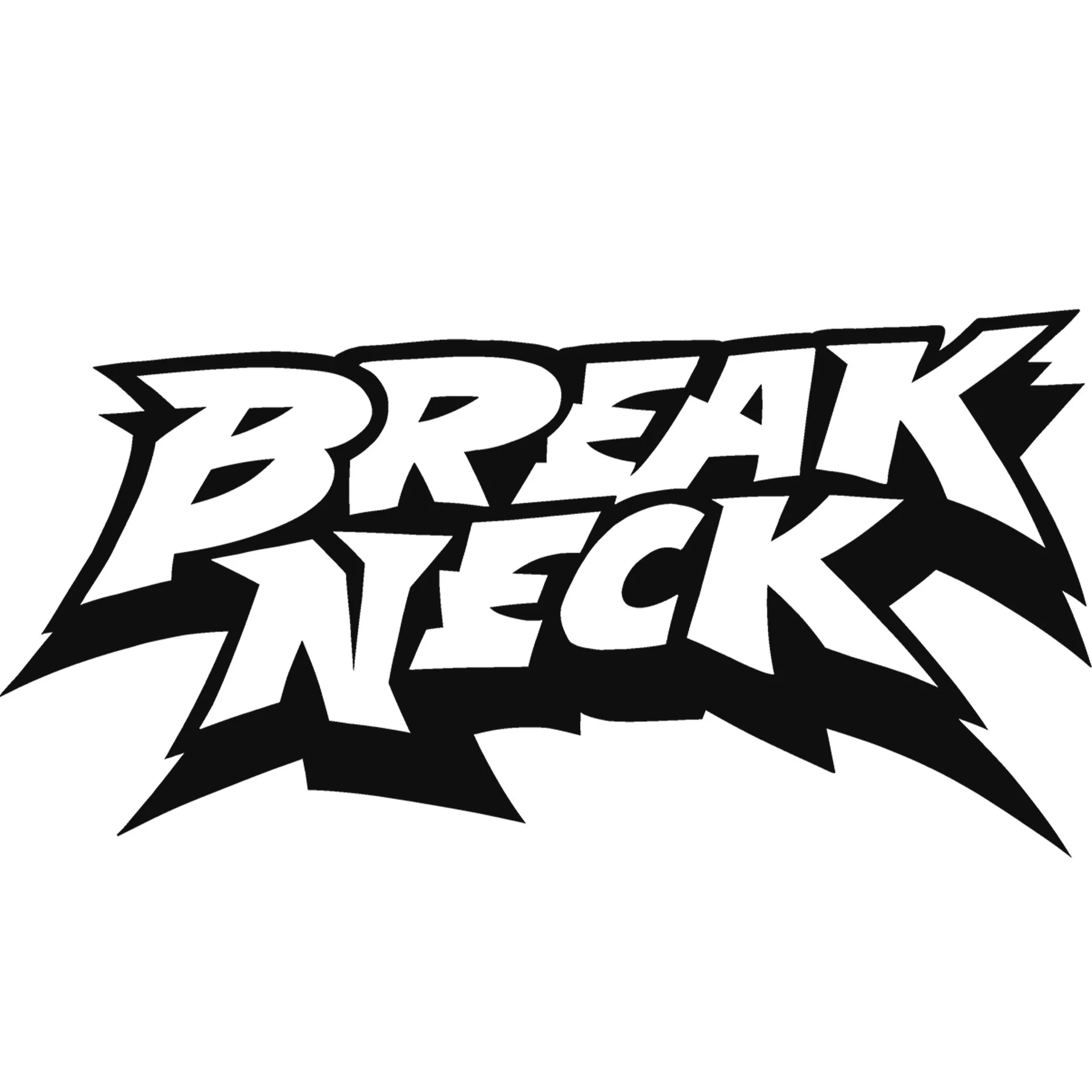
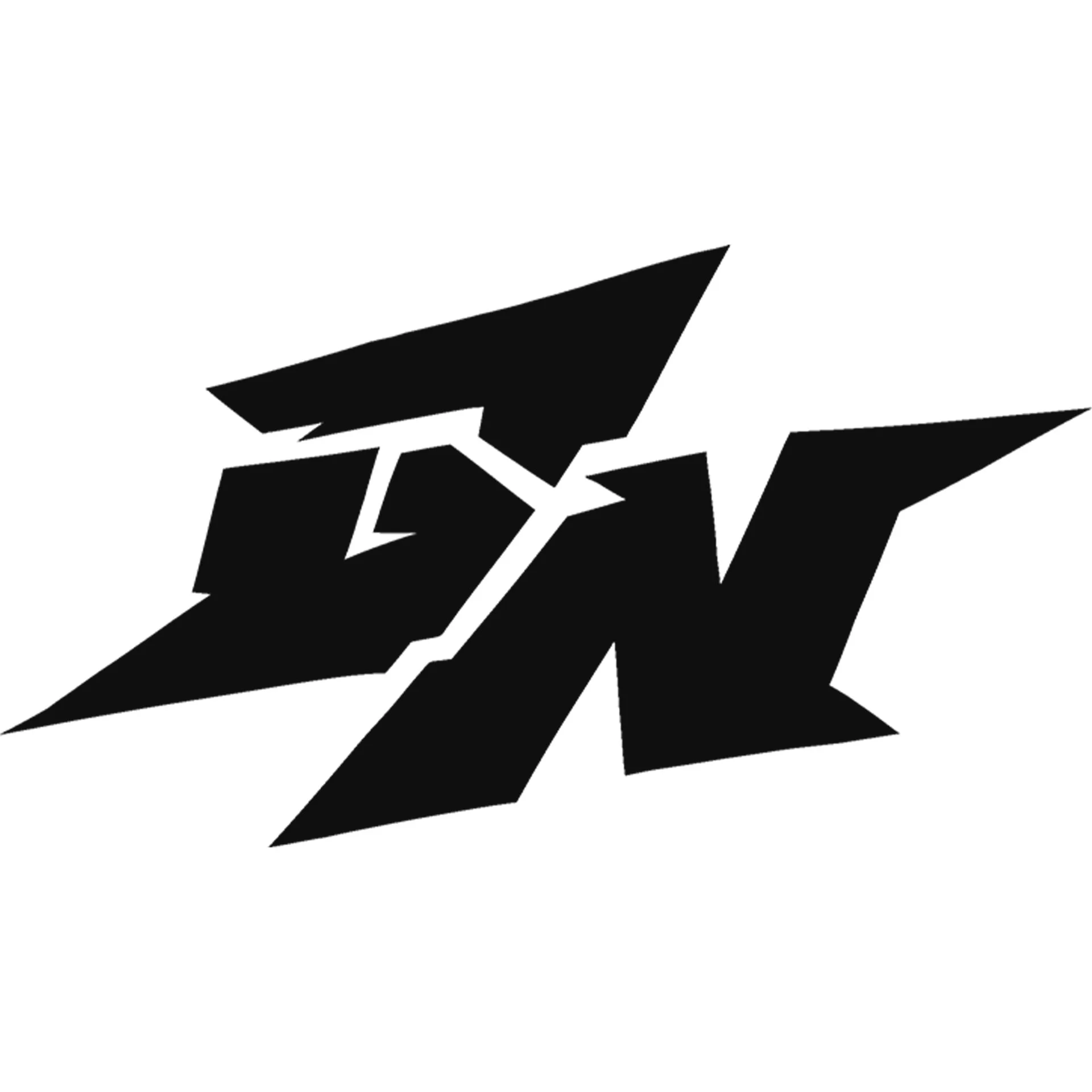
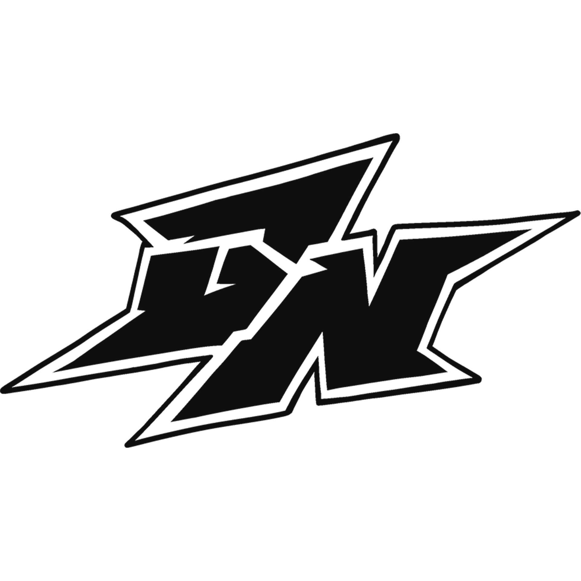
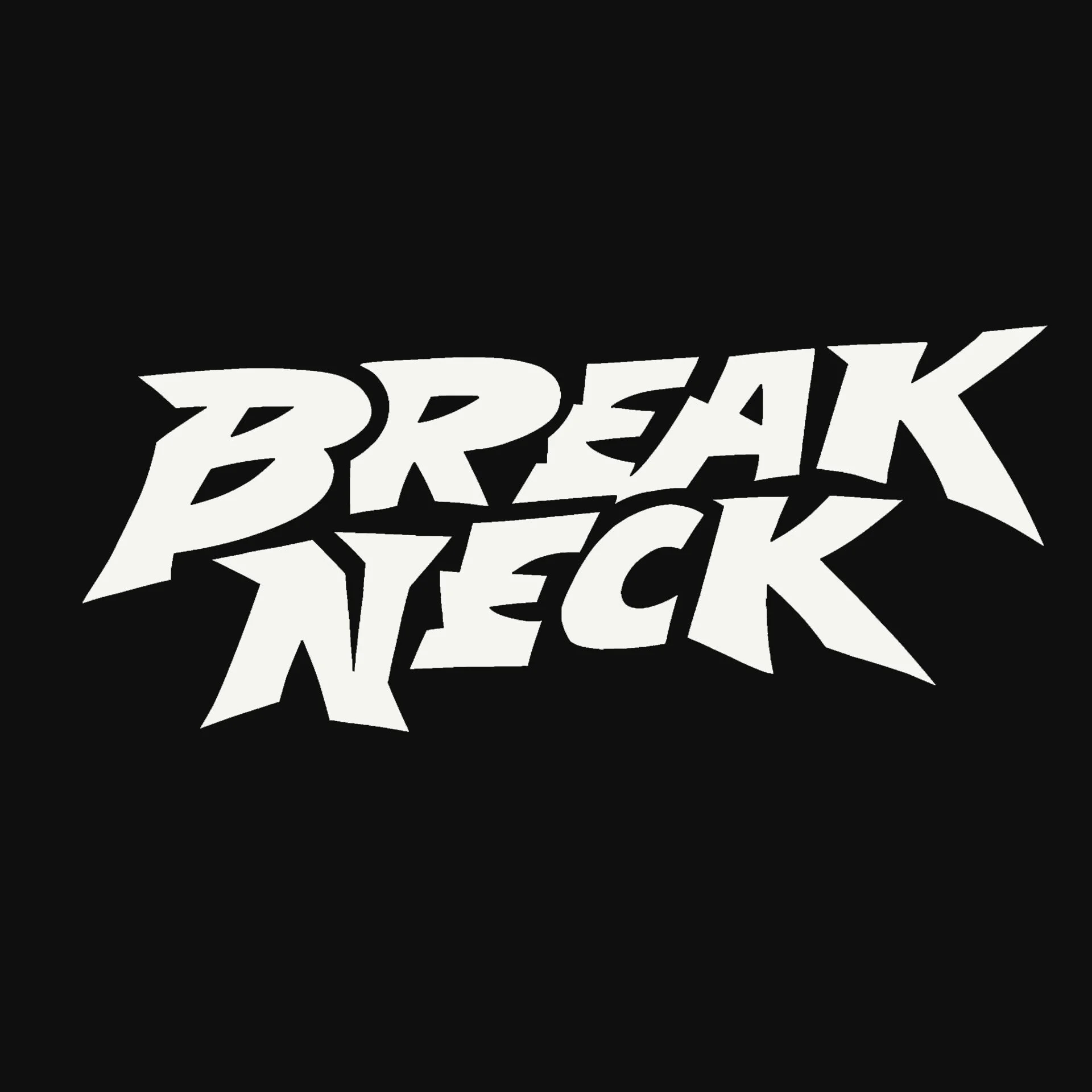
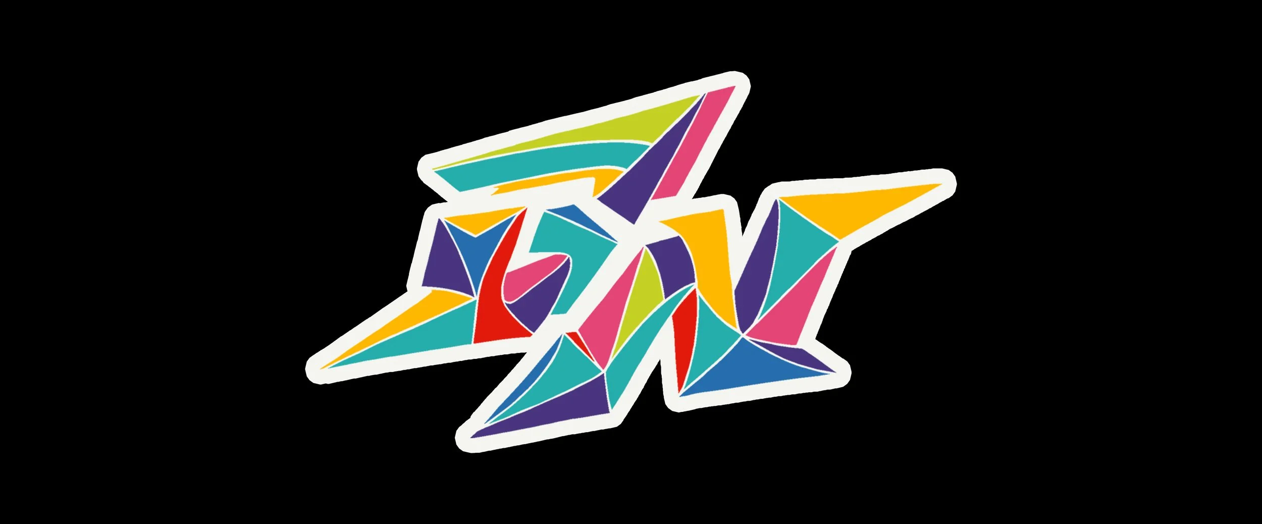
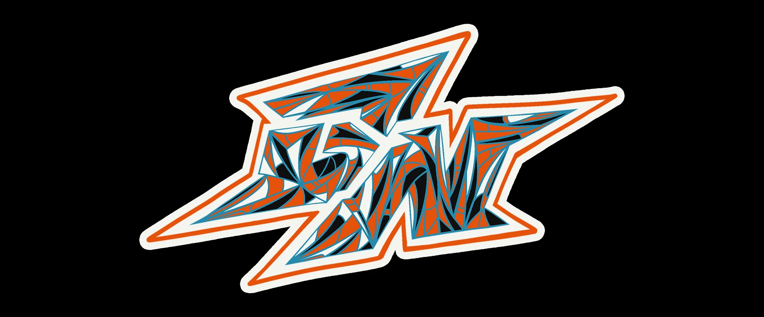
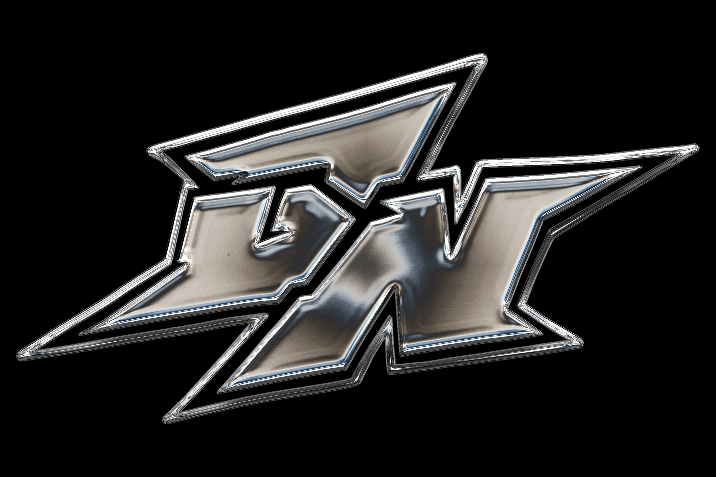
Sketch Development
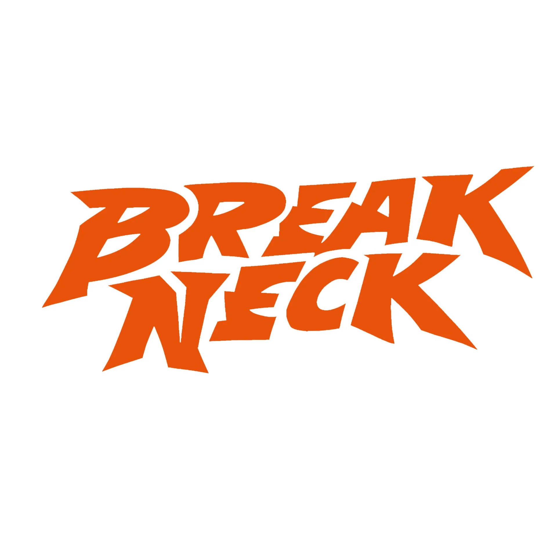
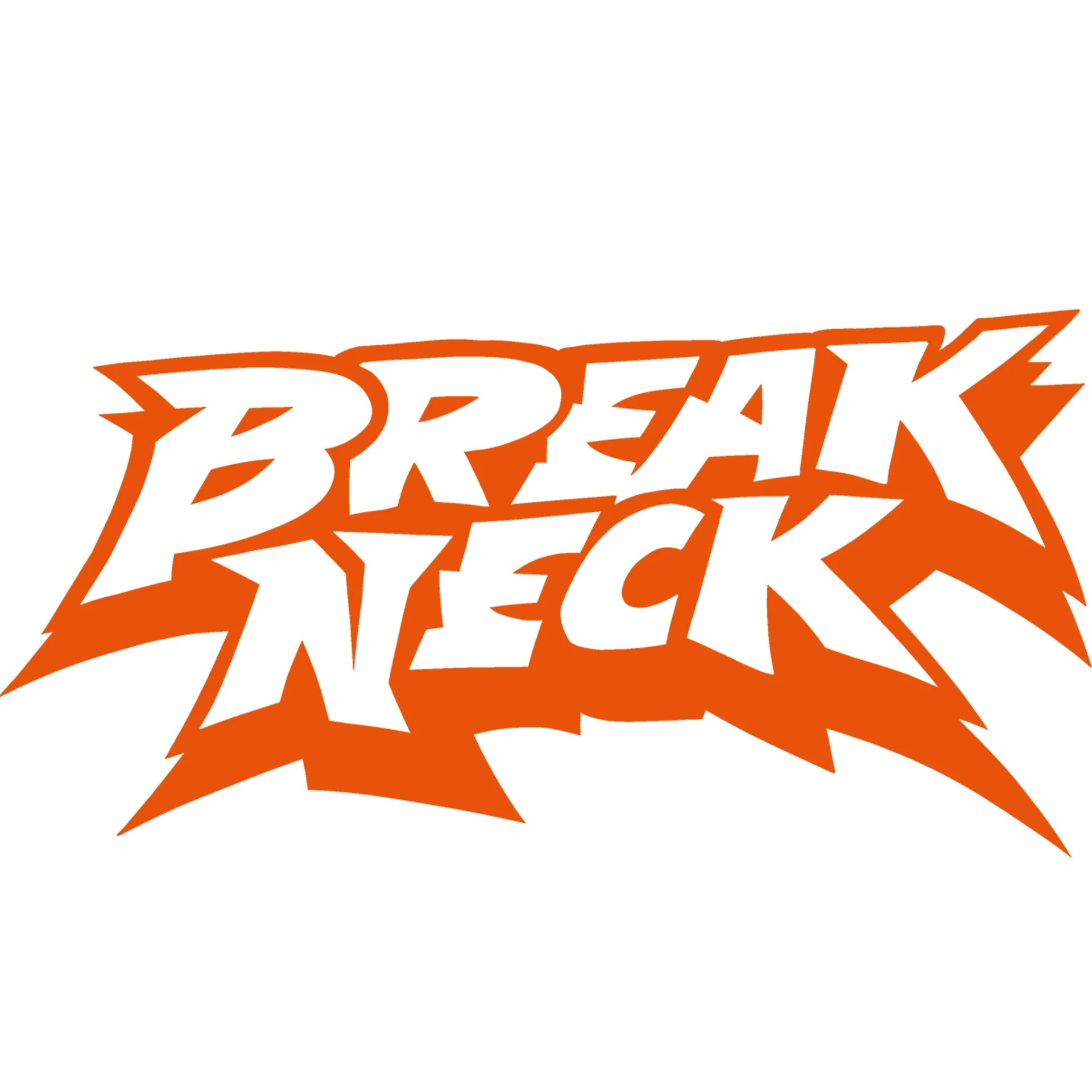
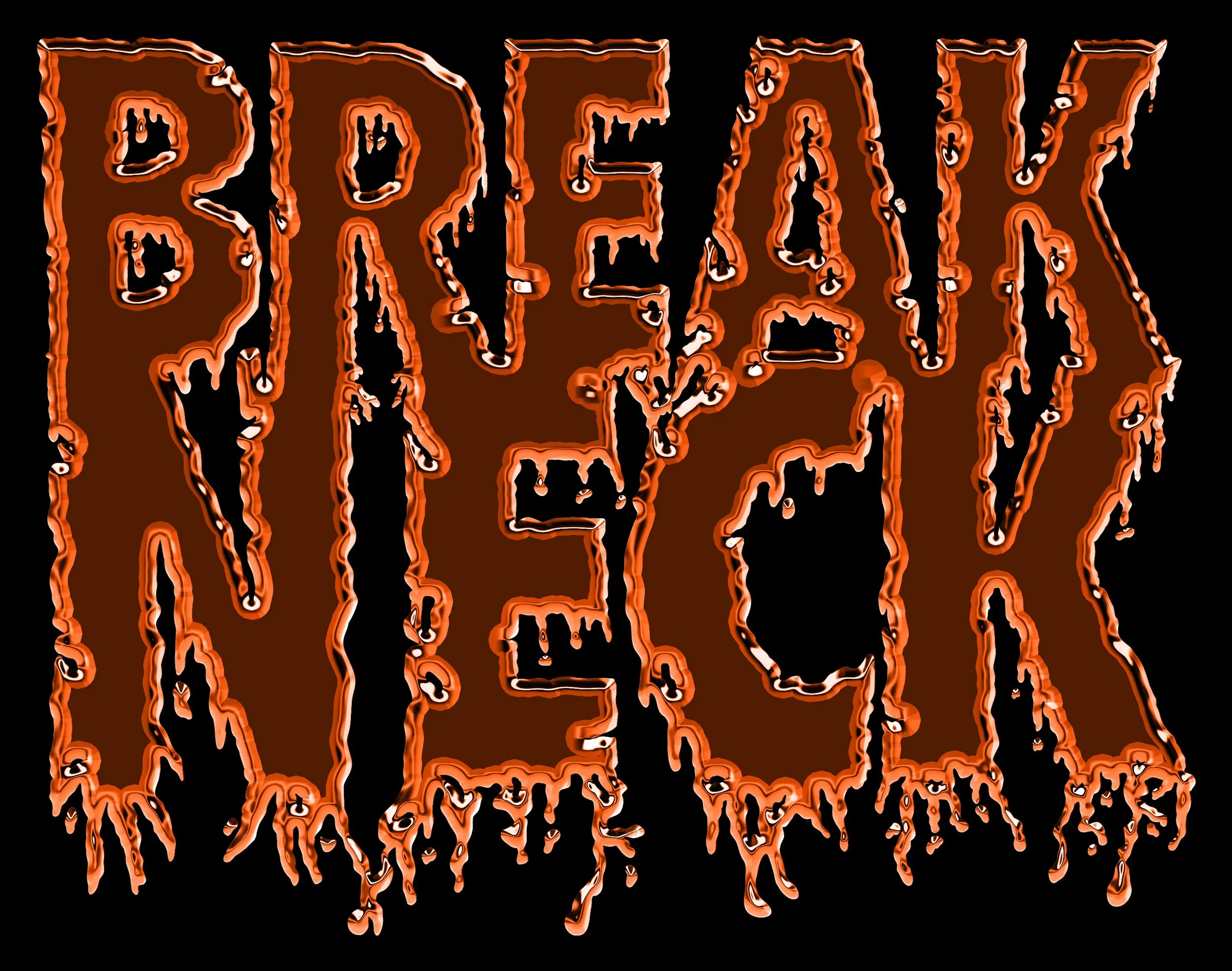
The project began in Procreate with hand-drawn logo sketches and exploratory wordmarks before refinement in Illustrator. Multiple directions were tested including badge marks, condensed typography systems, monograms, and race-inspired layouts before narrowing the system into the final identity.
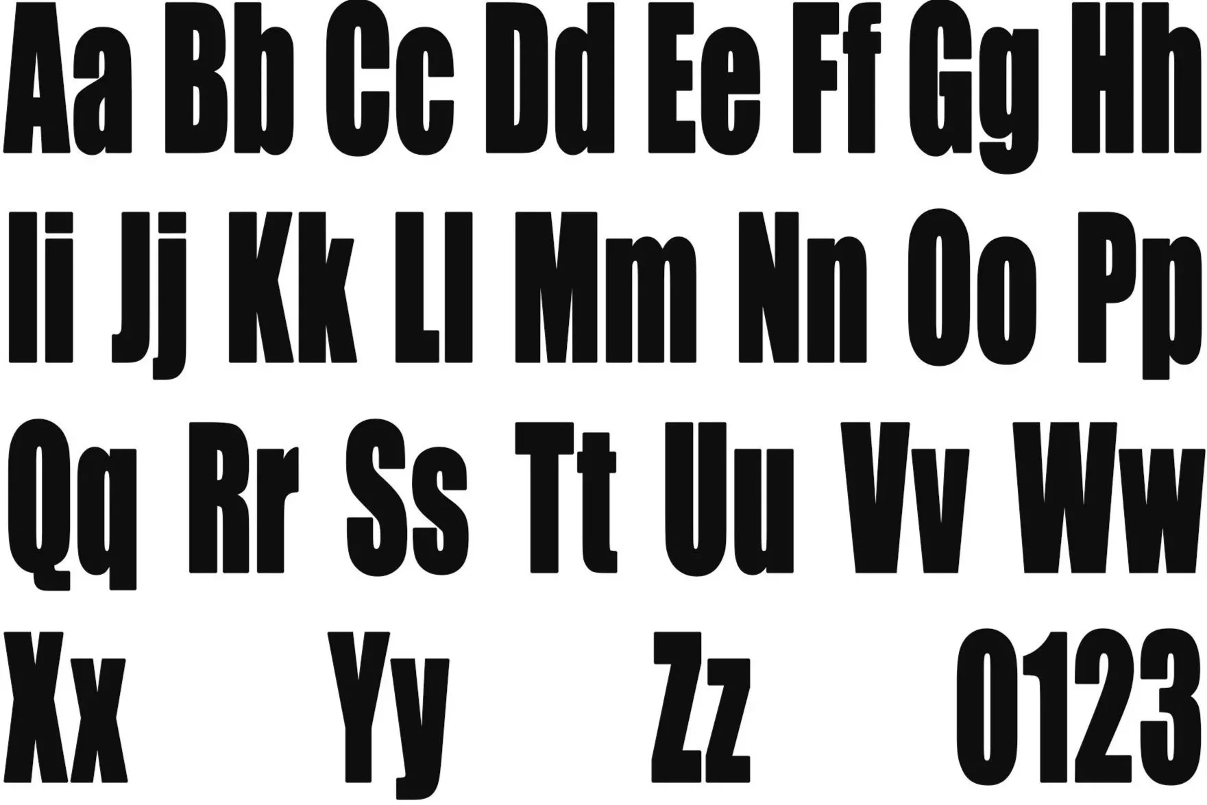
Typeface Selection
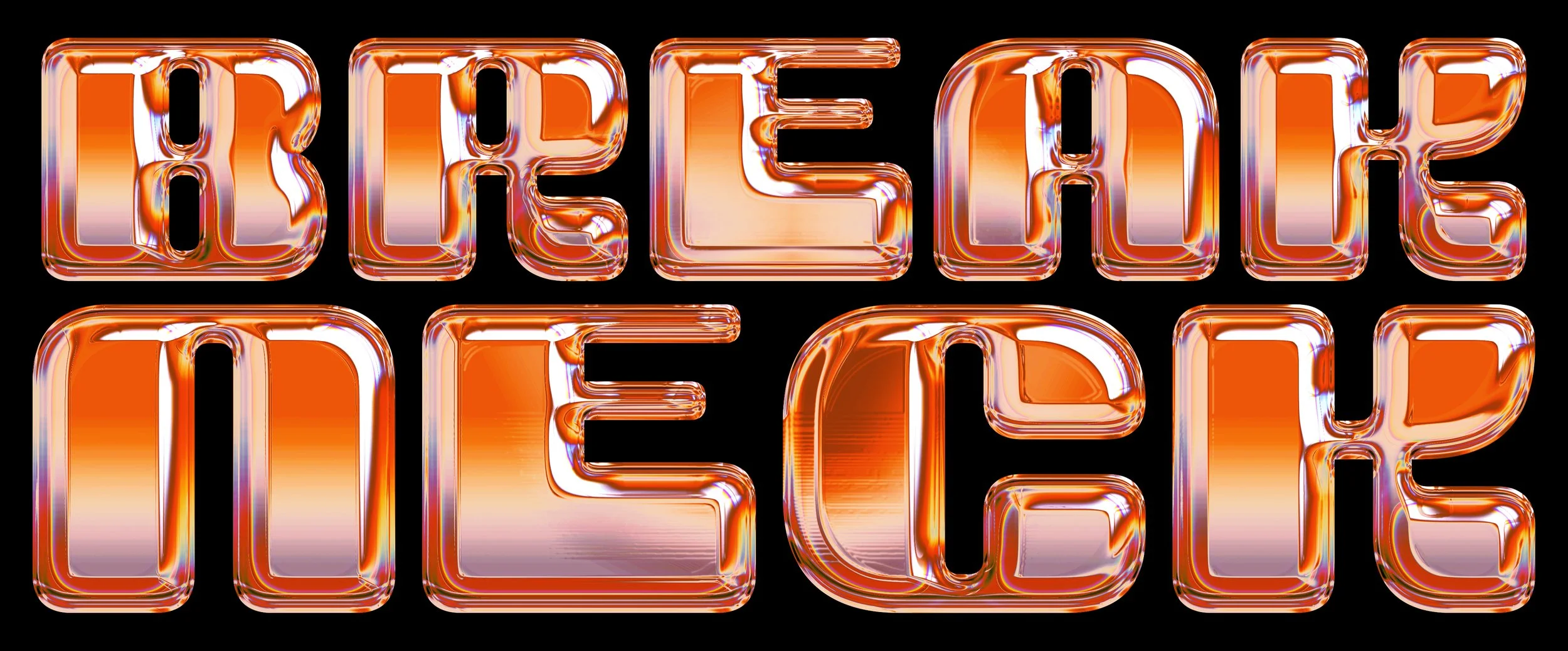
Impact
Previous Options
Bebas Neue, Compacta
Typeface Study
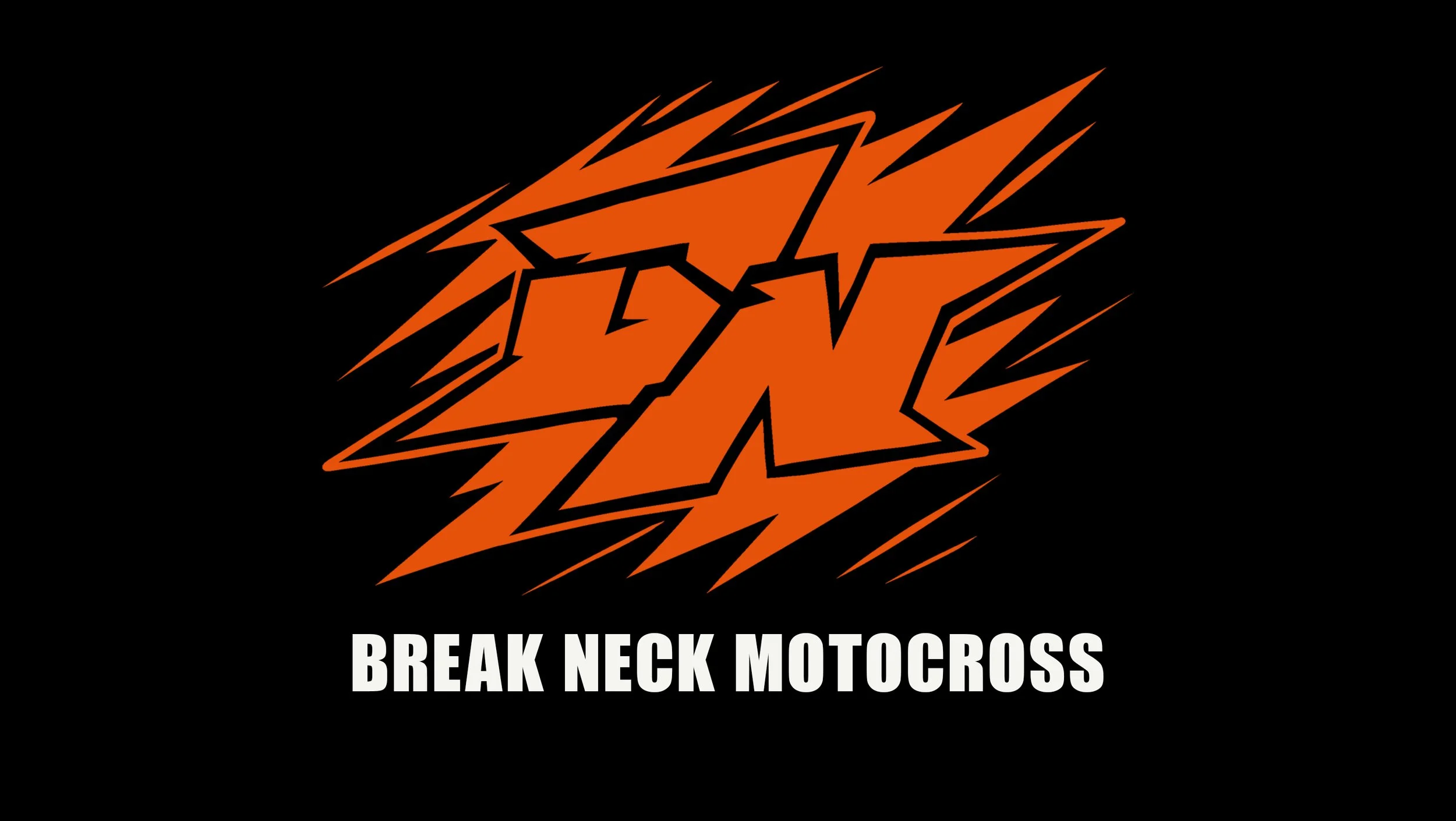
Impact was chosen for its compressed structure and aggressive weight. It reads clearly across jerseys, helmets, decals, and promotional graphics without needing to be scaled up to work. It was the most practical choice for a brand that lives across that many applications.
Color Selection
Hunter Orange, Flat Black, Race White
Color Study
Hunter Orange is the dominant color because it hits hard against any background and stays visible on the track. Flat Black adds weight and Race White keeps everything readable when the graphics layer up. The three colors work together across every kit and application without ever fighting each other.
Hunter Orange
HEX #E6510A
RGB 232, 82, 10
CMYK 0, 65, 96, 9
Flat Black
HEX #0F0F0F
RGB 15, 15, 15
CMYK 0, 0, 0, 94
Race White
HEX #F5F5F0
RGB 245, 245, 240
CMYK 0, 0, 2, 4
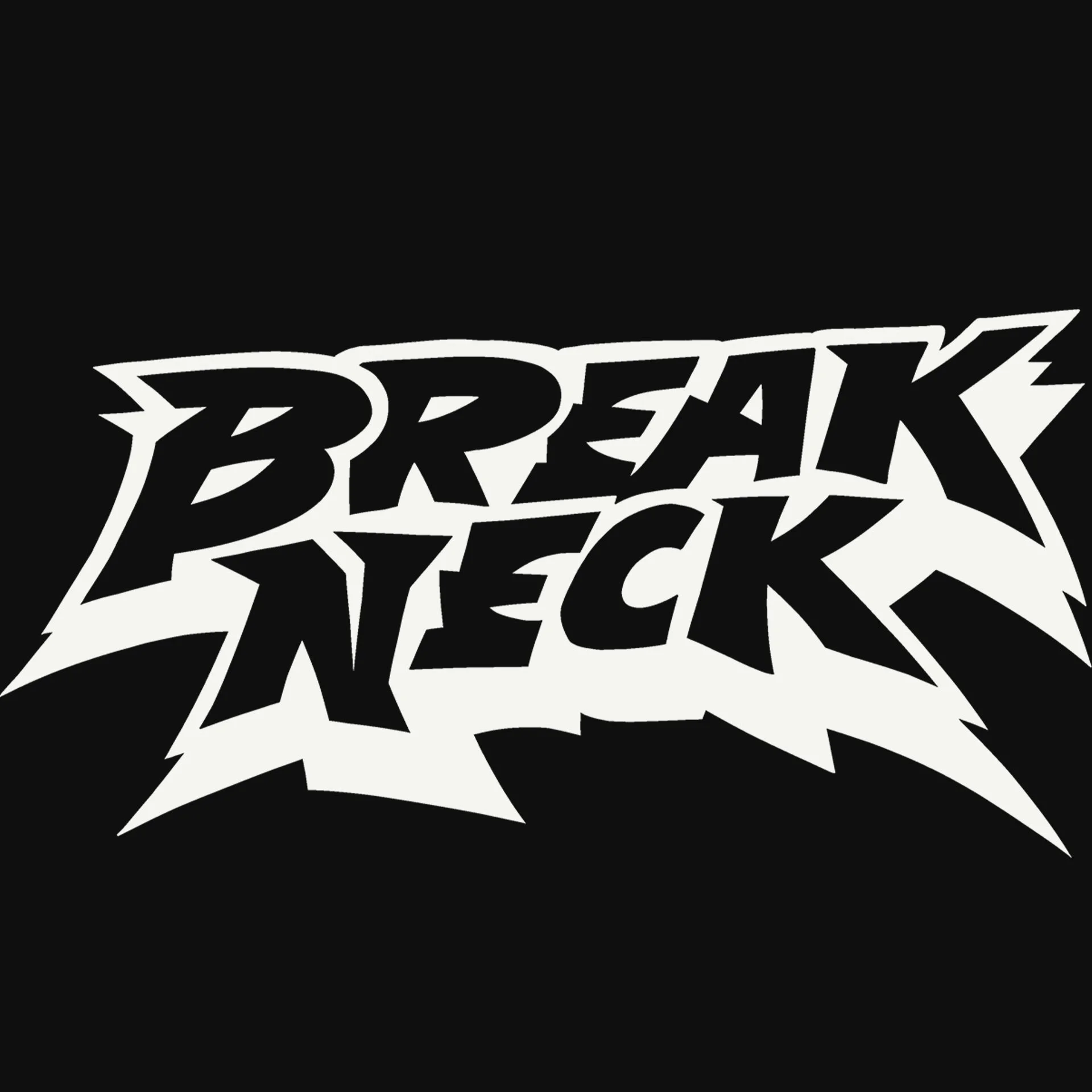
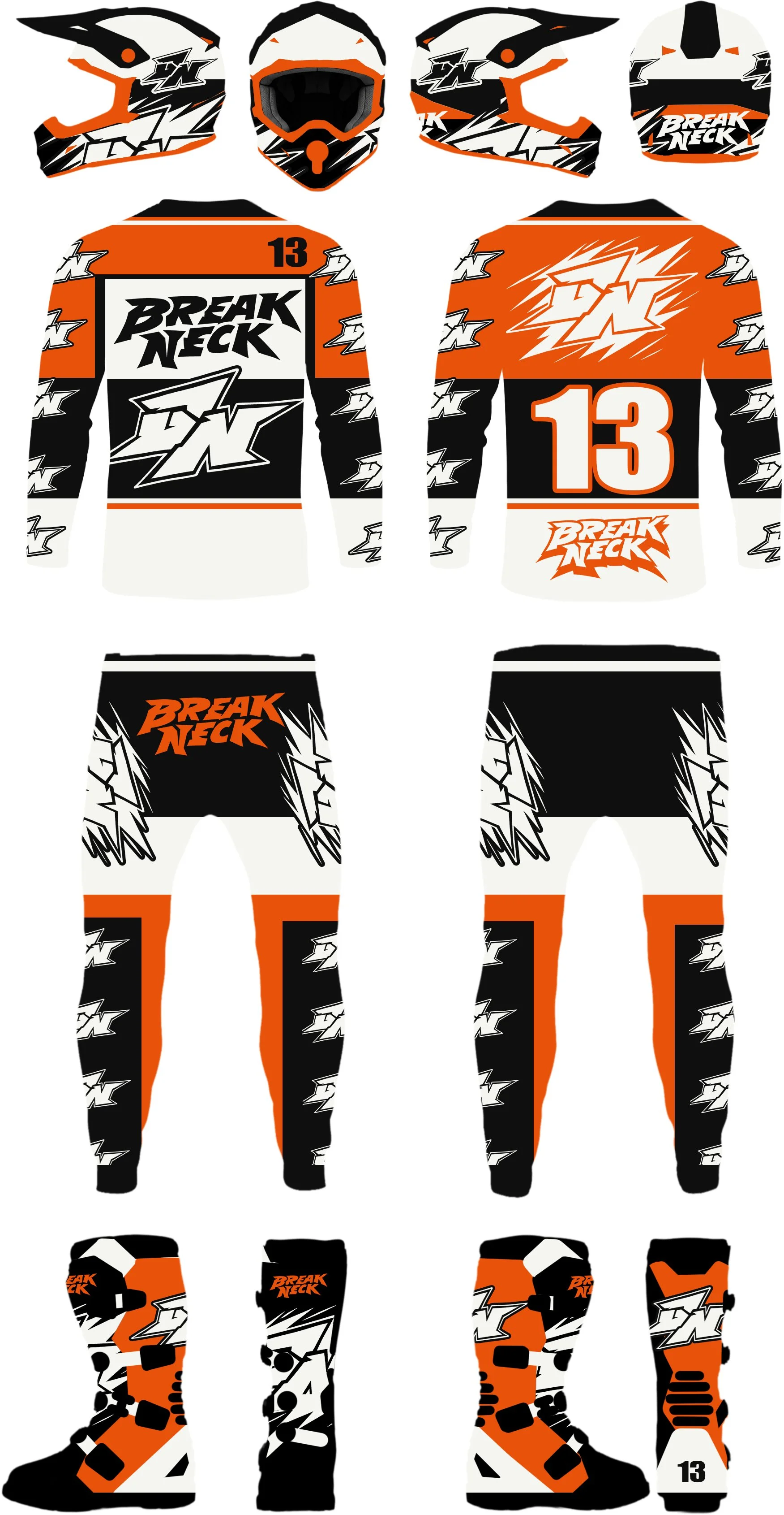
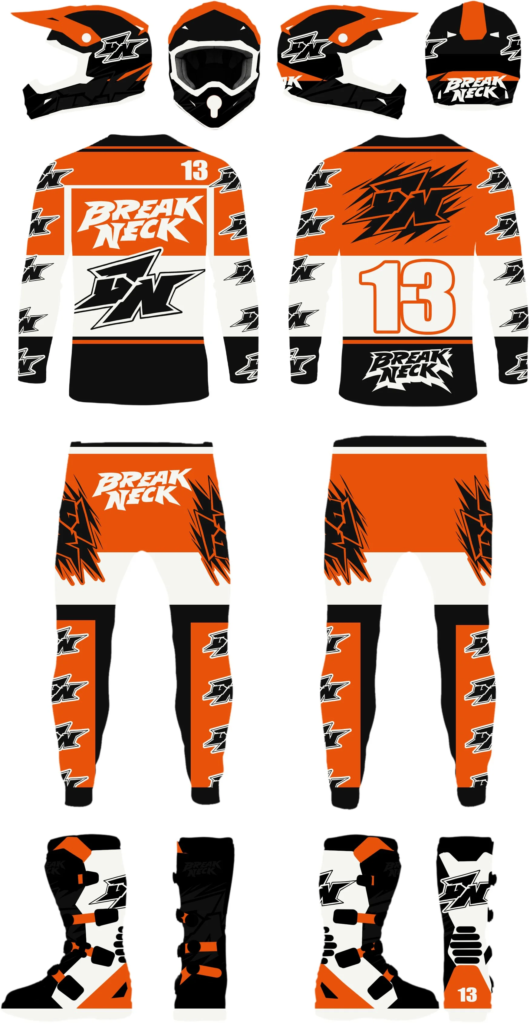
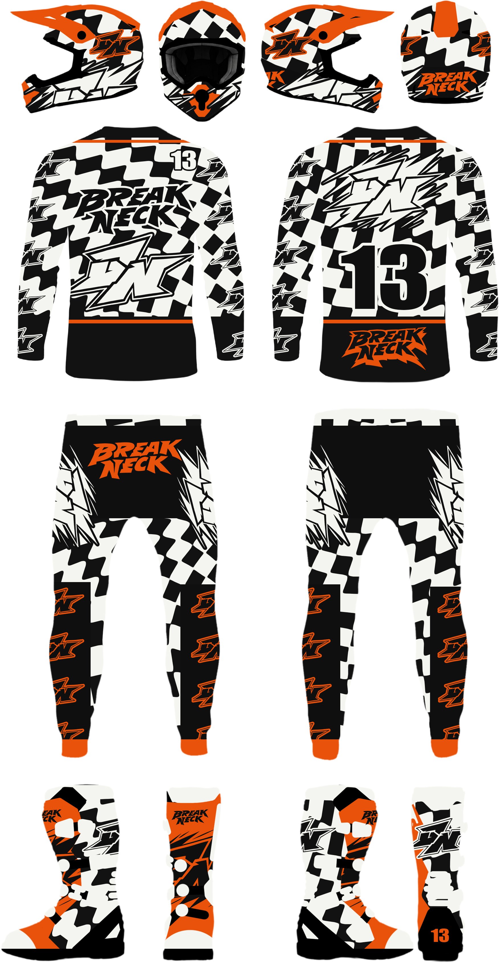
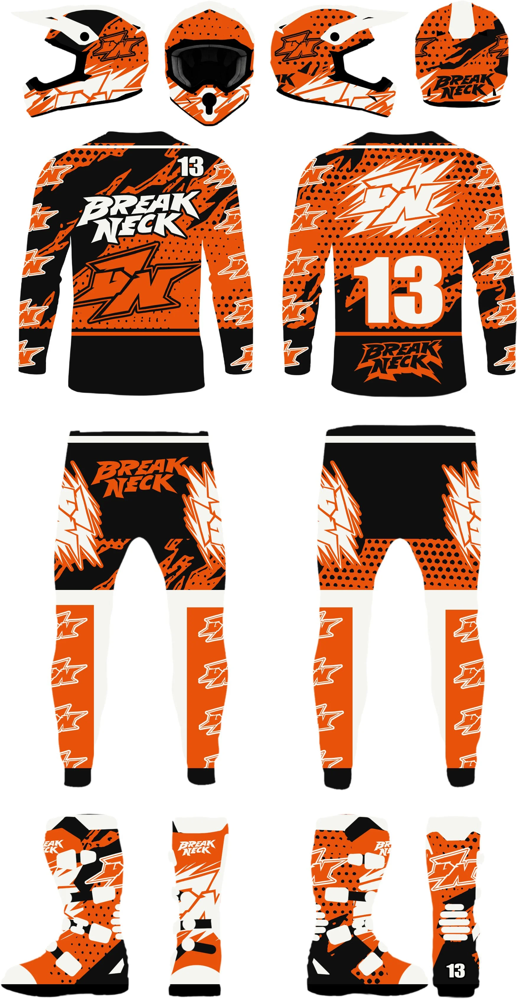
Final Identity System
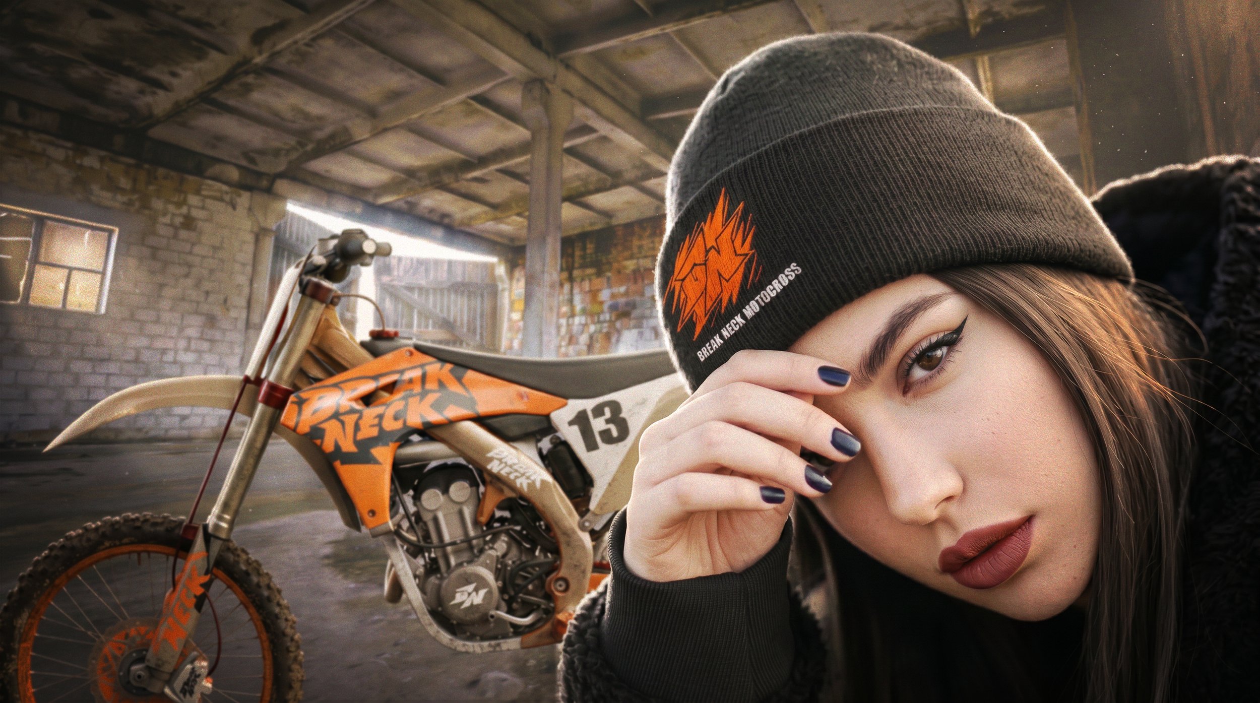
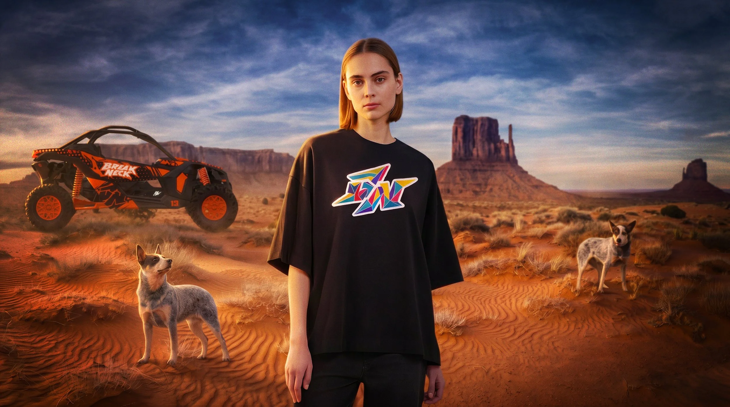
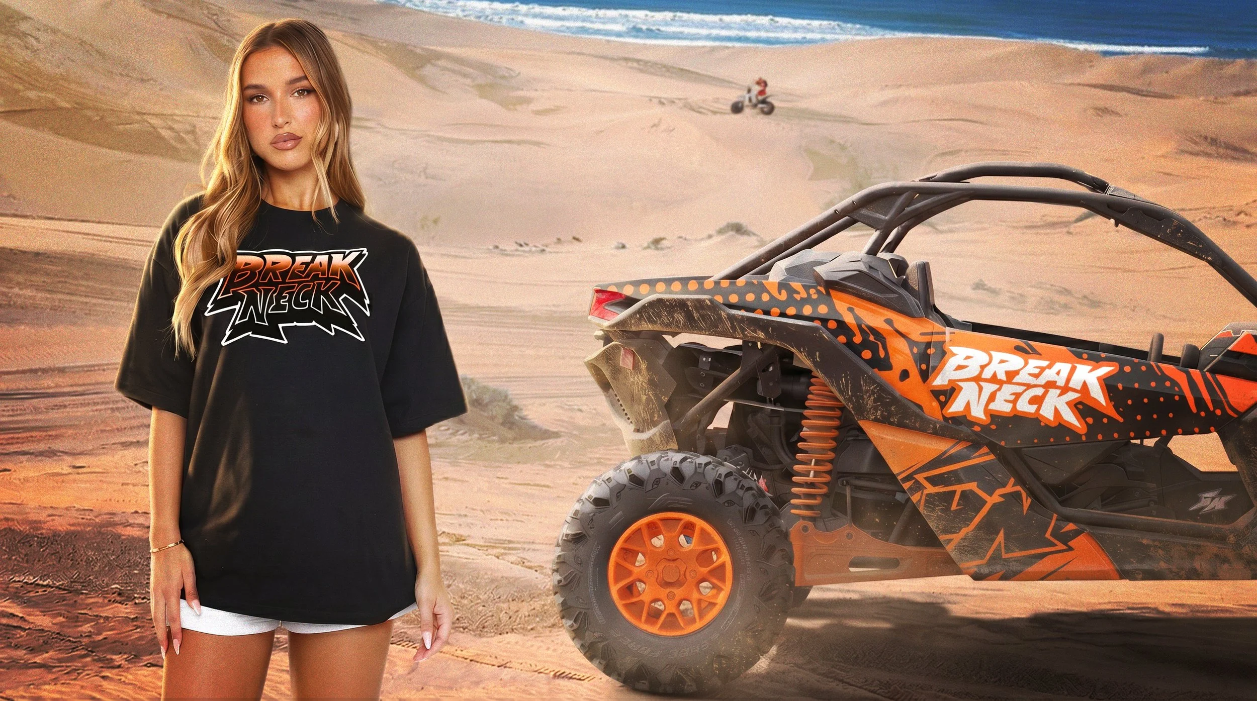
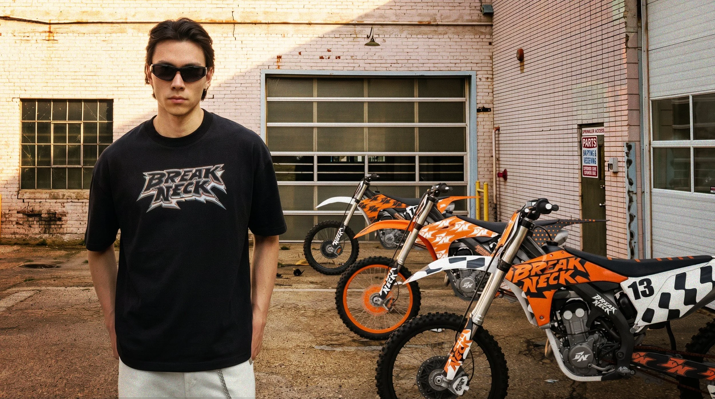
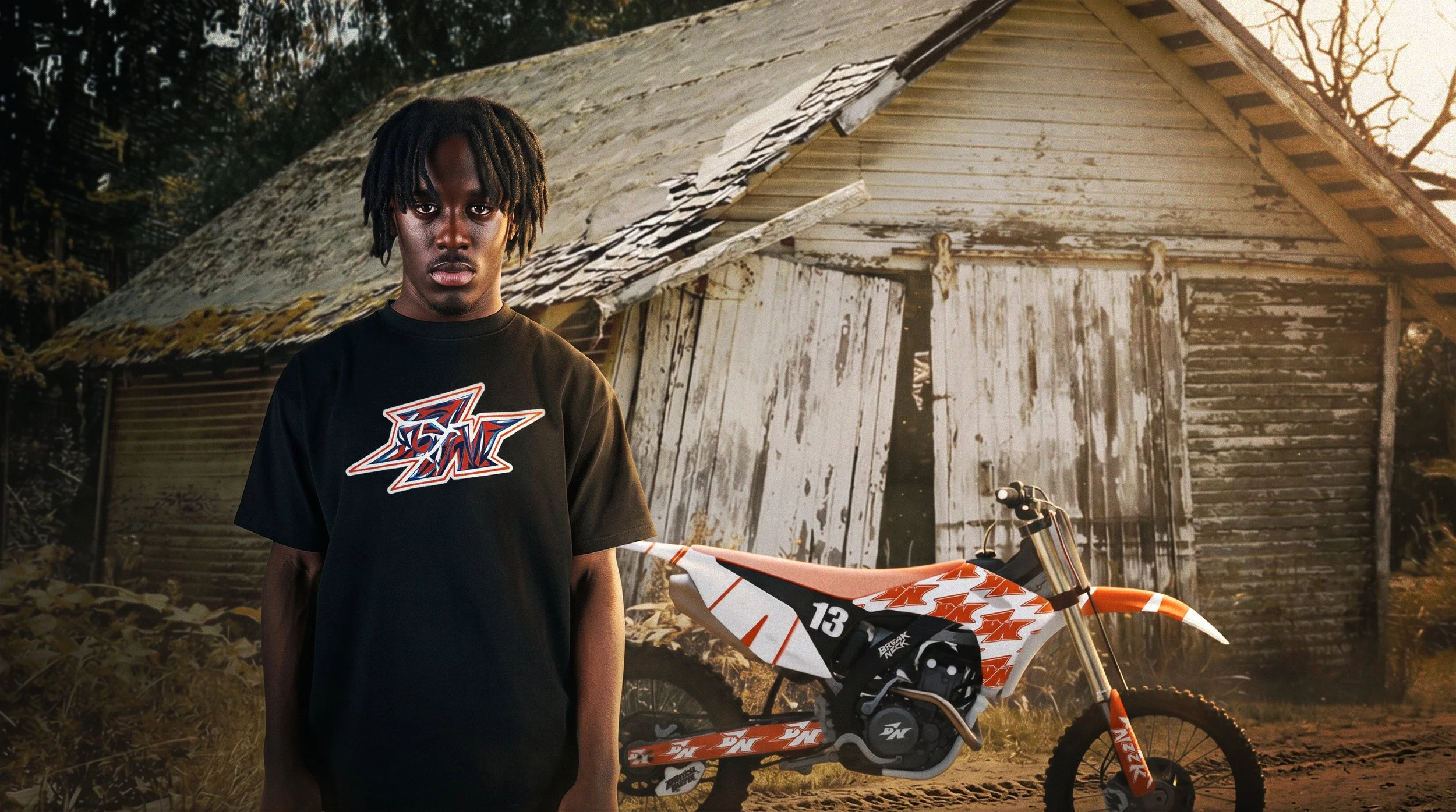
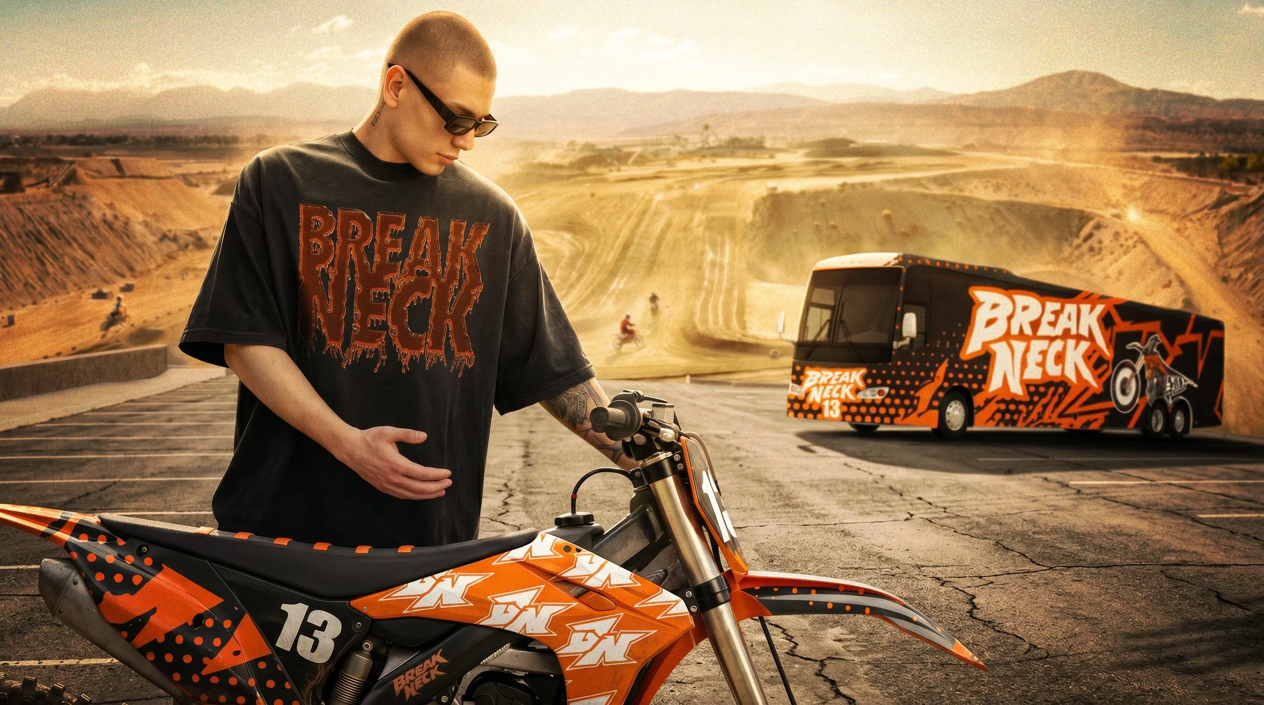
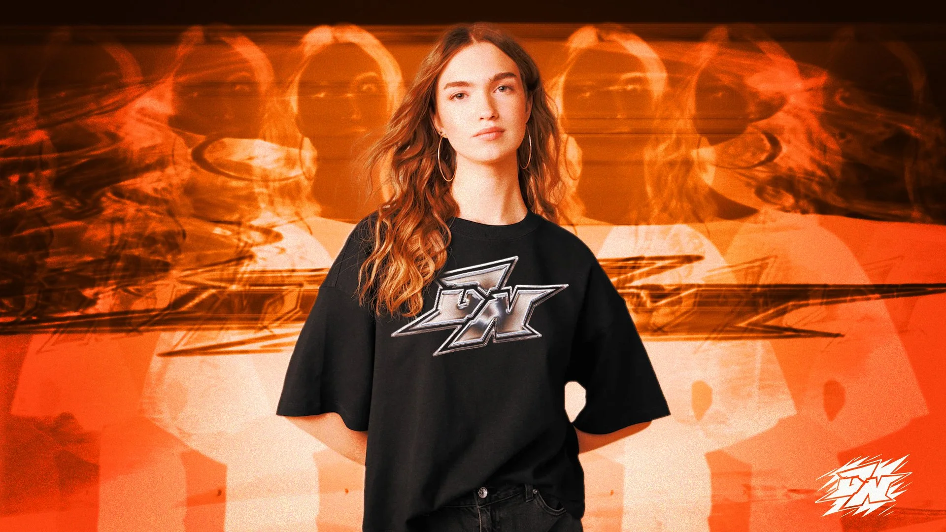
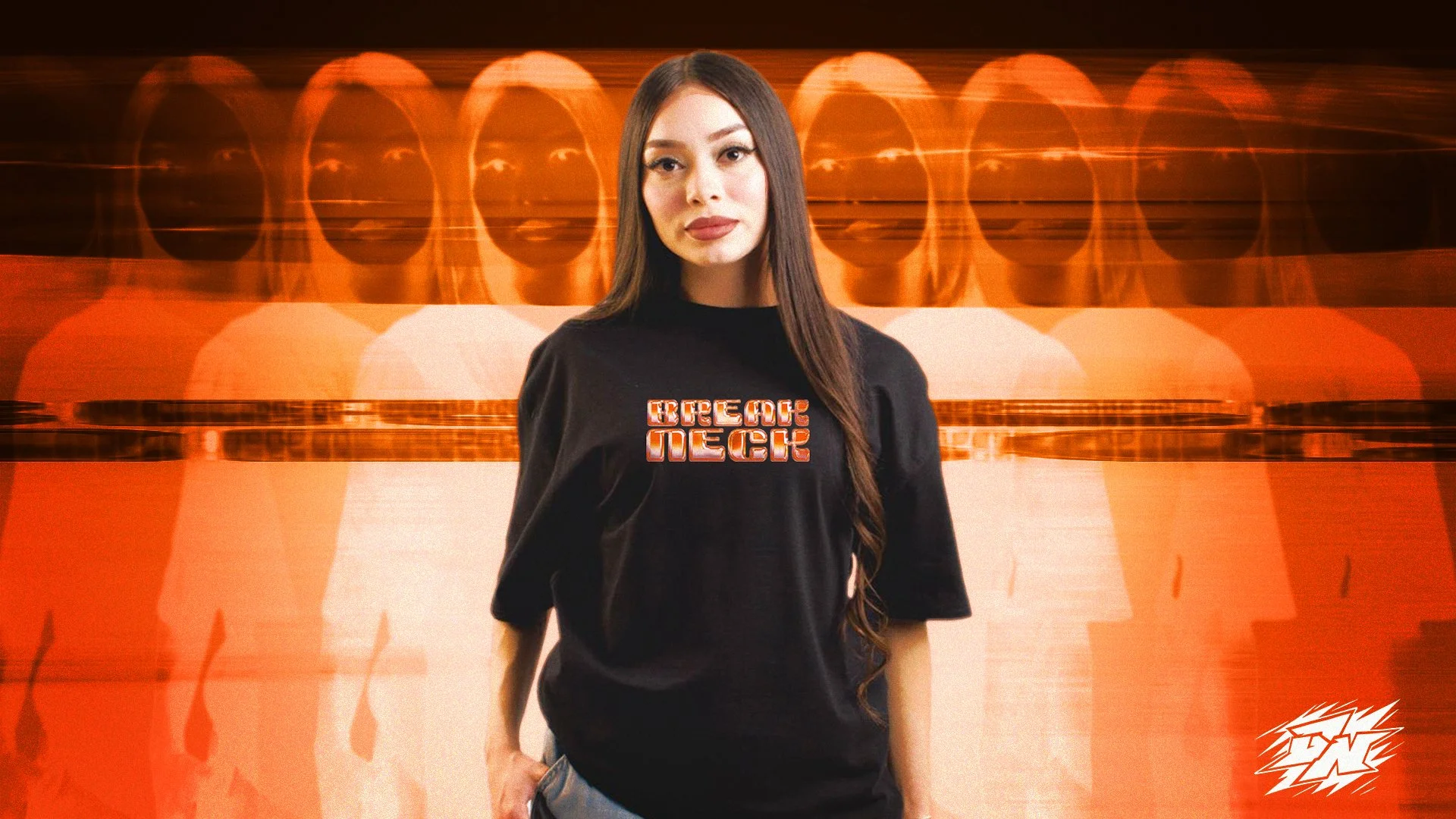
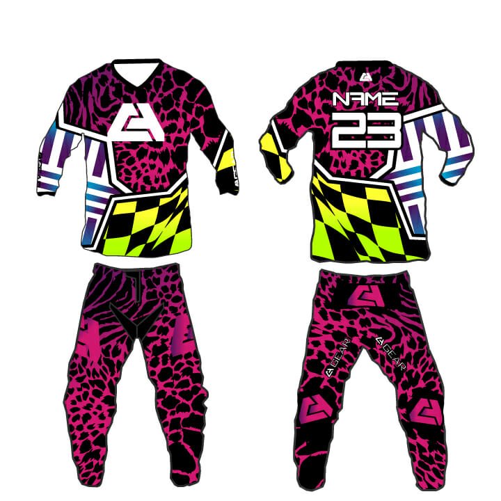
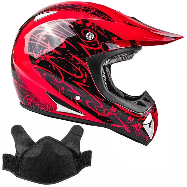
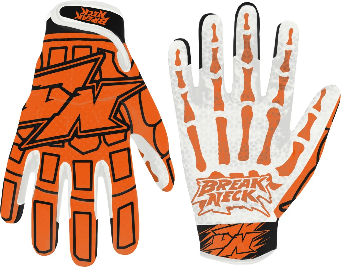
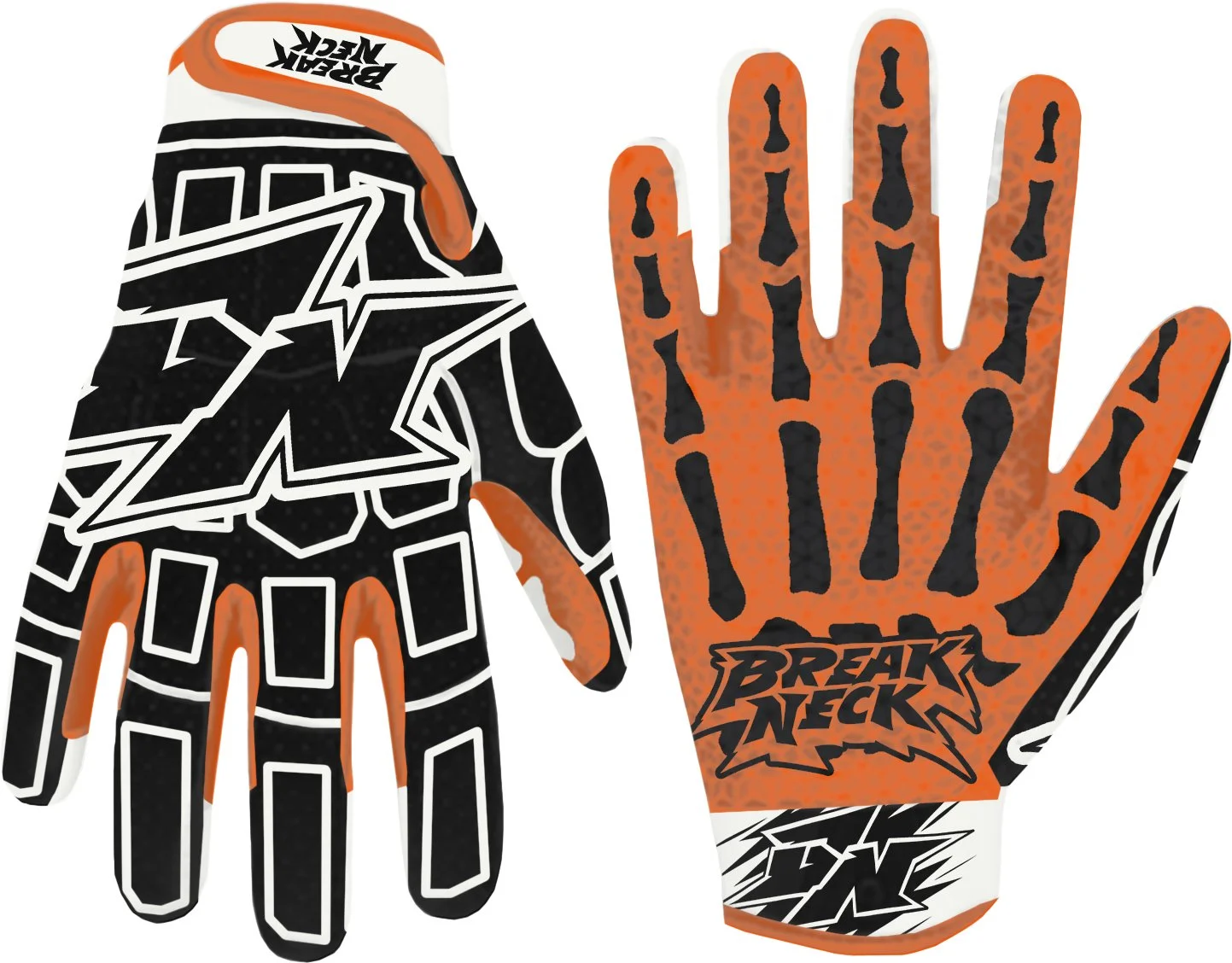
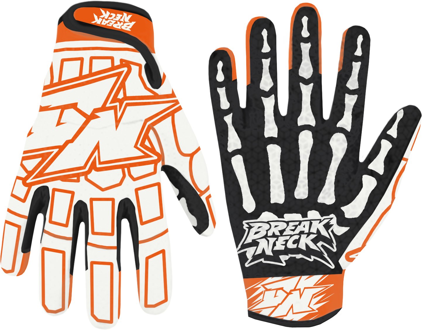
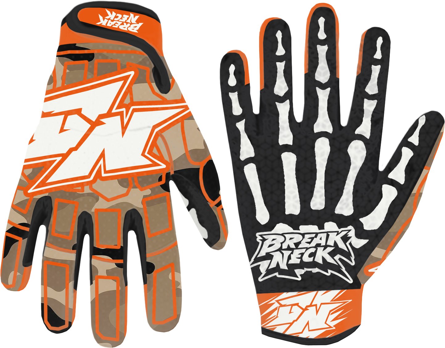
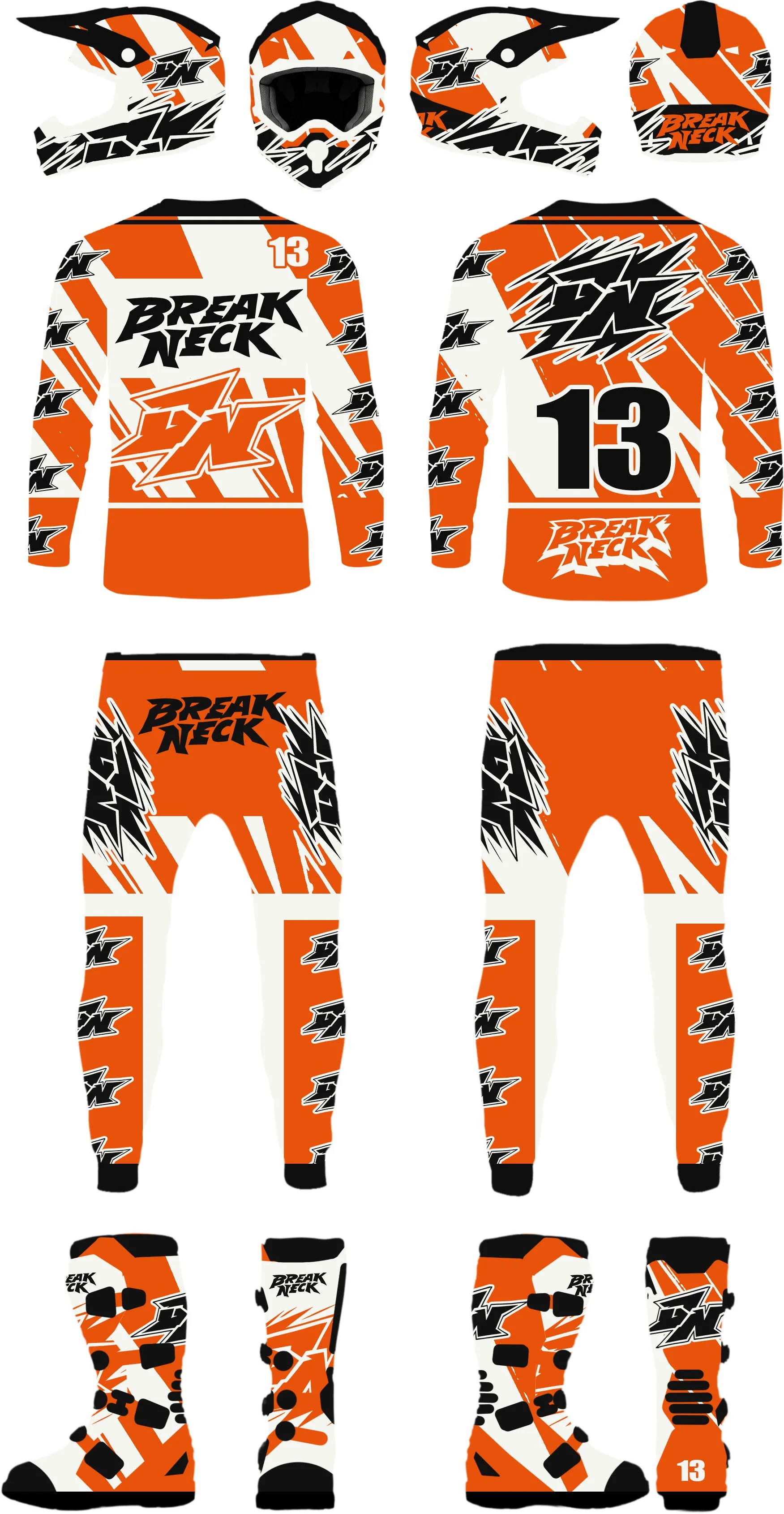
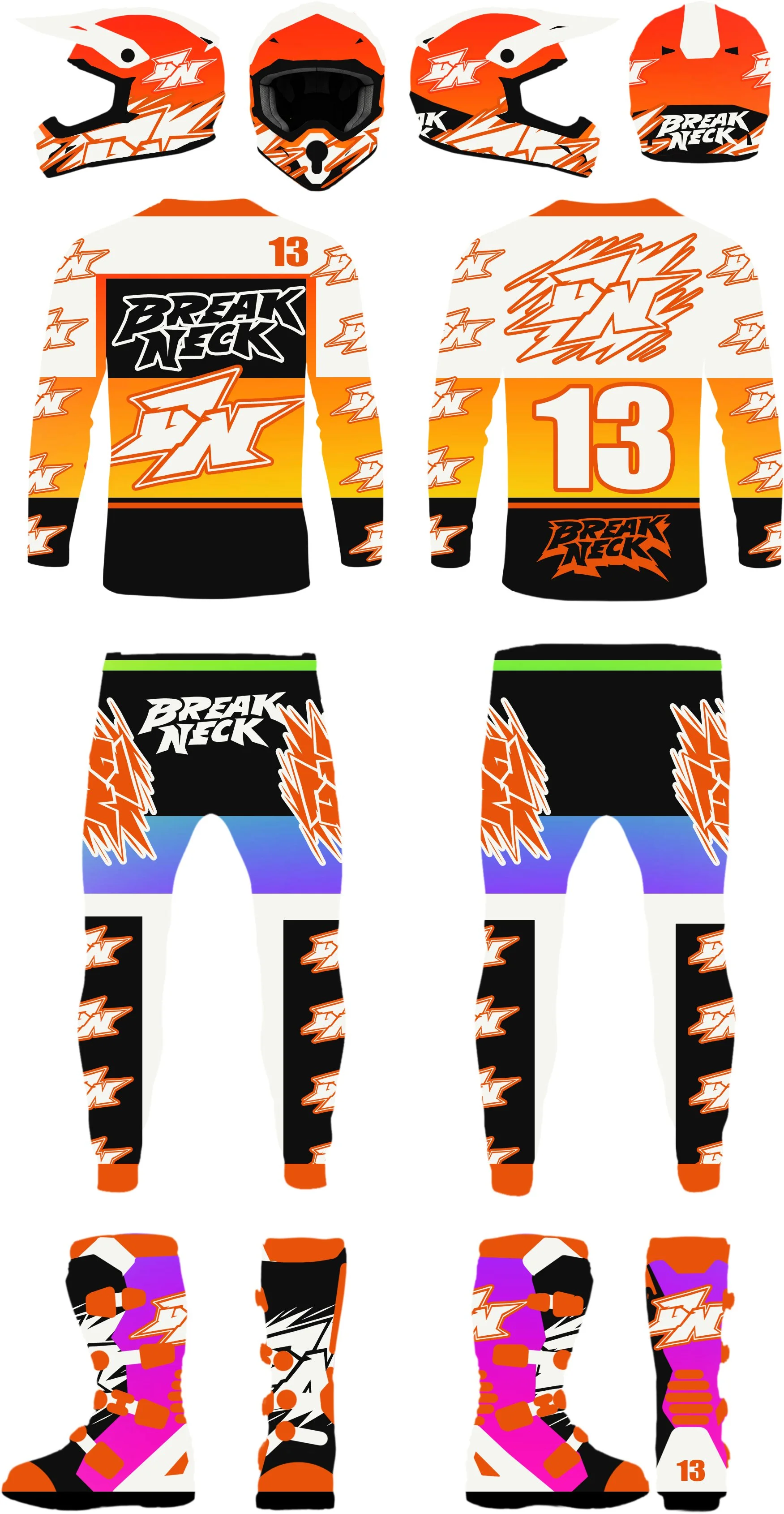
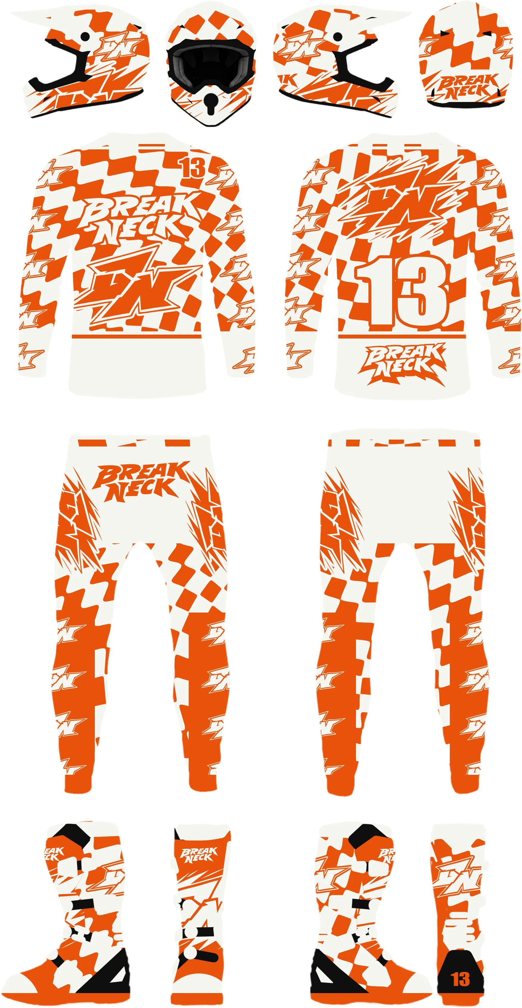
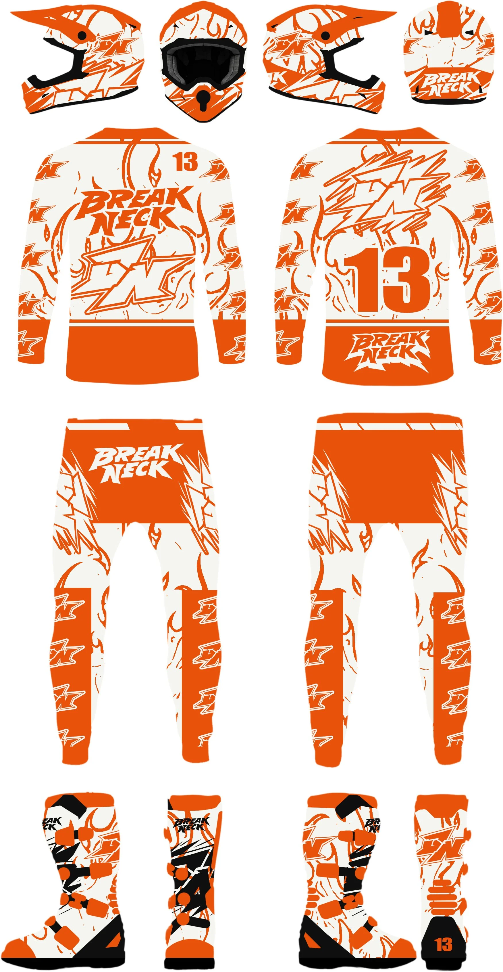
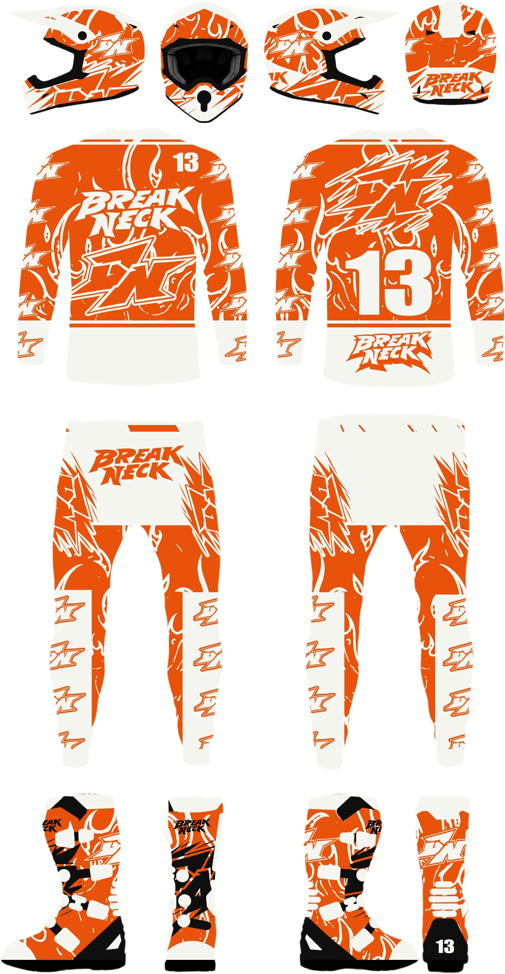
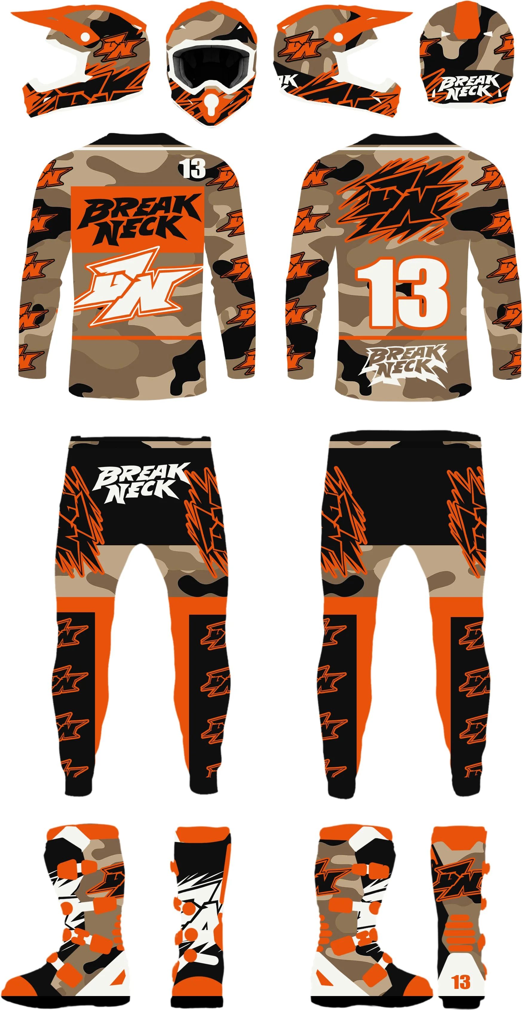
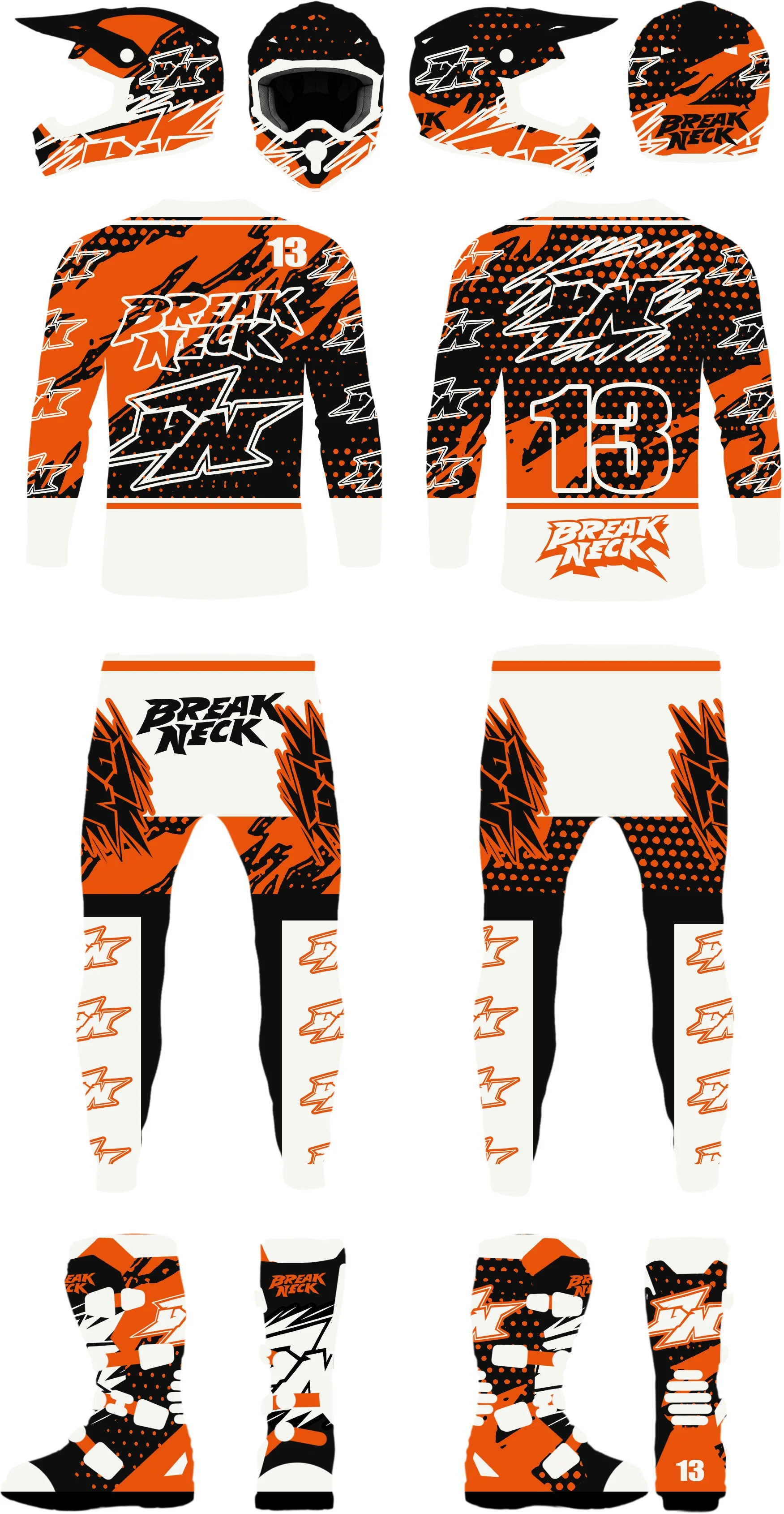
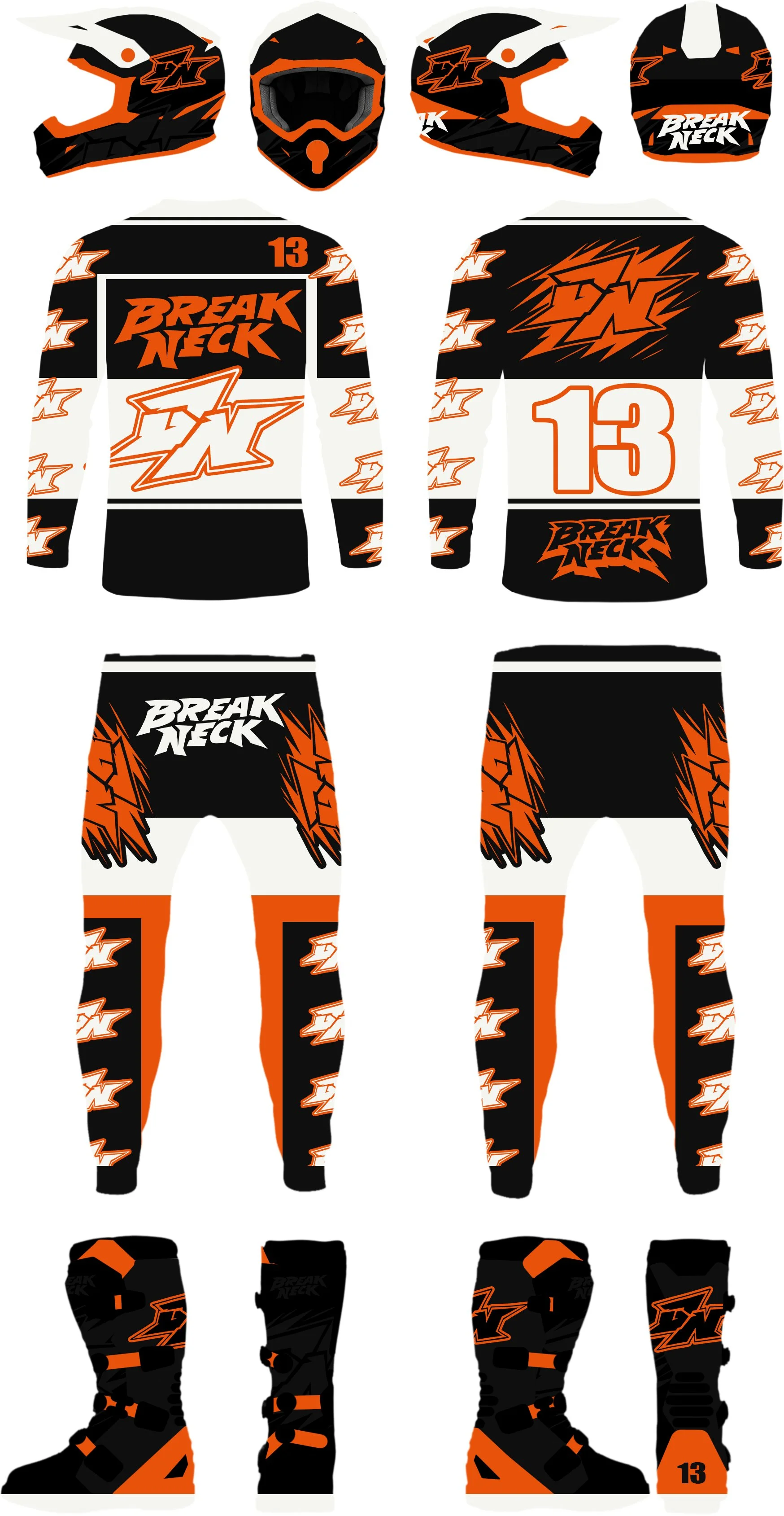
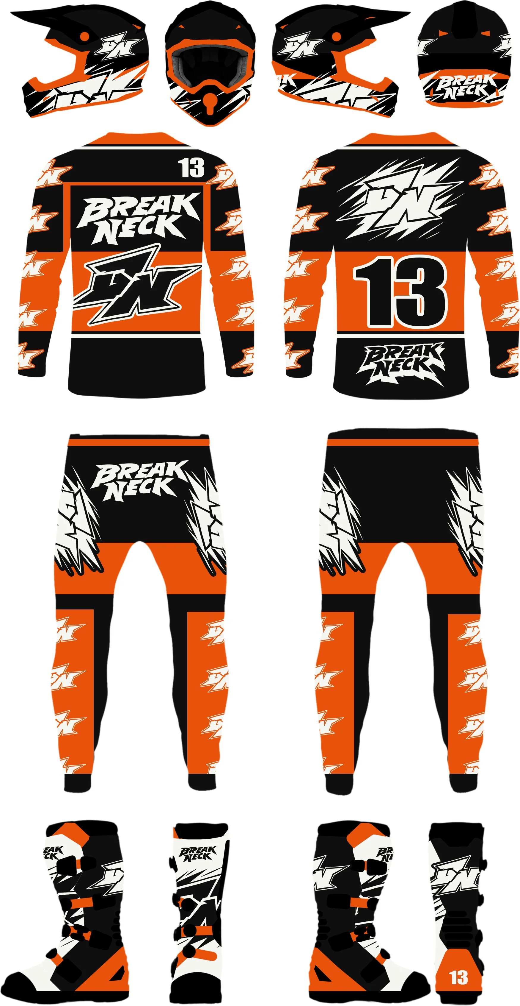
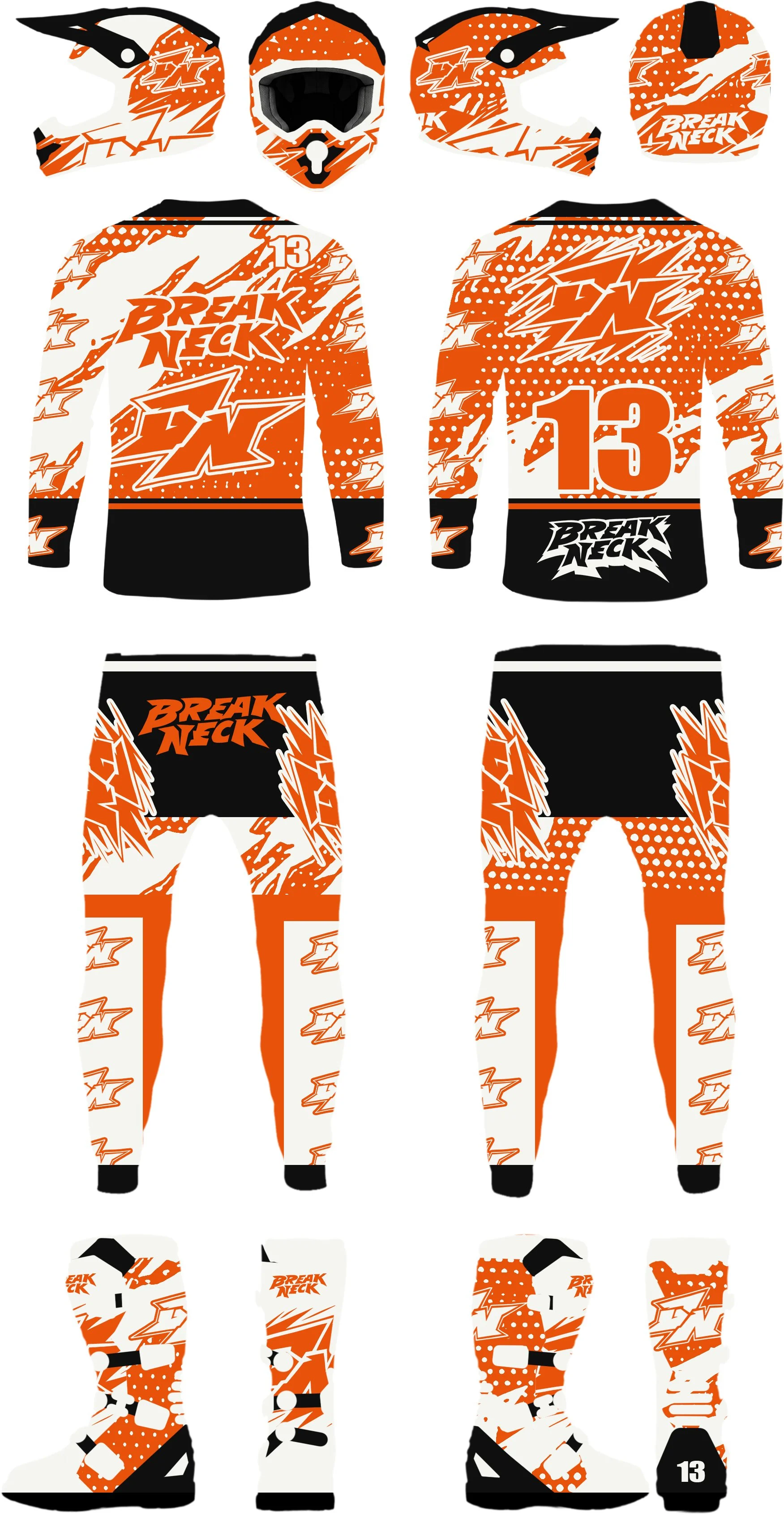
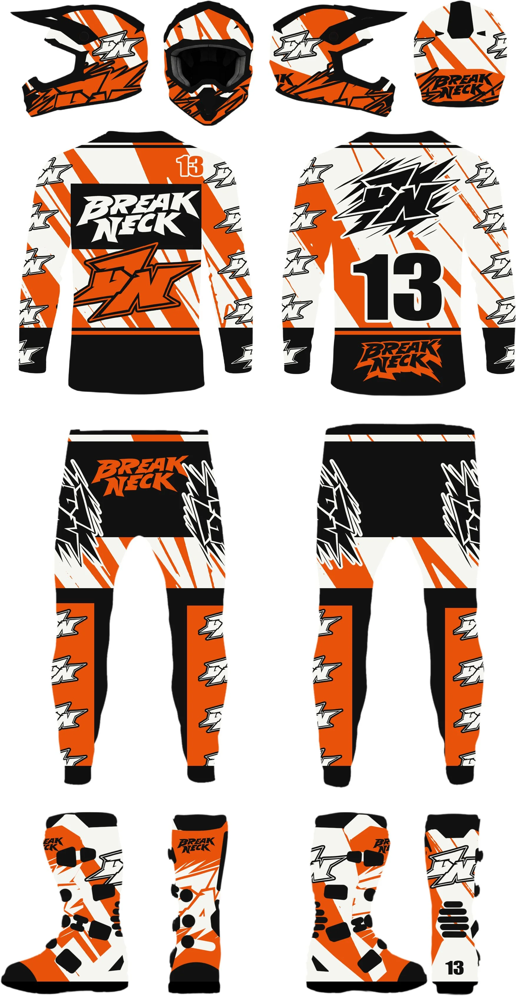
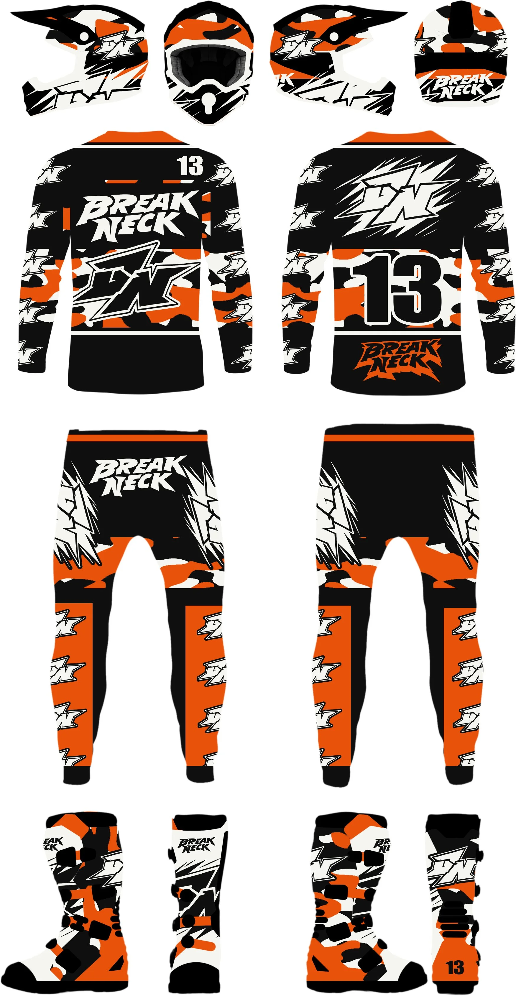
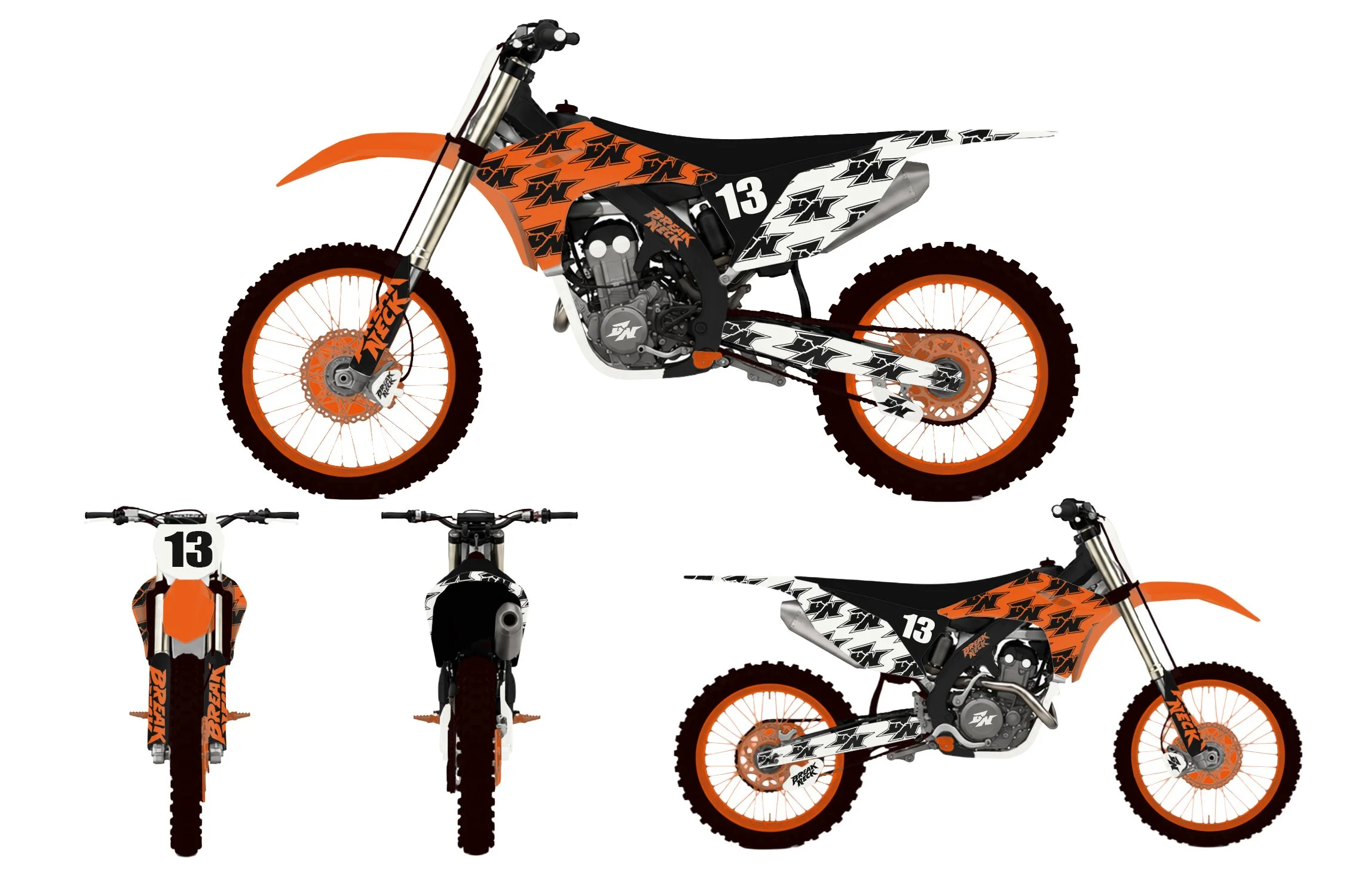
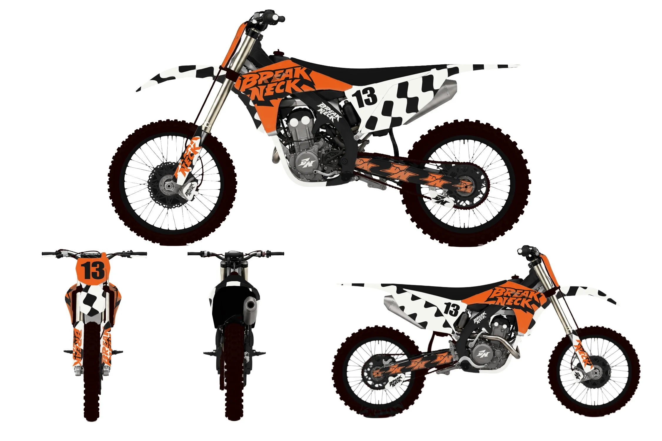
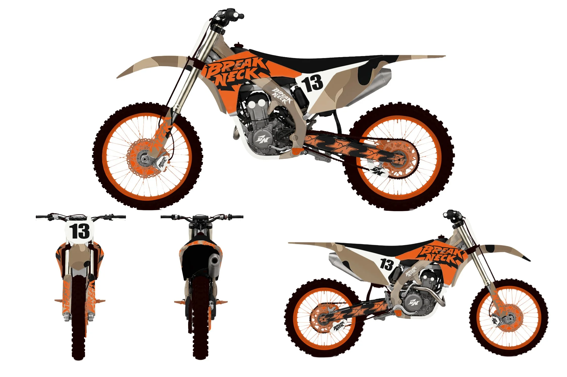
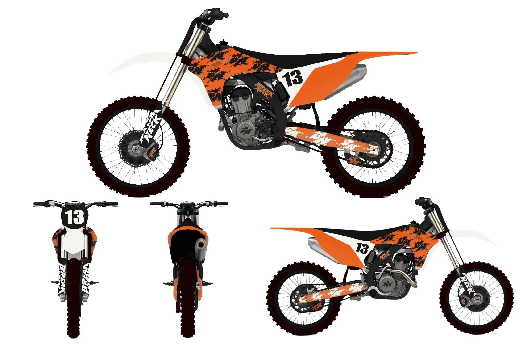
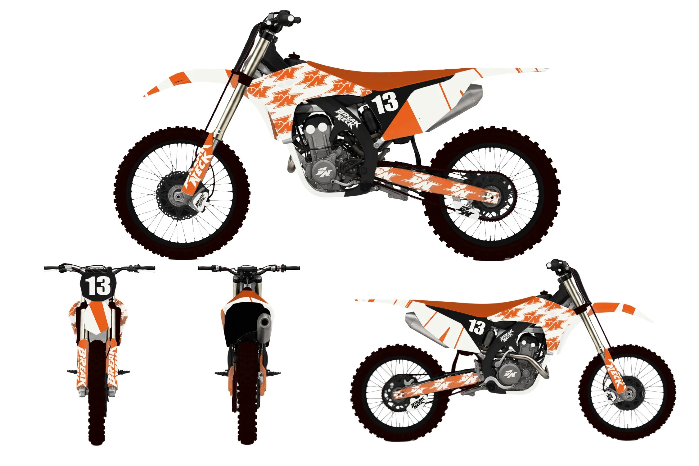
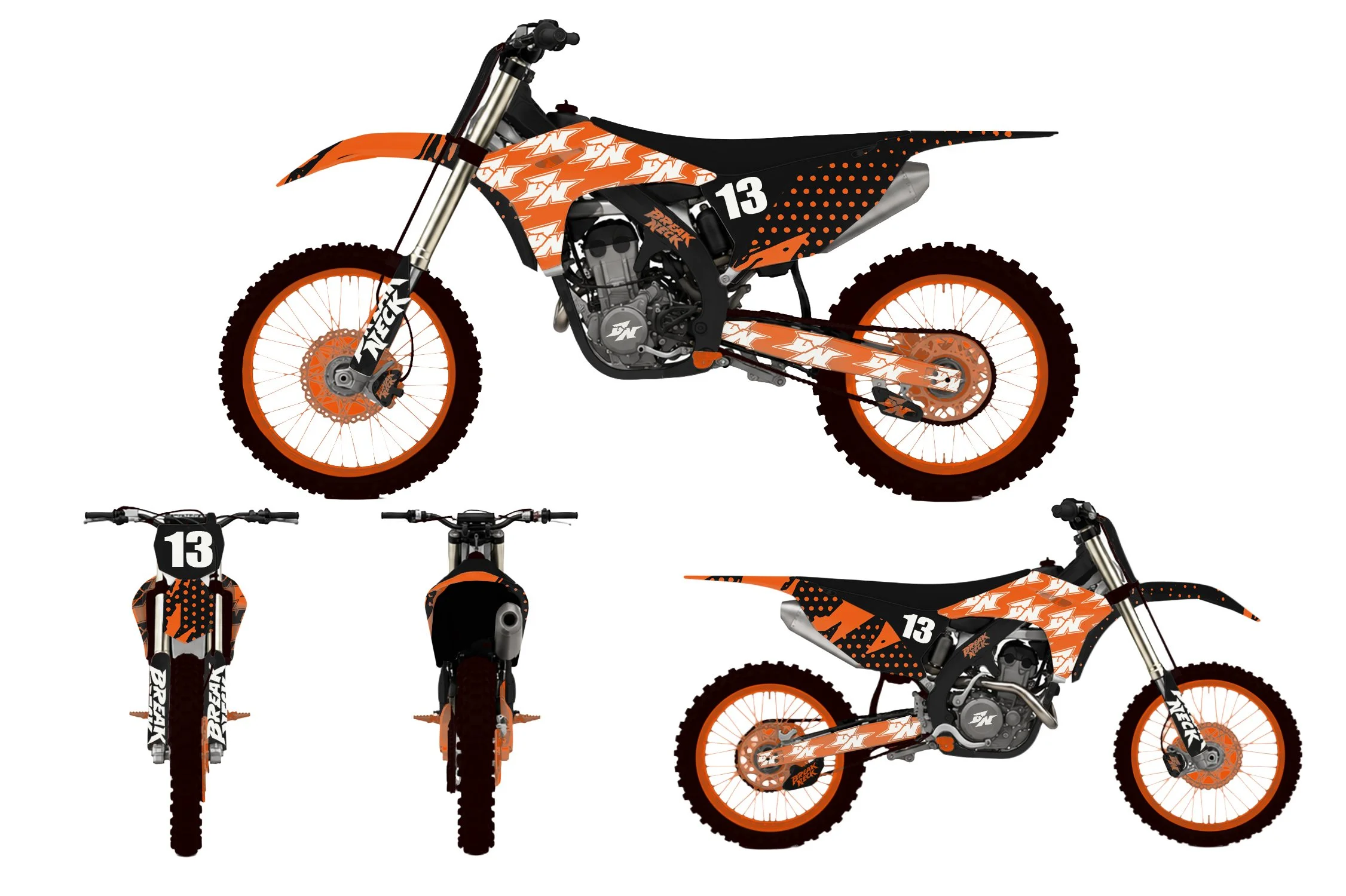
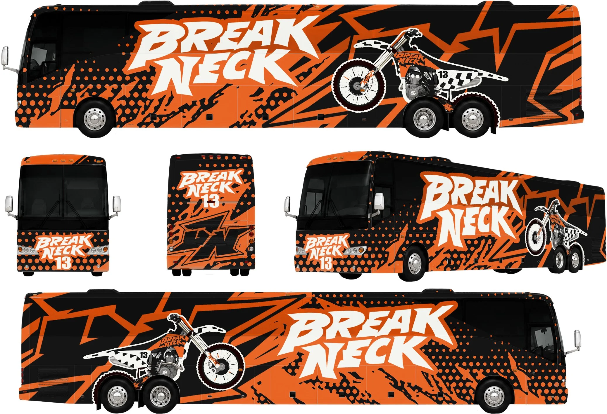
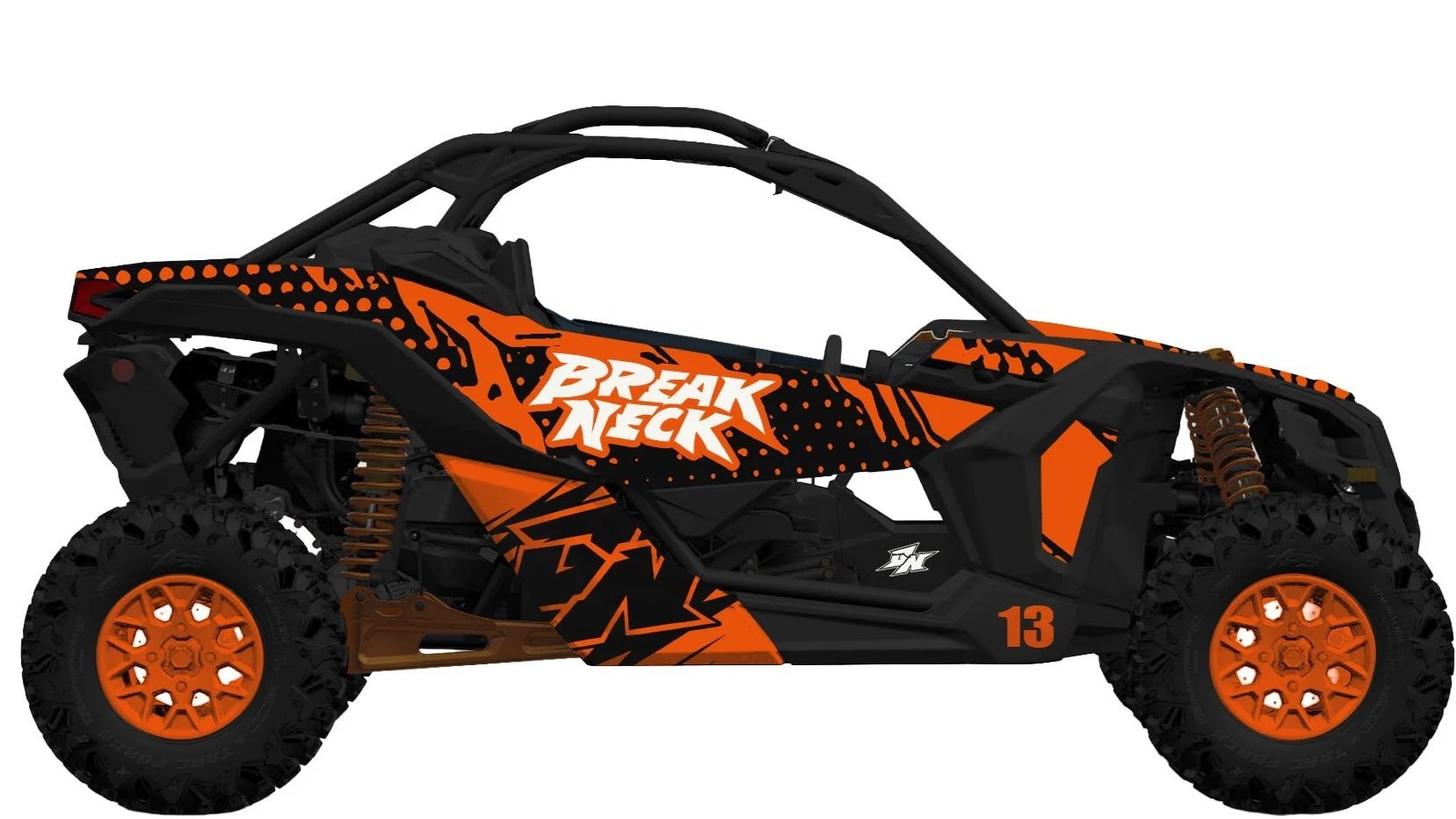
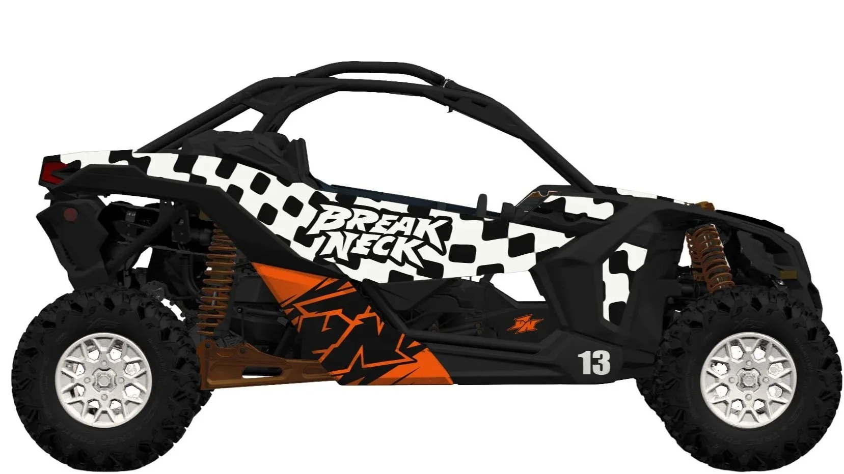
The final identity system expands across multiple branded applications designed to feel consistent while still giving each piece its own personality. Included in the project are live Procreate logo development videos, sixteen complete motocross kit colorways featuring unique helmet, jersey, pants, and boot combinations, four glove designs with custom skeletal hand grip graphics, seven apparel graphics, six bike wraps, four motion graphics, two dune buggies, and a fully branded tour bus design.
Every design was approached individually to avoid repetition across the collection while still maintaining a recognizable brand language throughout the system. The project became an opportunity to explore how far the identity could extend into the motocross world while keeping the visuals aggressive, fast, and cohesive across every application.
What started as a logo concept quickly evolved into a much larger brand universe and only scratches the surface of what the Break Neck Motocross identity could become.
Logo Development Live Videos
Motion Graphics
Gloves
Spring Collection
Summer Collection
Fall Collection
Winter Collection
Team Bikes
Team Tour Bus
Dune Buggies
Merchandise Designs
T-Shirts
Applications