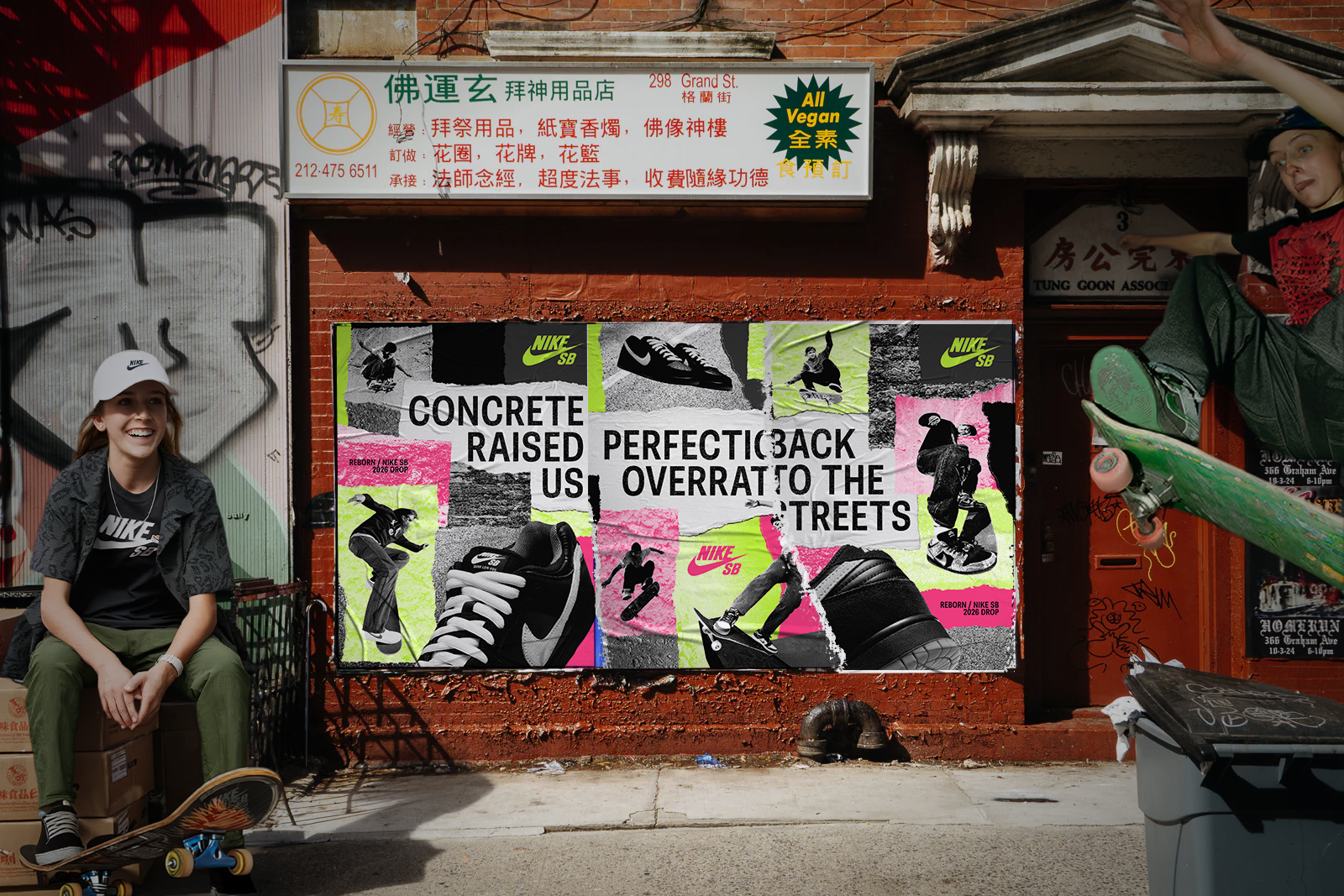
Nike SB "Reborn"
Campaign Identity Concept
Photoshop • Procreate • 2025
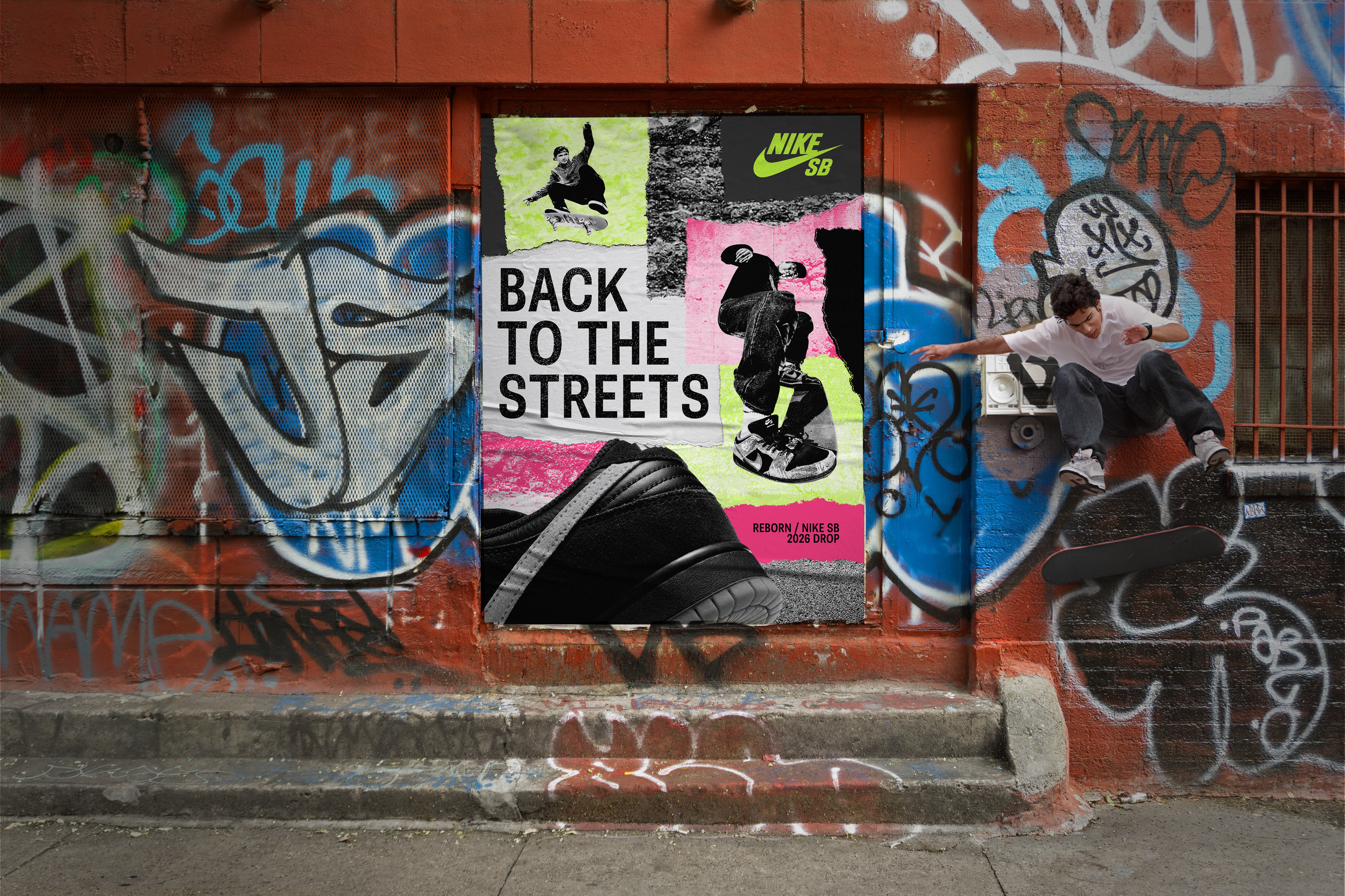
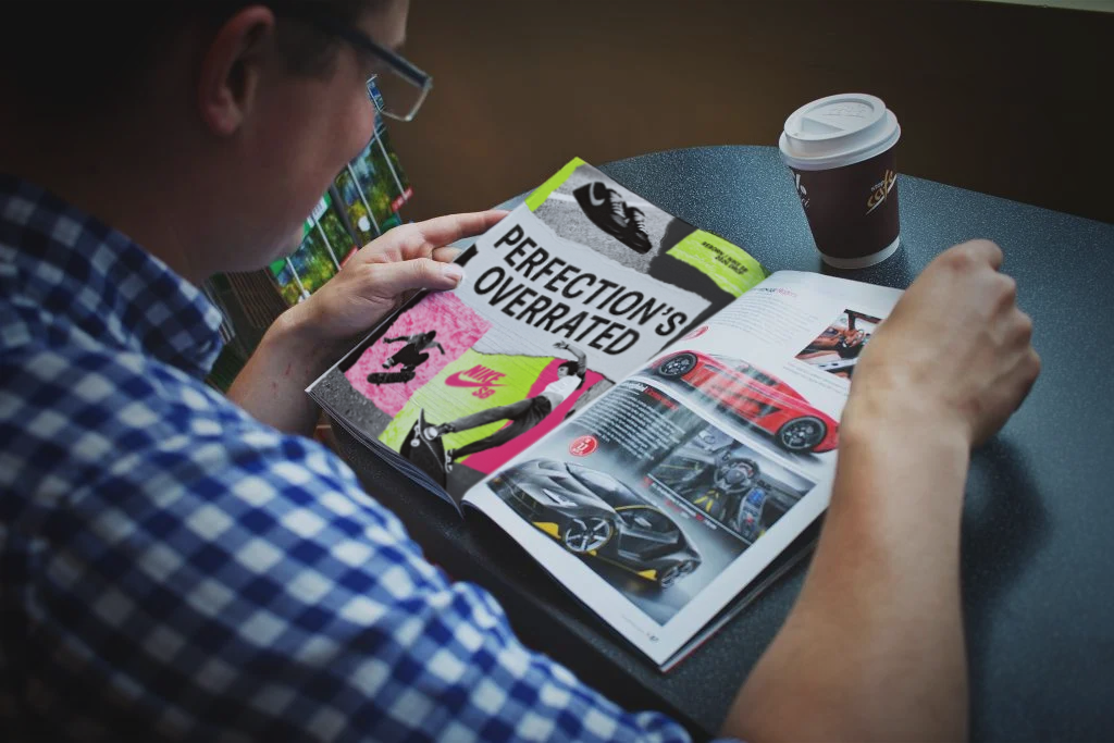
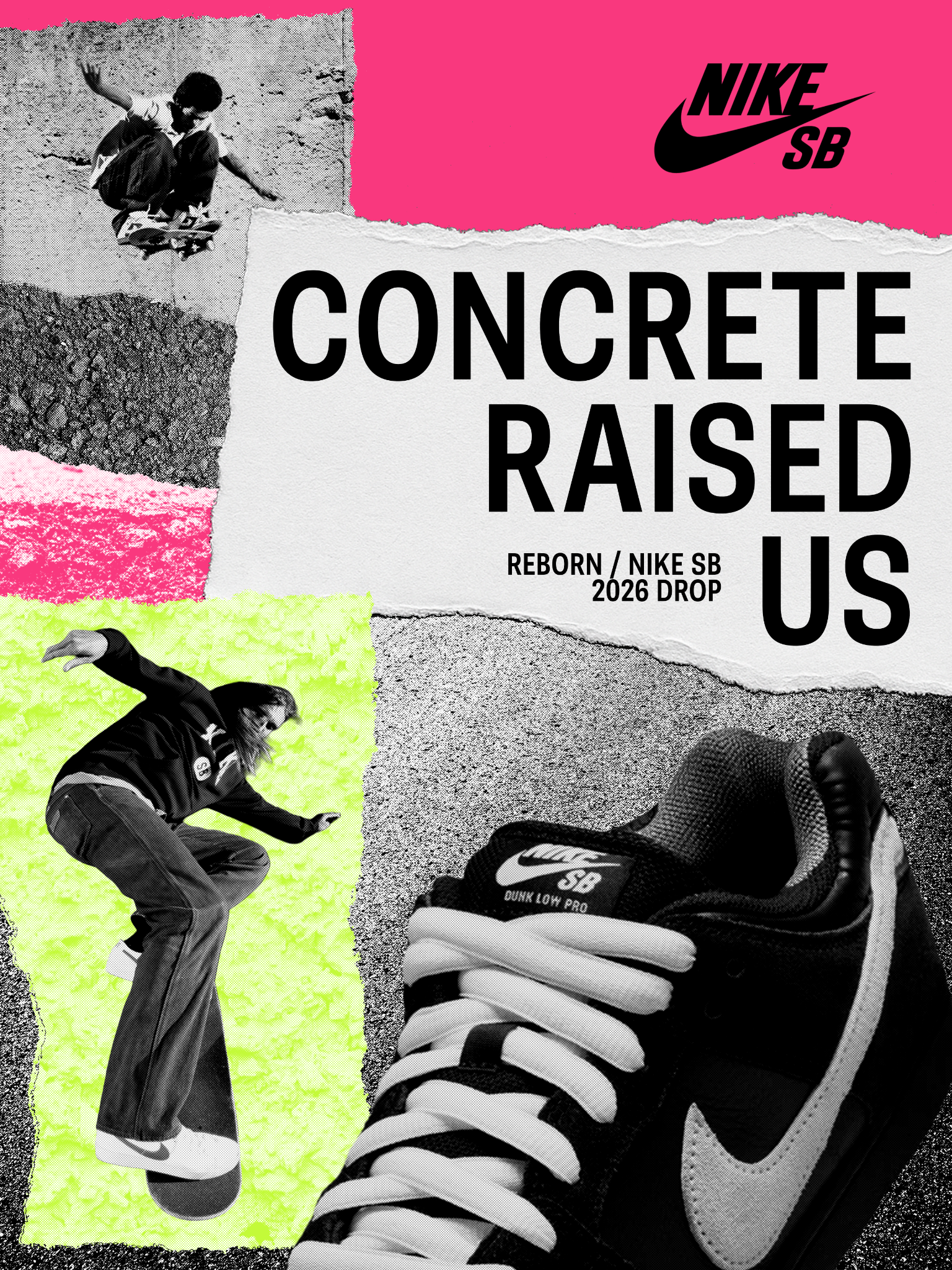
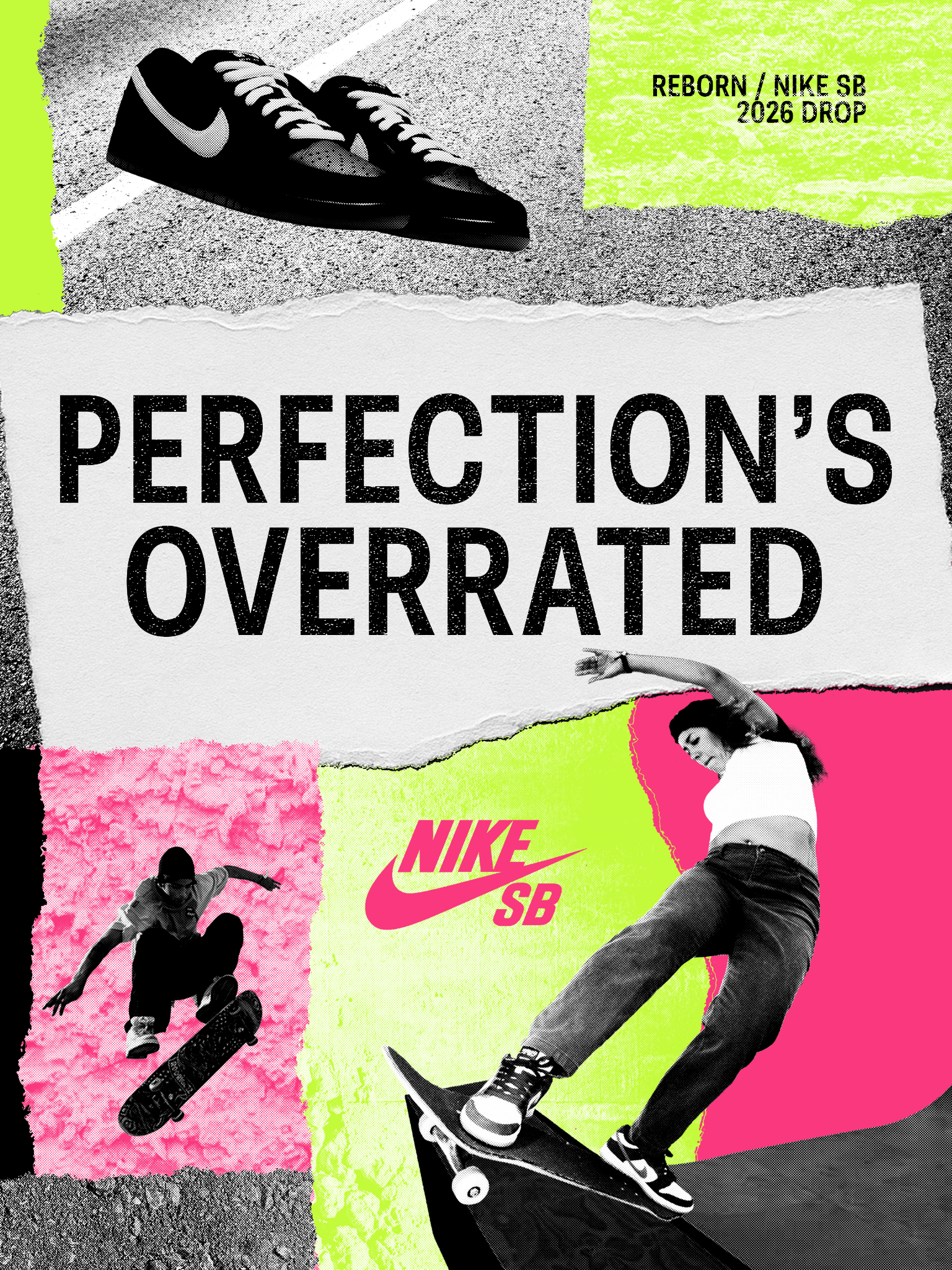
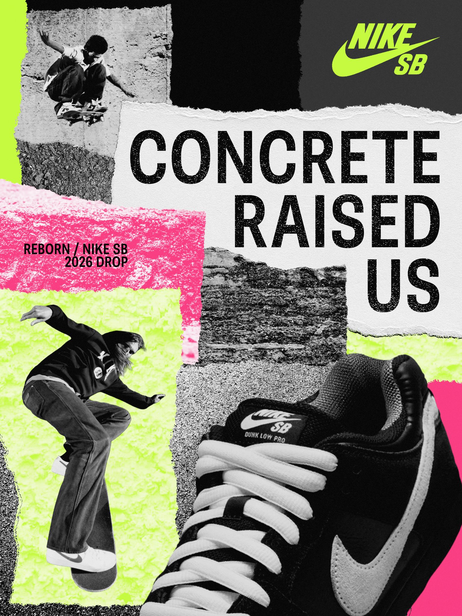
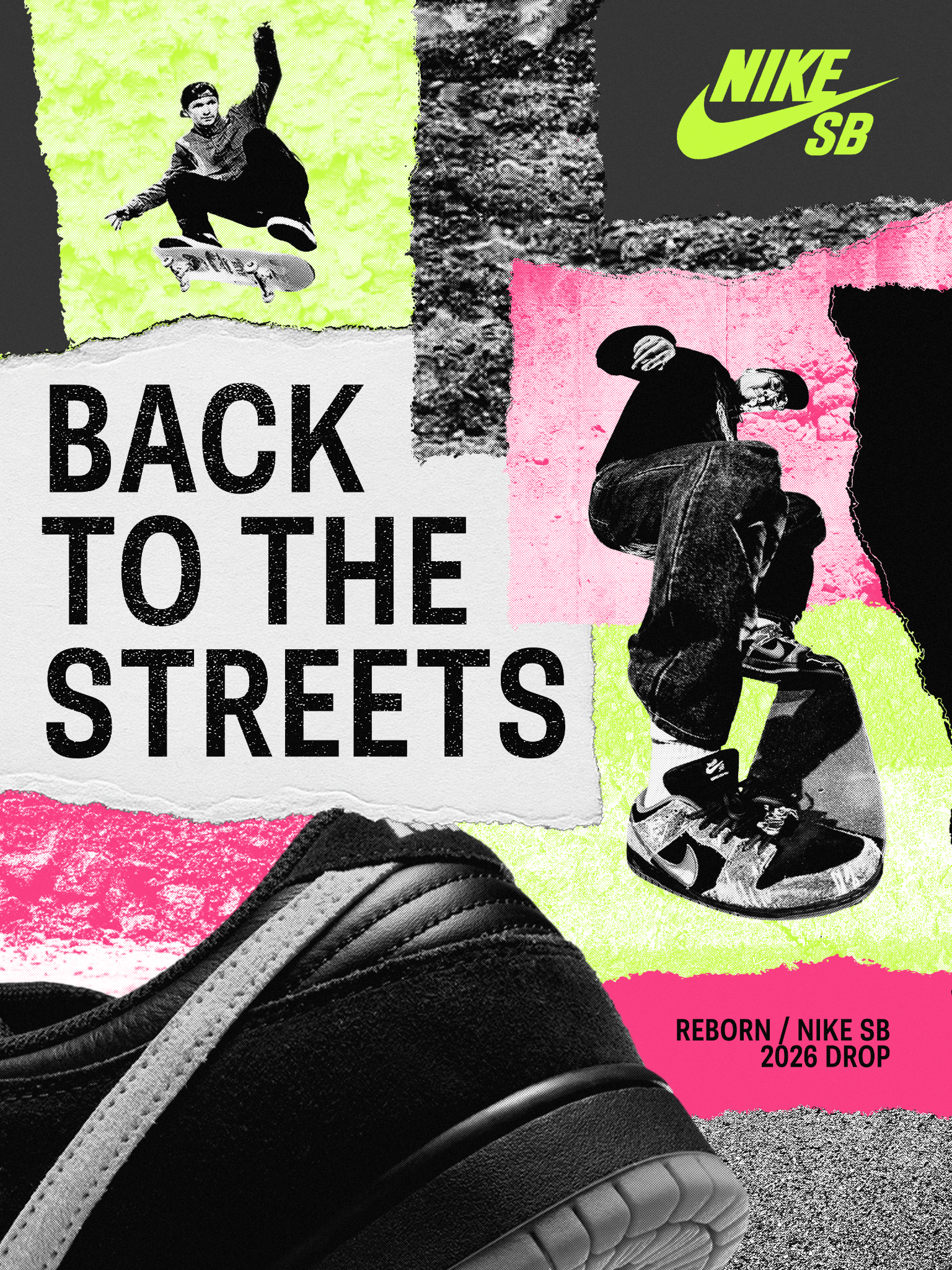
Nike SB "Reborn" is a conceptual campaign built around a shoe drop. The triptych blends collage, photography, and typography to push skate culture's street energy into a poster system. From there it extended into packaging, apparel, and product graphics to see how far the identity could stretch across a real launch.
Visual Direction
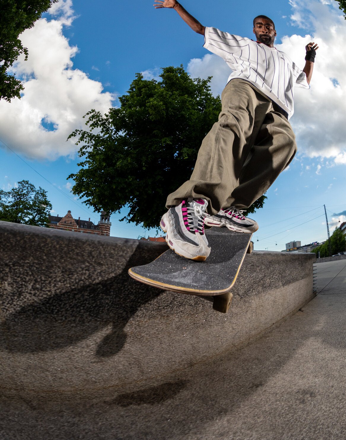
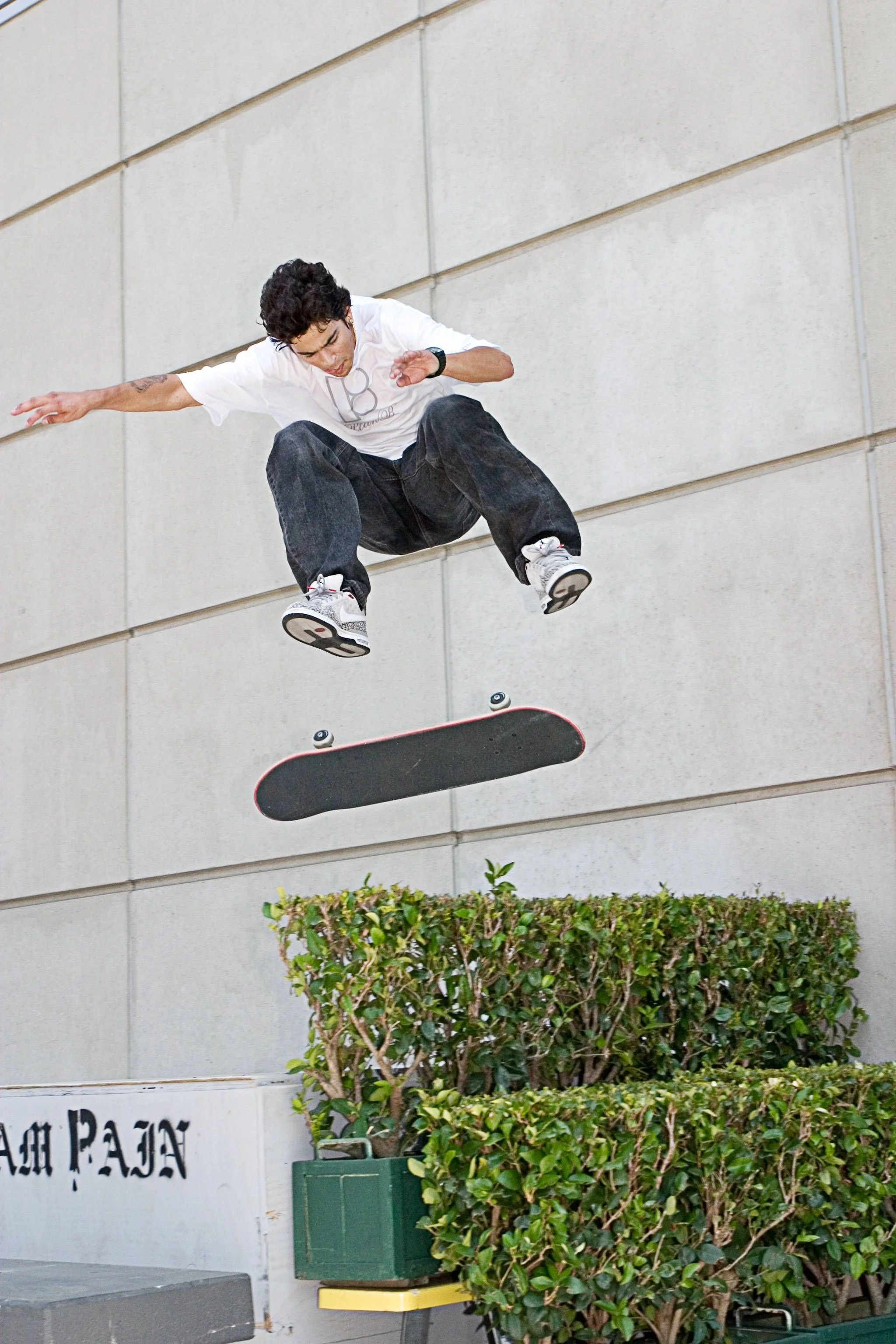
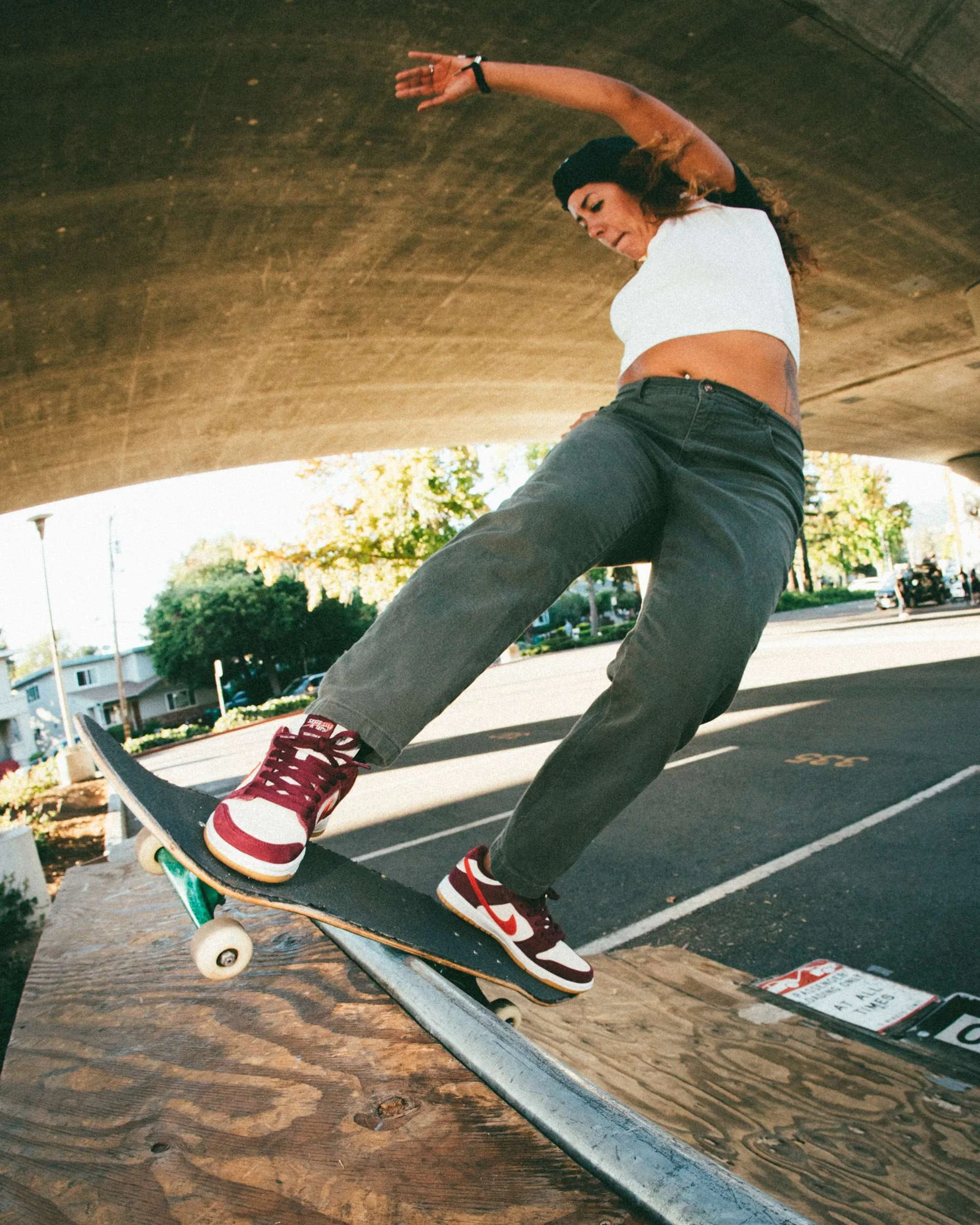
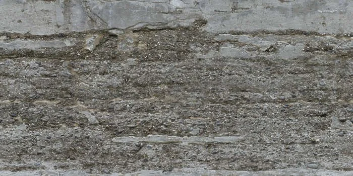
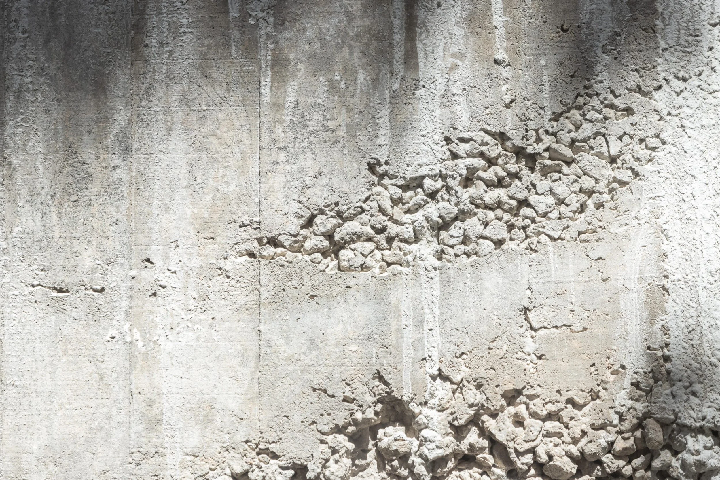
The mood board pulled from real street skating. Worn concrete, rough asphalt, low angle trick shots, and lived-in footwear. The textures and surfaces were chosen to set a raw grounded tone built around movement, impact, and real skate spots rather than anything staged or polished.

Sketch Development
The early sketches worked out composition, hierarchy, and how to combine photography with collage textures and bold type. Each sketch helped define the rhythm and structure that carried through into the final posters.

Typeface Selection
Belarius Sans Bold
Previous Options
Futura Bold, Acier BAT
Typeface Study
Belarius Sans Bold was chosen over Futura because it brings a thicker more grounded weight that fits the raw DIY tone of Nike SB better than Nike's usual direction. The bold compact geometry delivers a strong direct message while still letting the textures, neon accents, and photography lead.
Color Selection
Volt Green, Hyper Pink, Concrete Gray, True Black
Color Study
Volt Green and Hyper Pink bring the attitude and impact while Concrete Gray and True Black keep everything grounded in a real street environment. The neon tones add energy without making the campaign feel artificial.
Volt Green
HEX #C3FA39
RGB 195, 250, 57
CMYK 22, 0, 77, 2
Hyper Pink
HEX #F9387E
RGB 249, 56, 126
CMYK 0, 78, 31, 2
Concrete Gray
HEX #2E2E2E
RGB 46, 46, 46
CMYK 0, 0, 0, 82
True Black
HEX #000000
RGB 0, 0, 0
CMYK 0, 0, 0, 100
First Drafts
The first drafts tested lighting, contrast, texture balance, and placement before simplifying the final compositions. These versions established the hierarchy and helped refine the flow of each poster before anything was locked in.

Final Deliverables
The final triptych brings all adjustments together into one unified system. Each piece feels balanced, loud, and cohesive while still having its own identity within the campaign.

Campaign Expansion
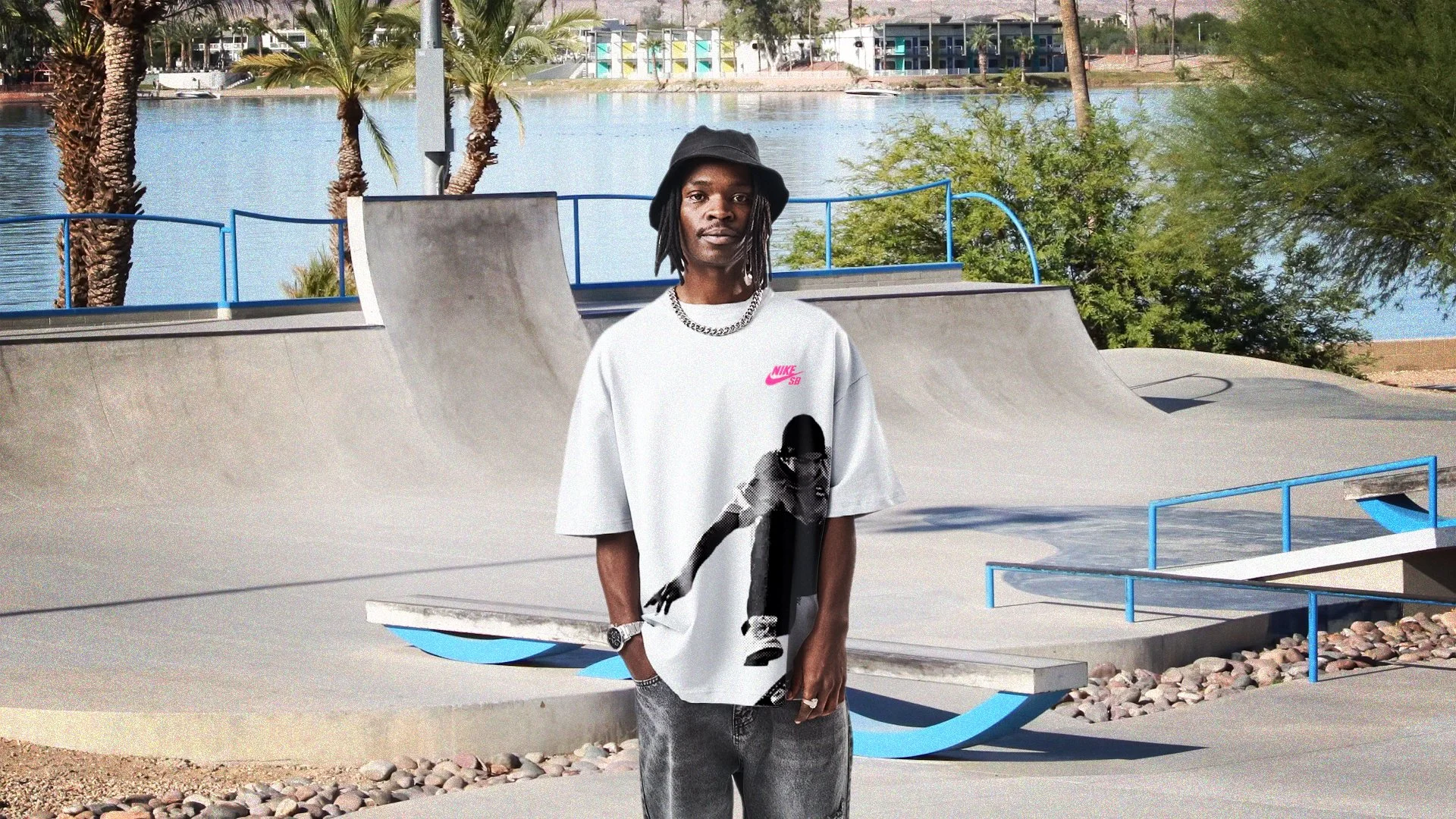
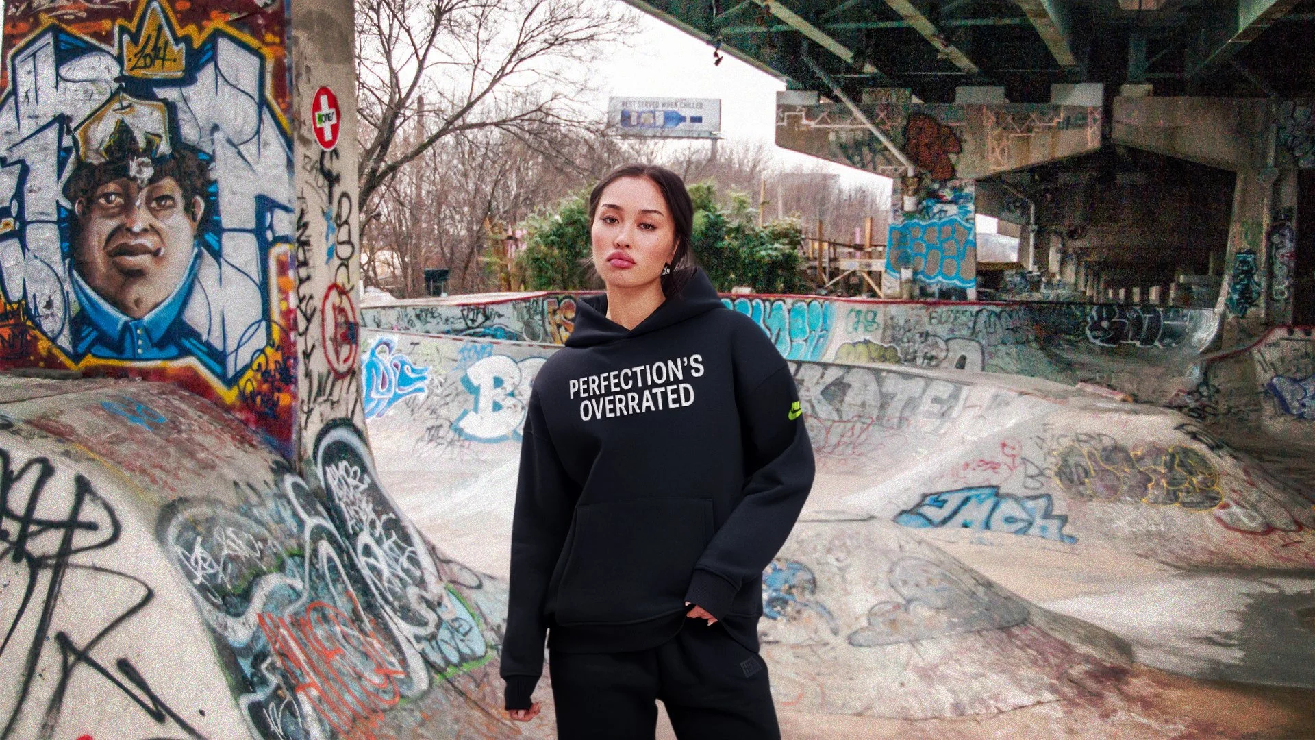
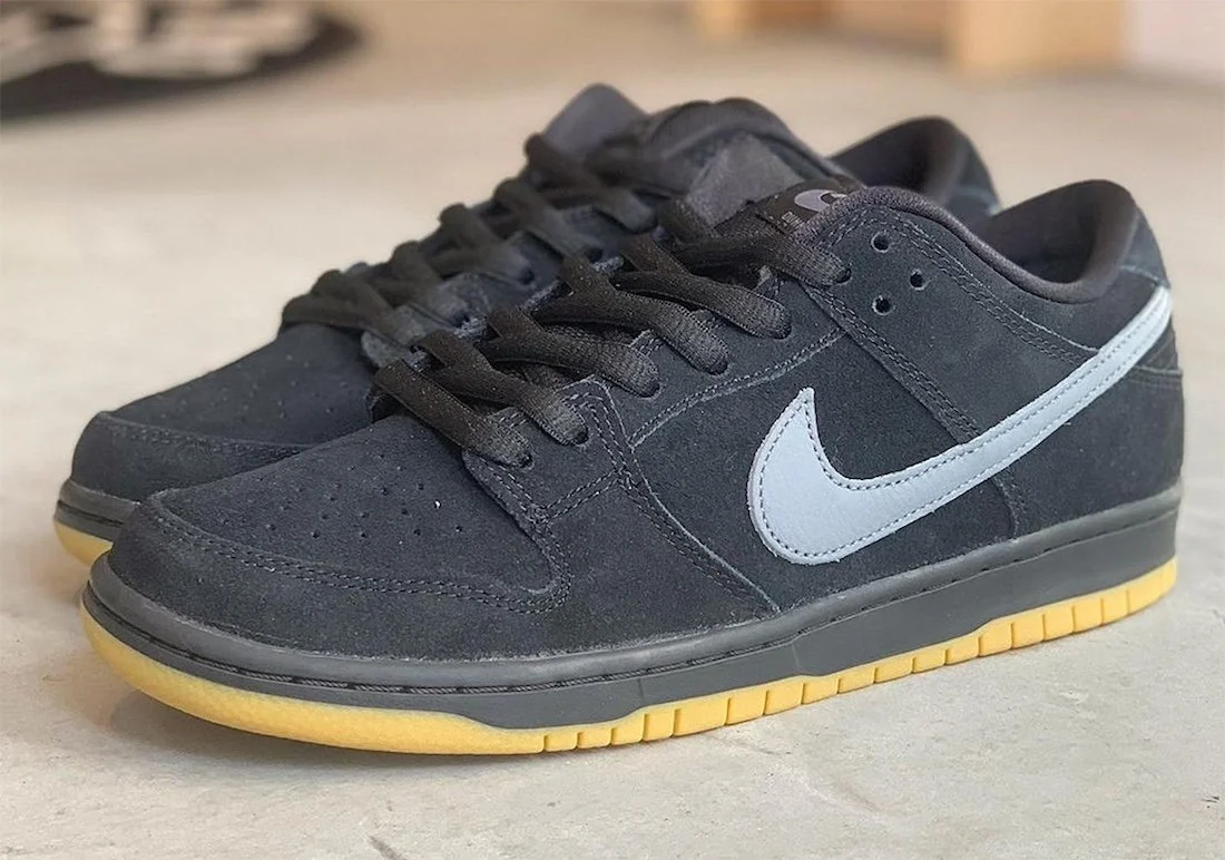
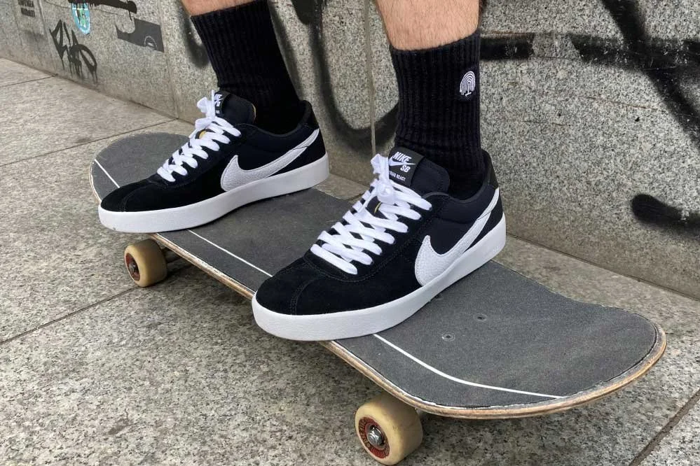
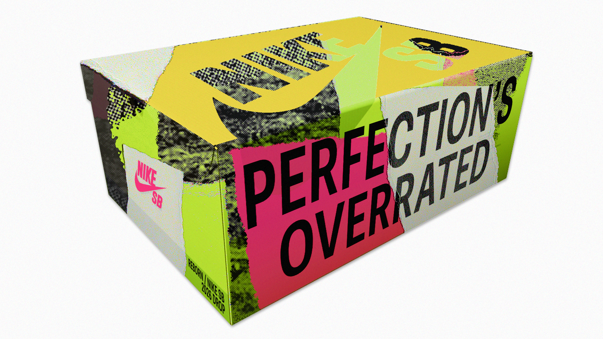
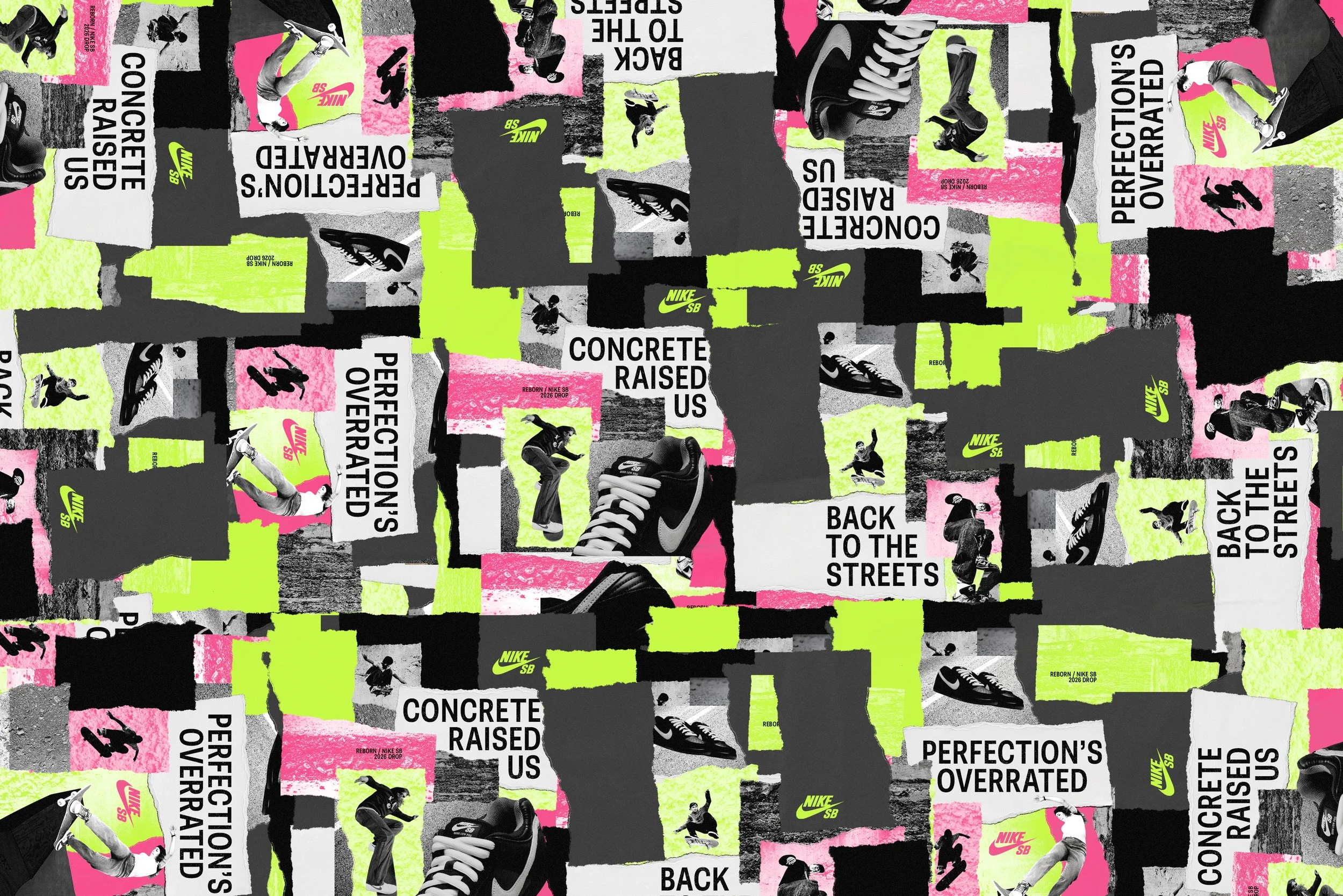
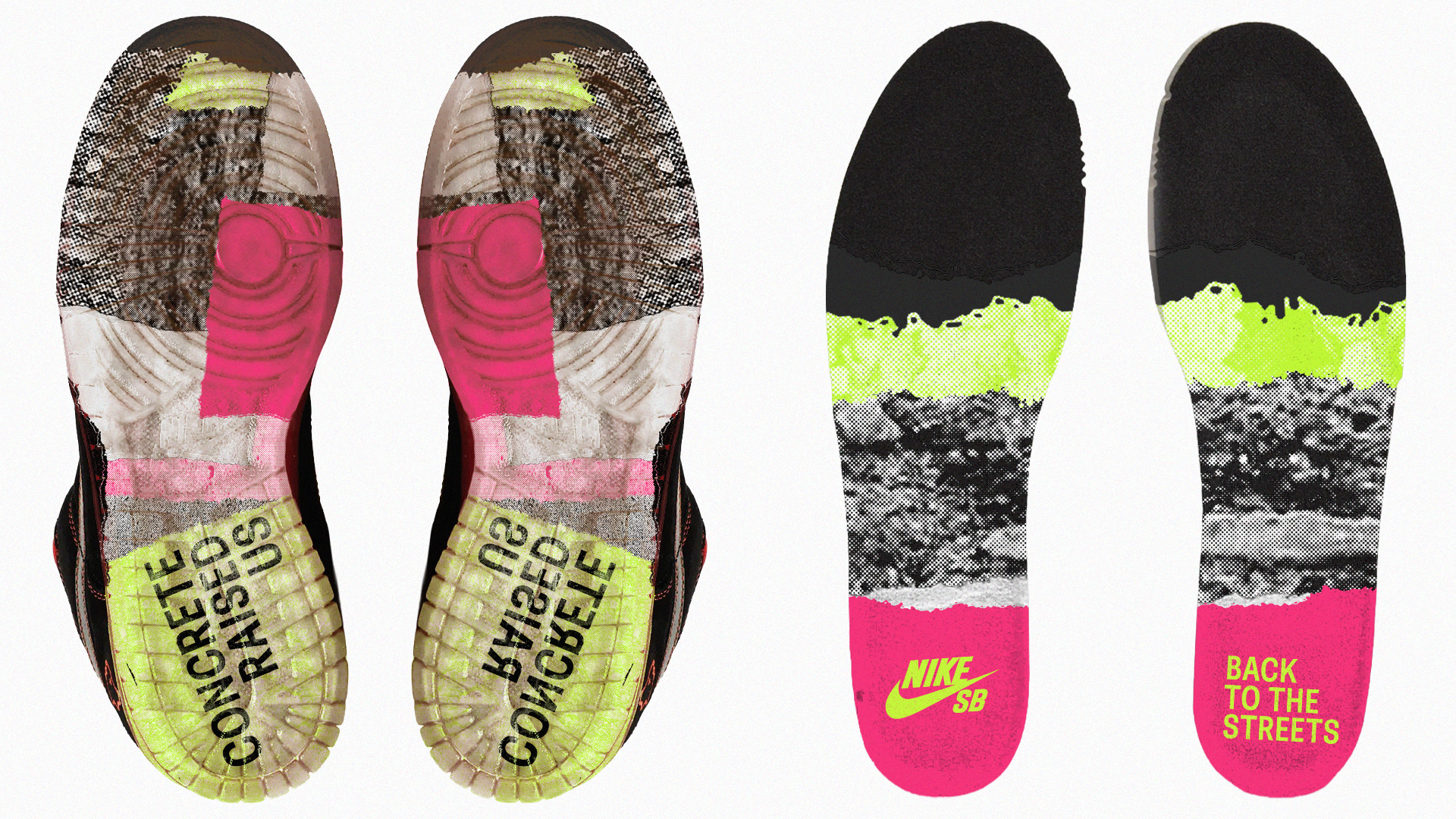
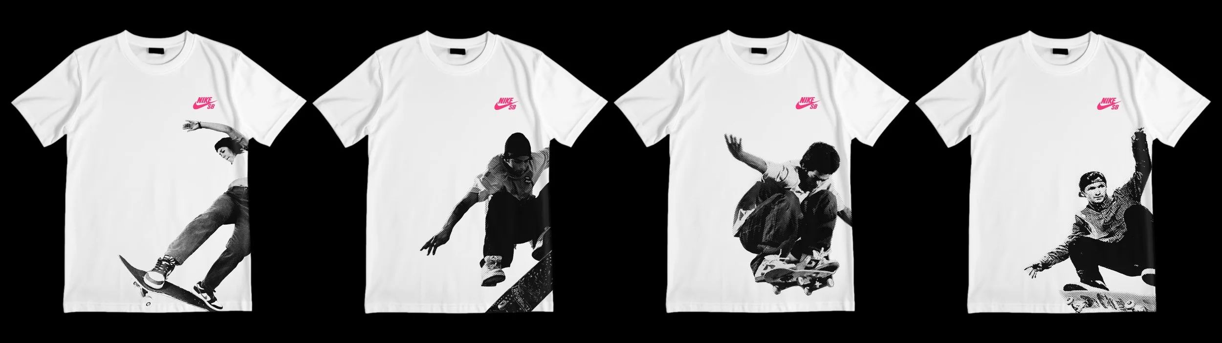
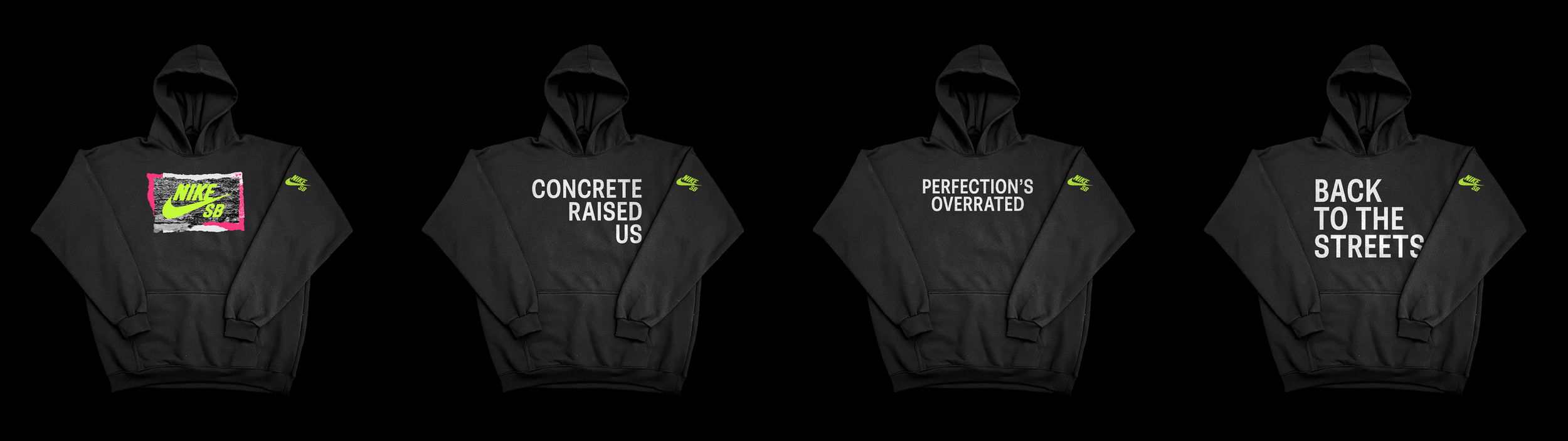
The campaign extended into product, apparel, and packaging to push the identity beyond the original poster rollout. Custom outsole and insole graphics, tissue paper, a redesigned shoe box, graphic tees featuring Nike SB pro skaters, and a series of hoodies built around key phrases and textures from the campaign. Each piece was designed to feel connected while still giving every application its own variation within the overall system.
Applications