Dead Heat Streetwear
Brand Identity Package
Photoshop • Procreate • Illustrator • 2026
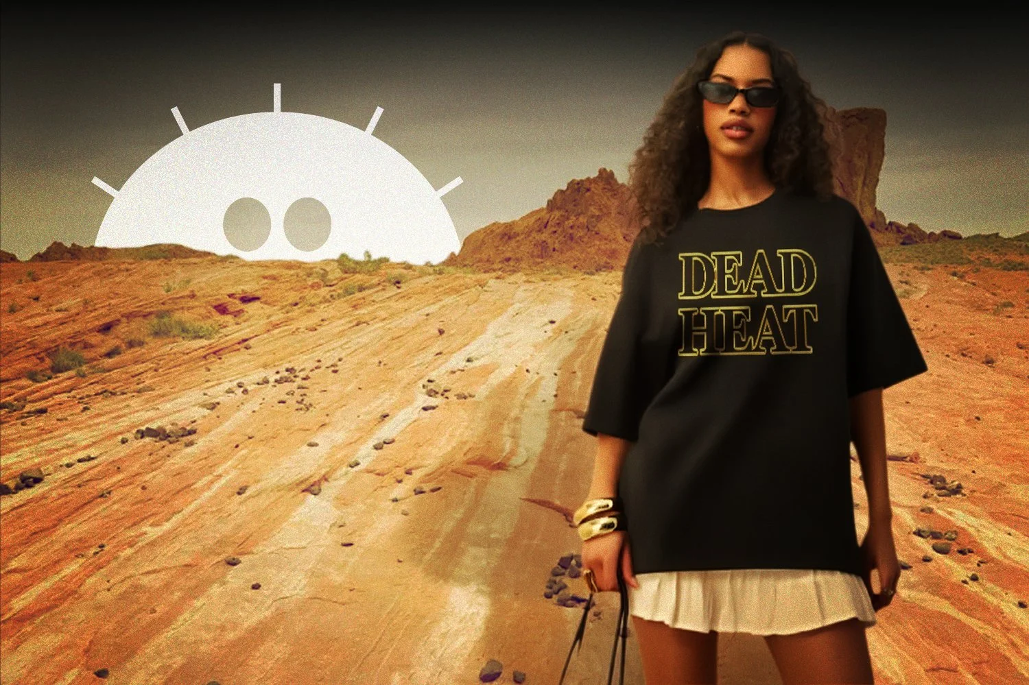
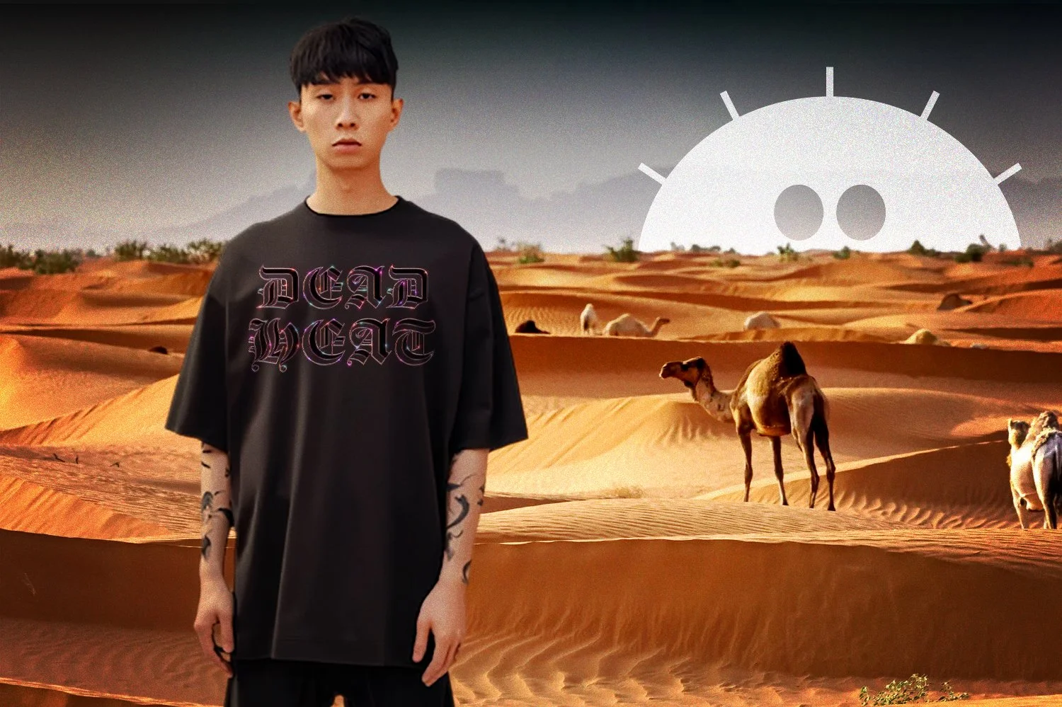
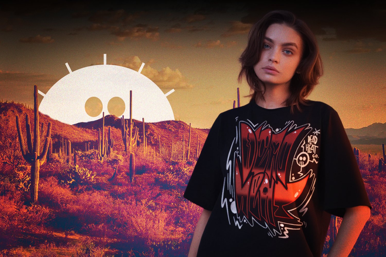
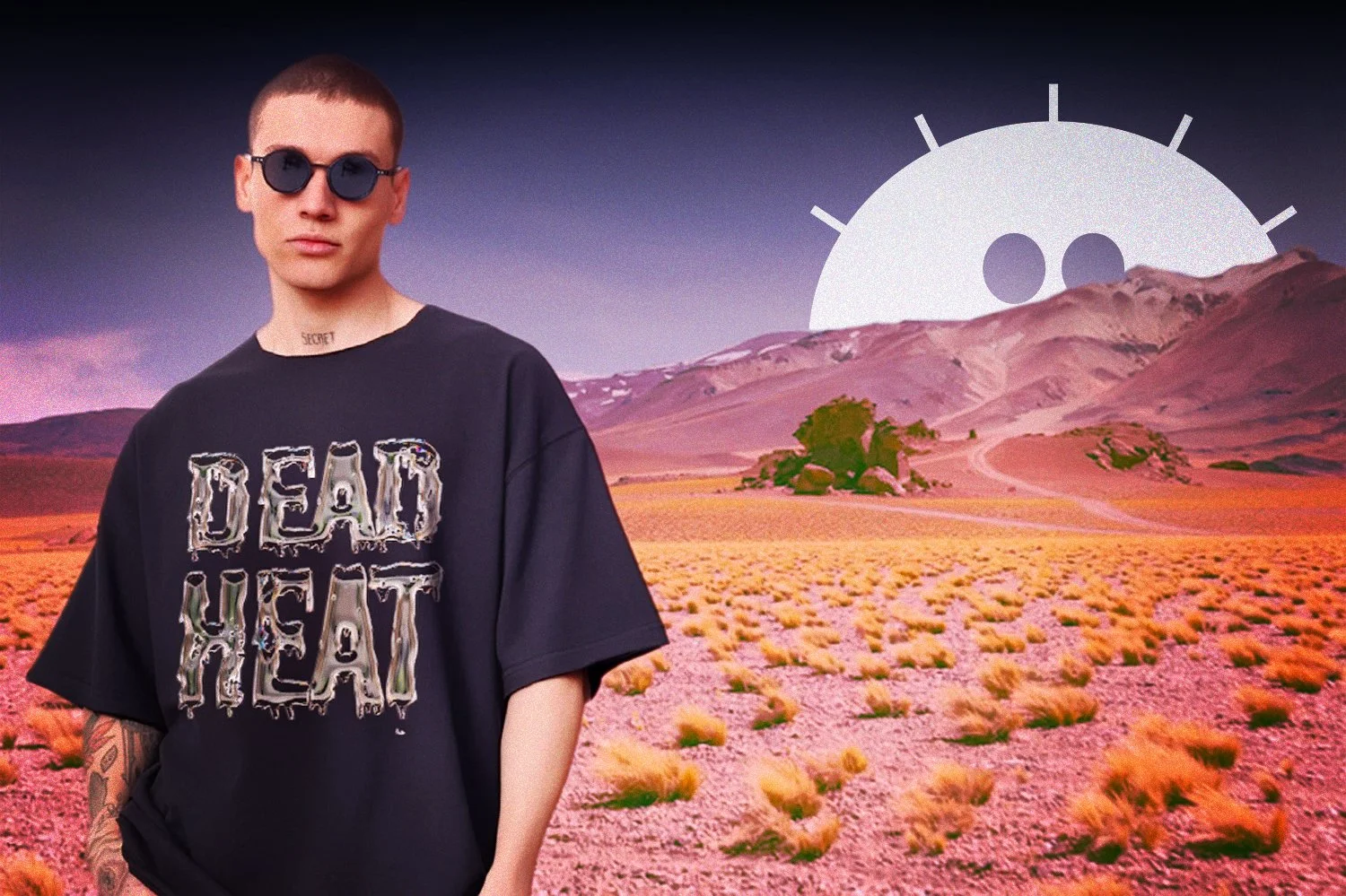
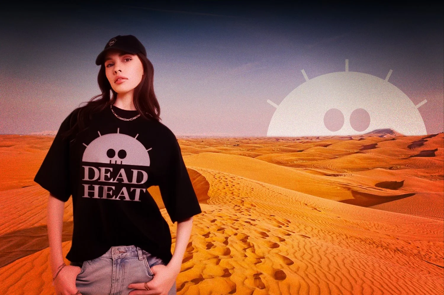
Dead Heat Co. is a fully realized streetwear brand concept built to show a complete brand identity system from concept to campaign. Starting from a name and a feeling the project grew into a logo system, multiple apparel collections, and a full desert campaign. Everything from the logo to the billboard mockups was designed to feel like a brand with a real world behind it.
Brand Direction
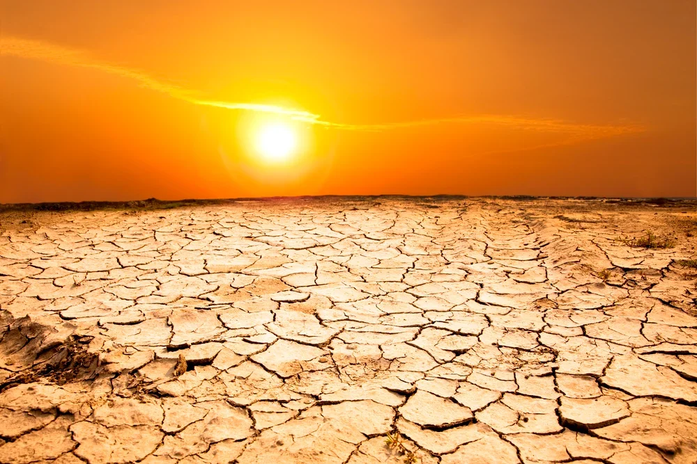
The mood board combines imagery tied to extreme heat, environmental pressure, and exhaustion alongside references from established streetwear brands. Melting ice was included to represent collapse under extreme temperature, reinforcing the idea behind the name. The visual world it builds feels sun-faded, intense, and pushed past its limit.

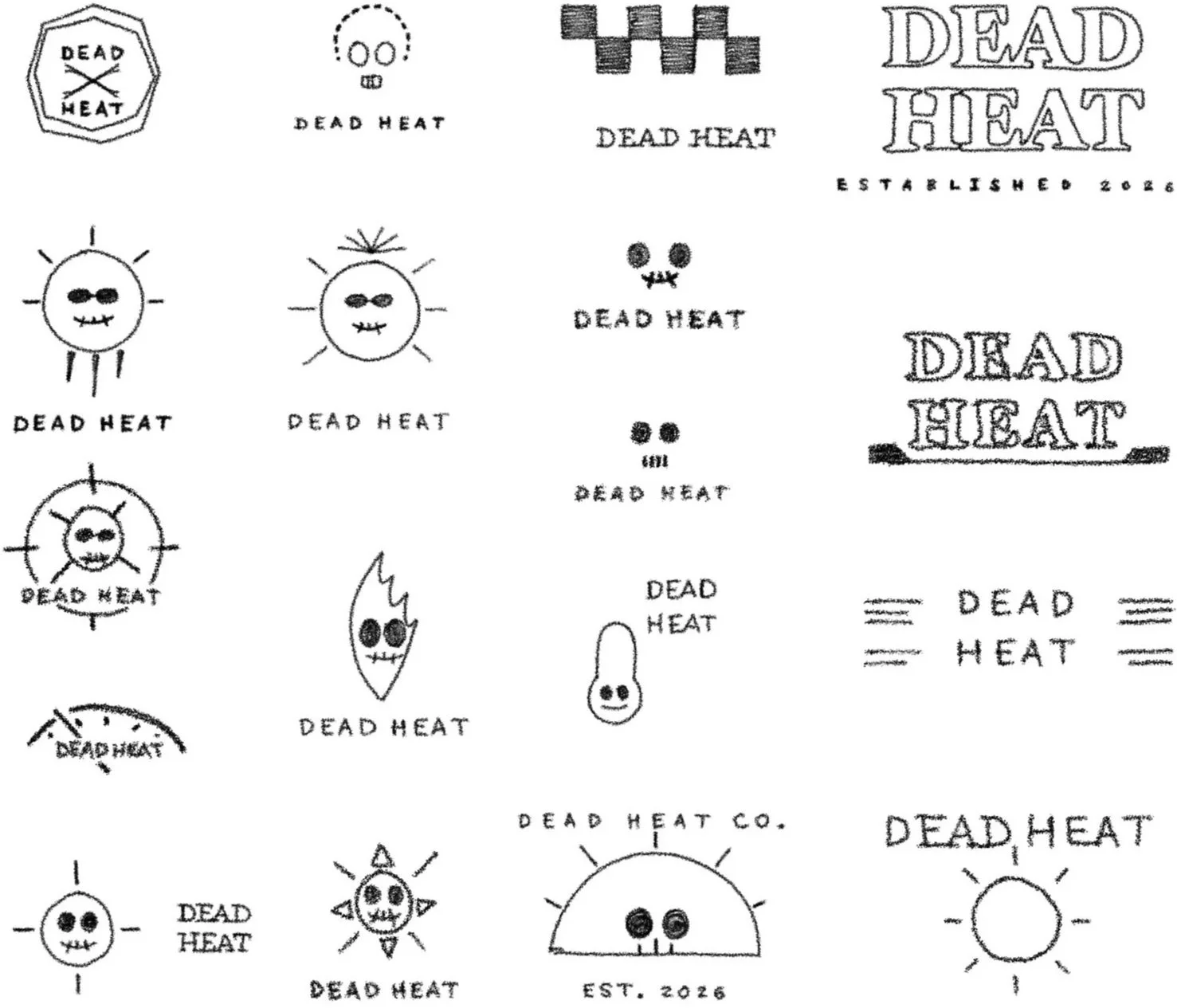
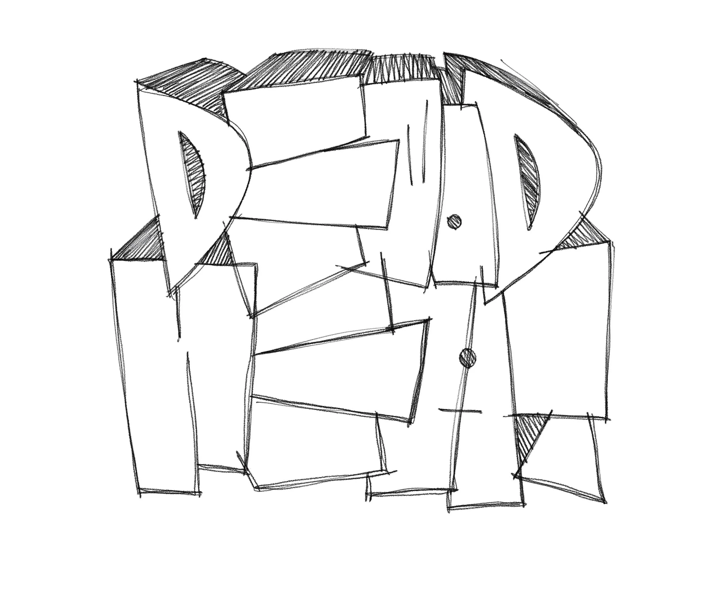
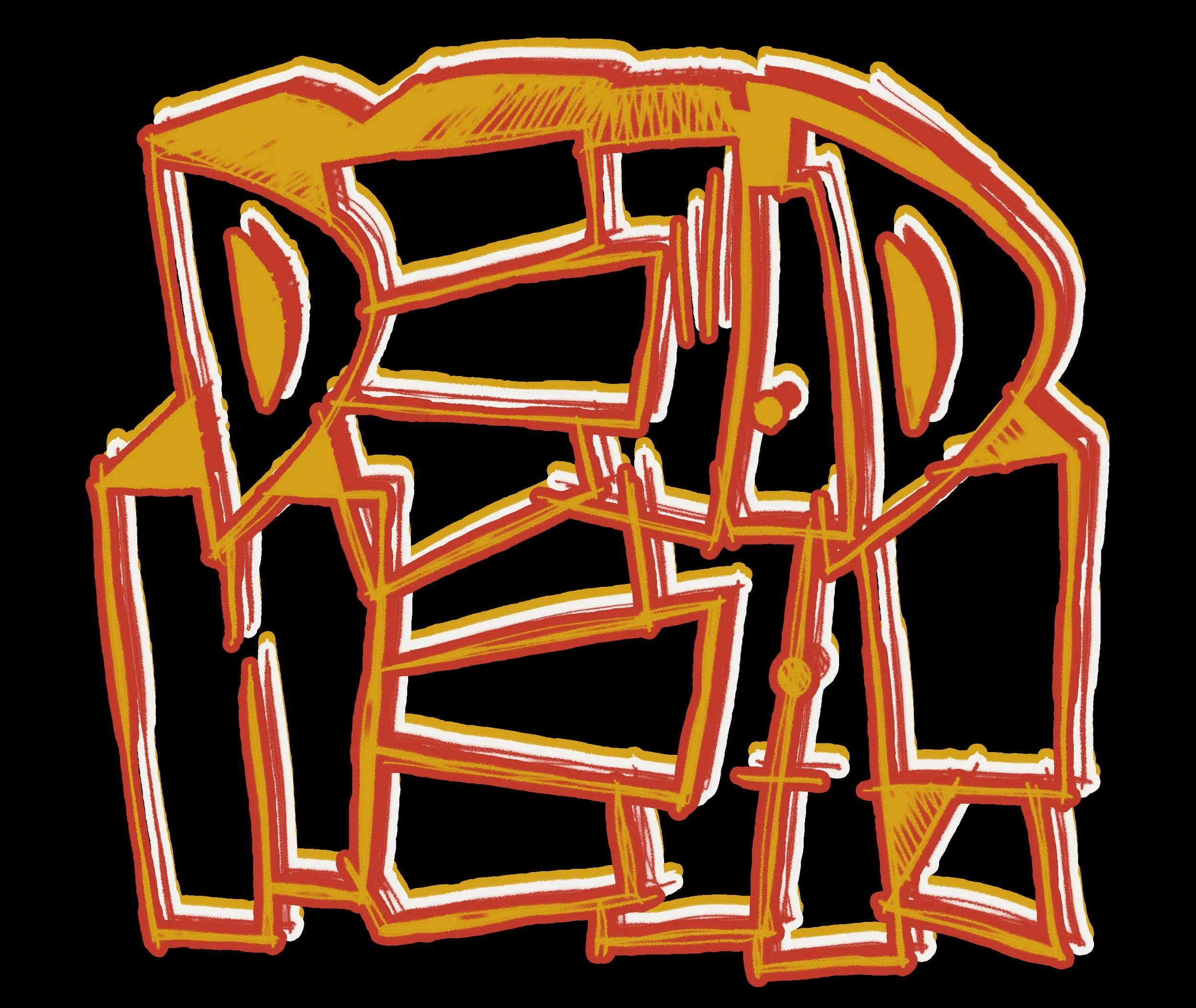
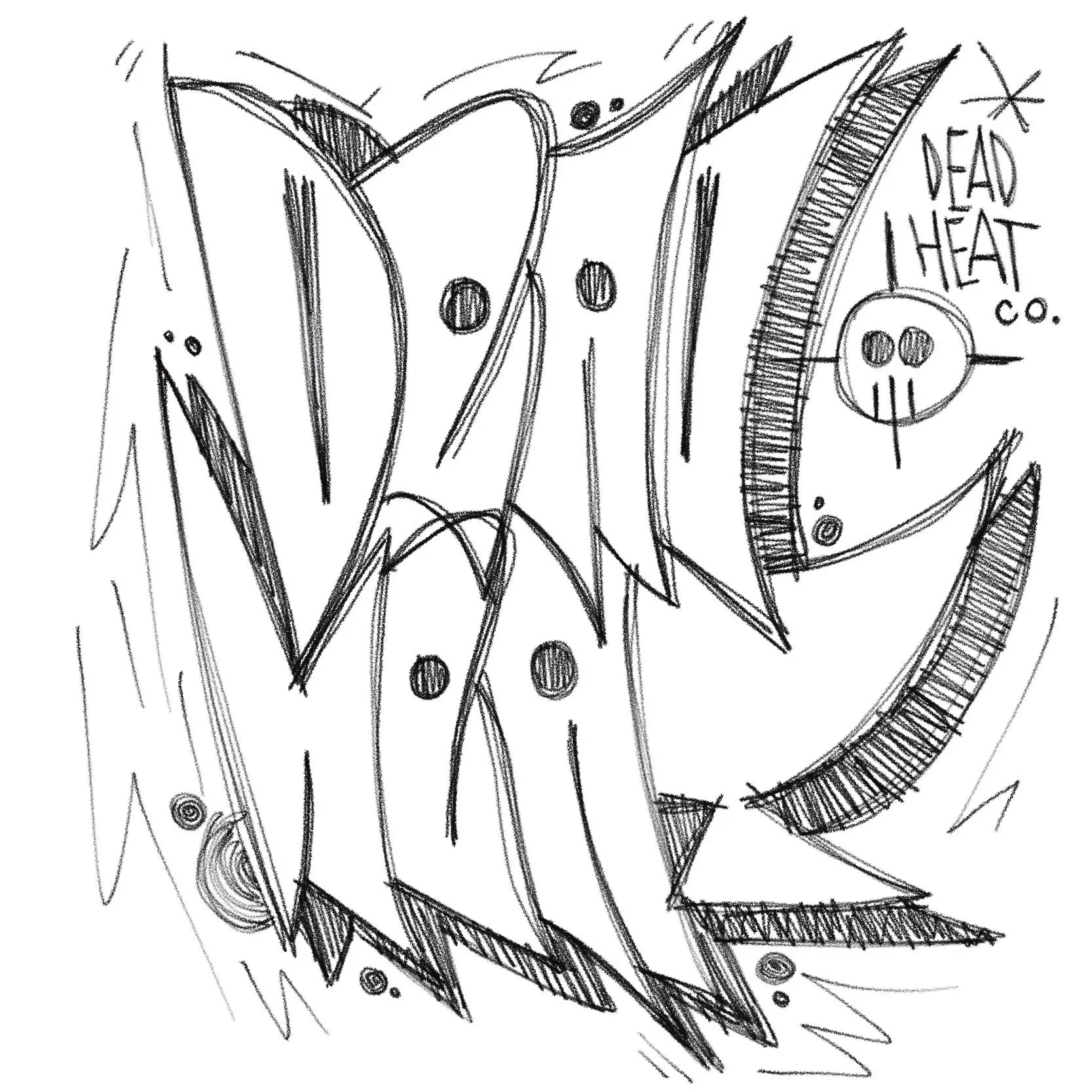
Sketch Development
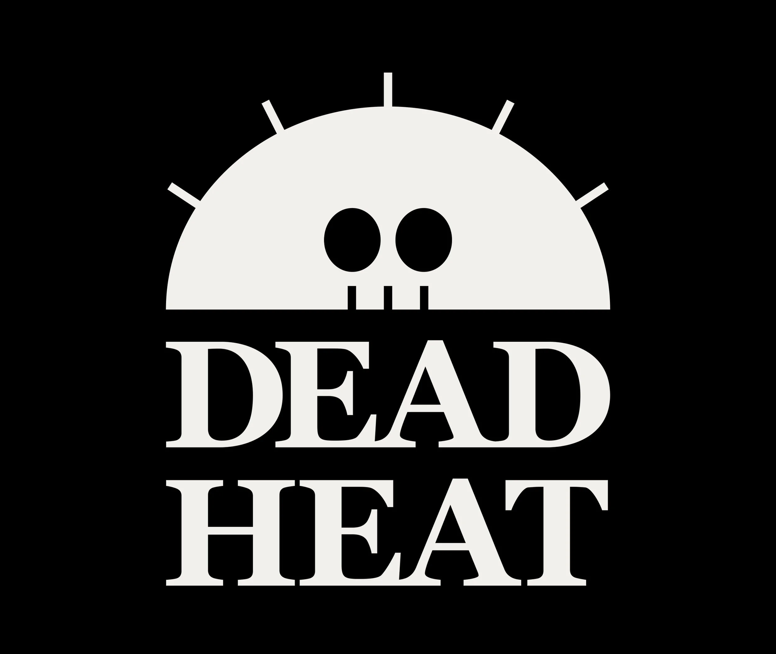
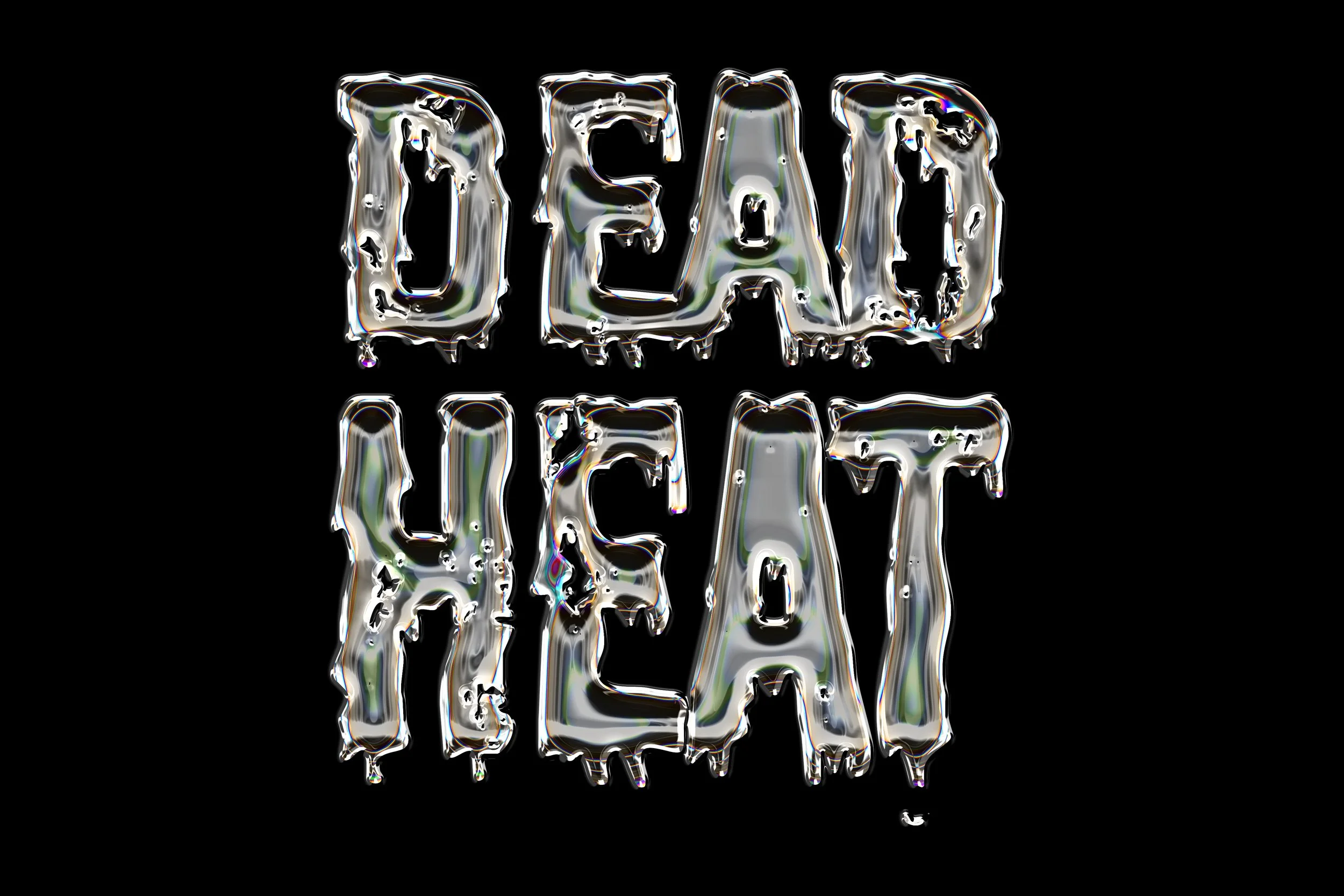
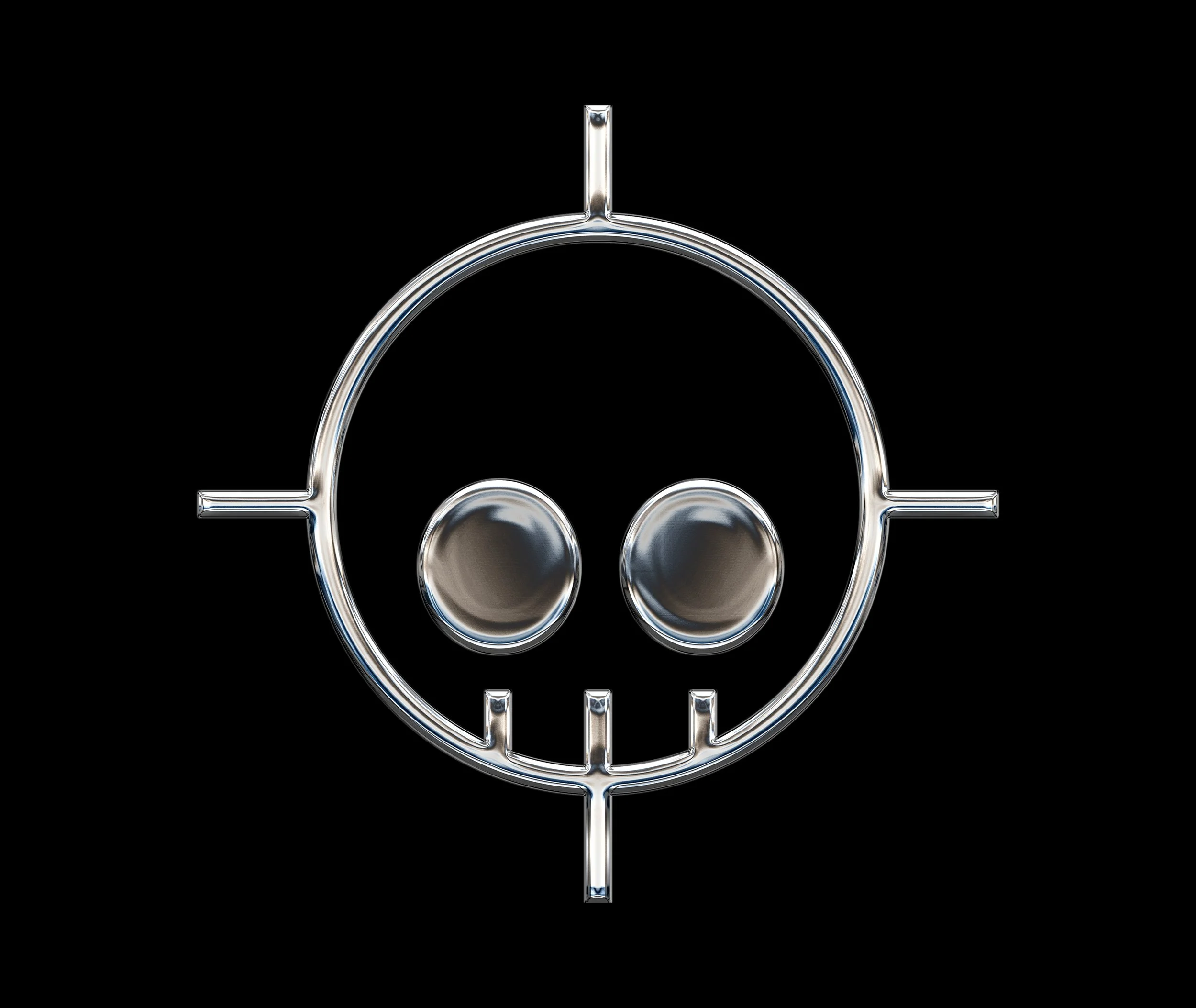
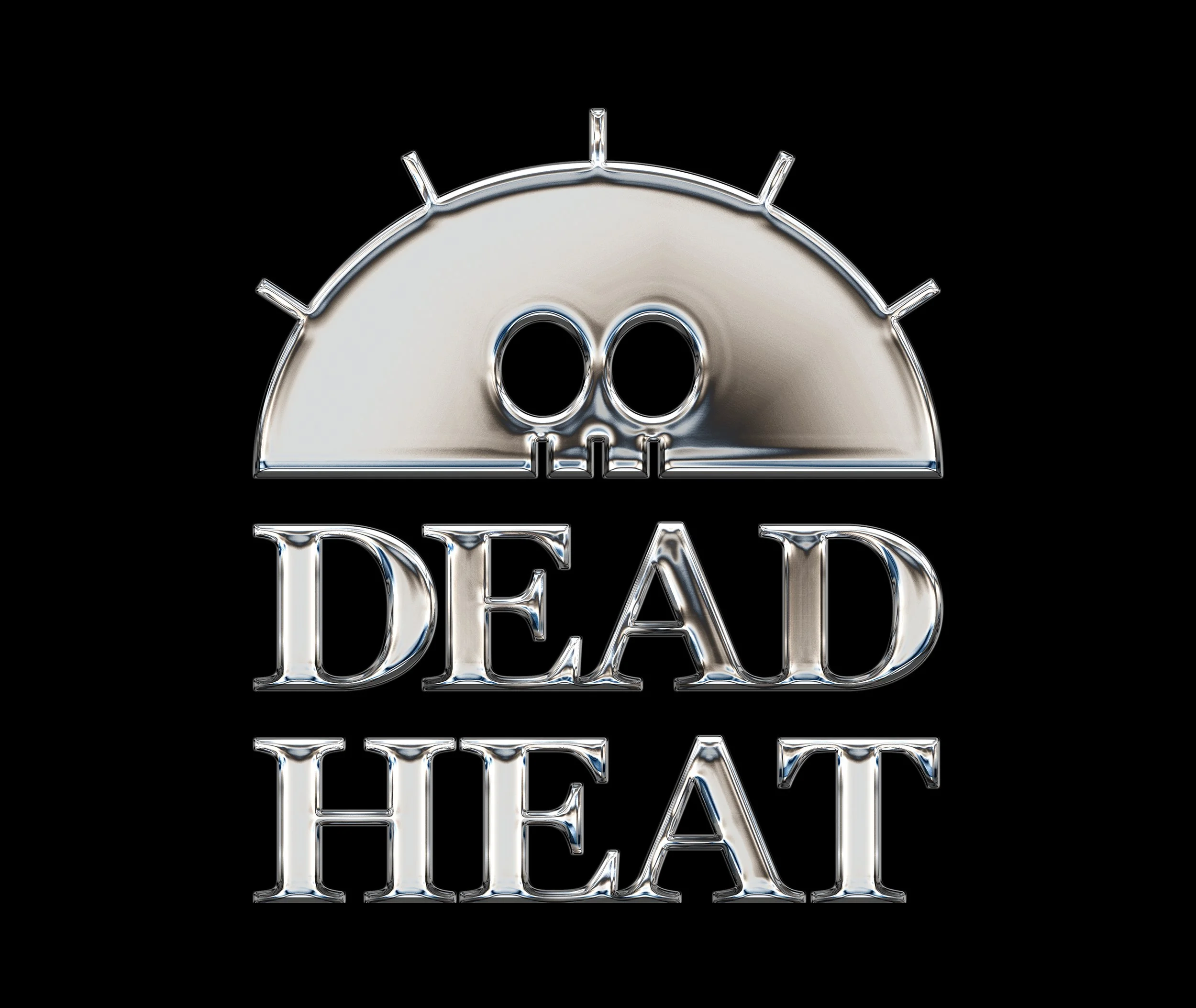
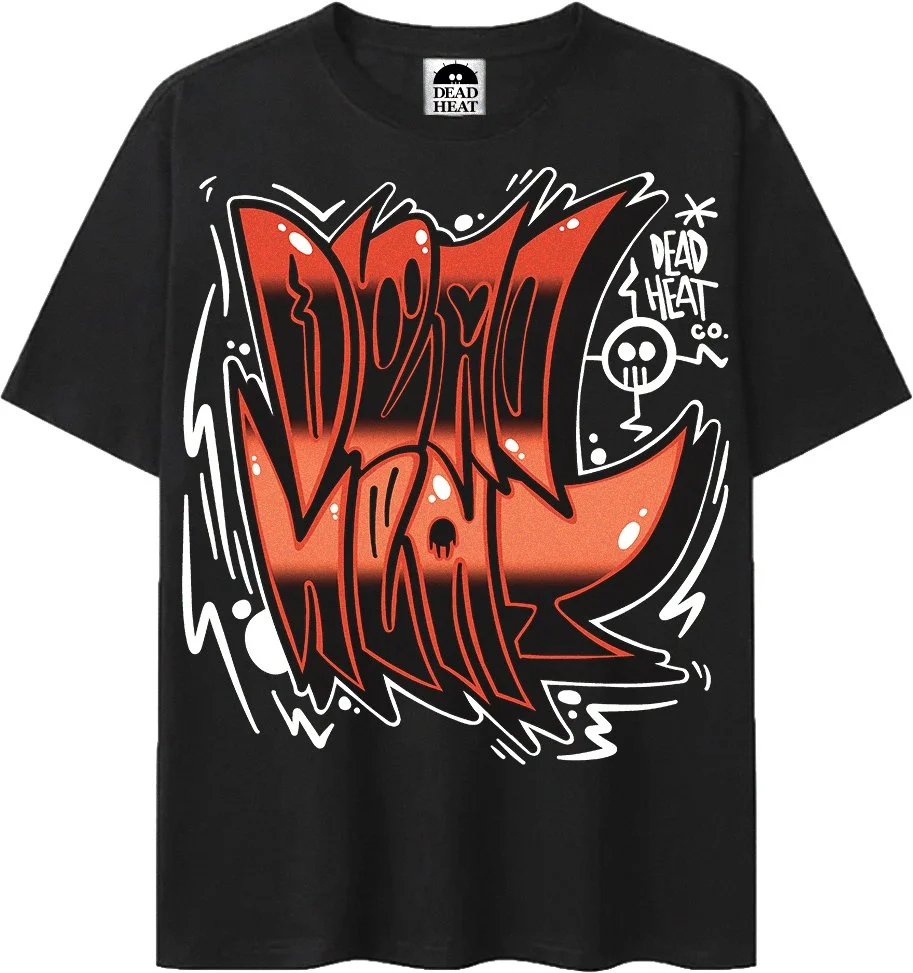
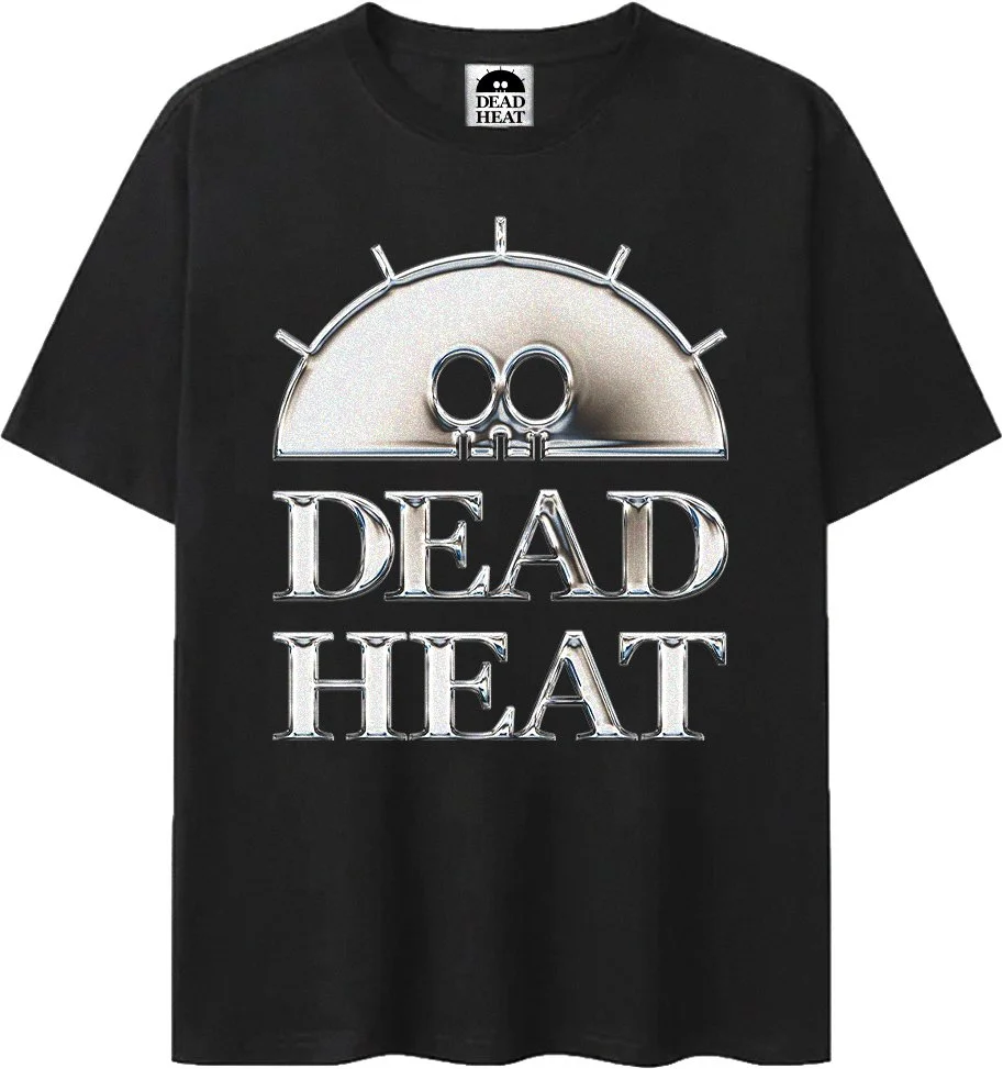
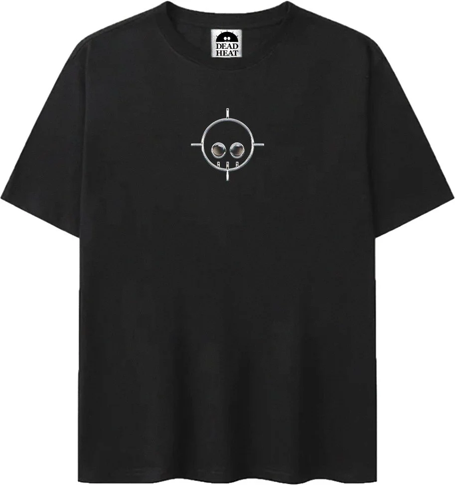
The process started with a full sheet of logo concepts before landing on the rising sun skull as the primary mark and the crosshair skull as the secondary. From there the apparel graphics were sketched across two distinct collection directions before moving into digital production.
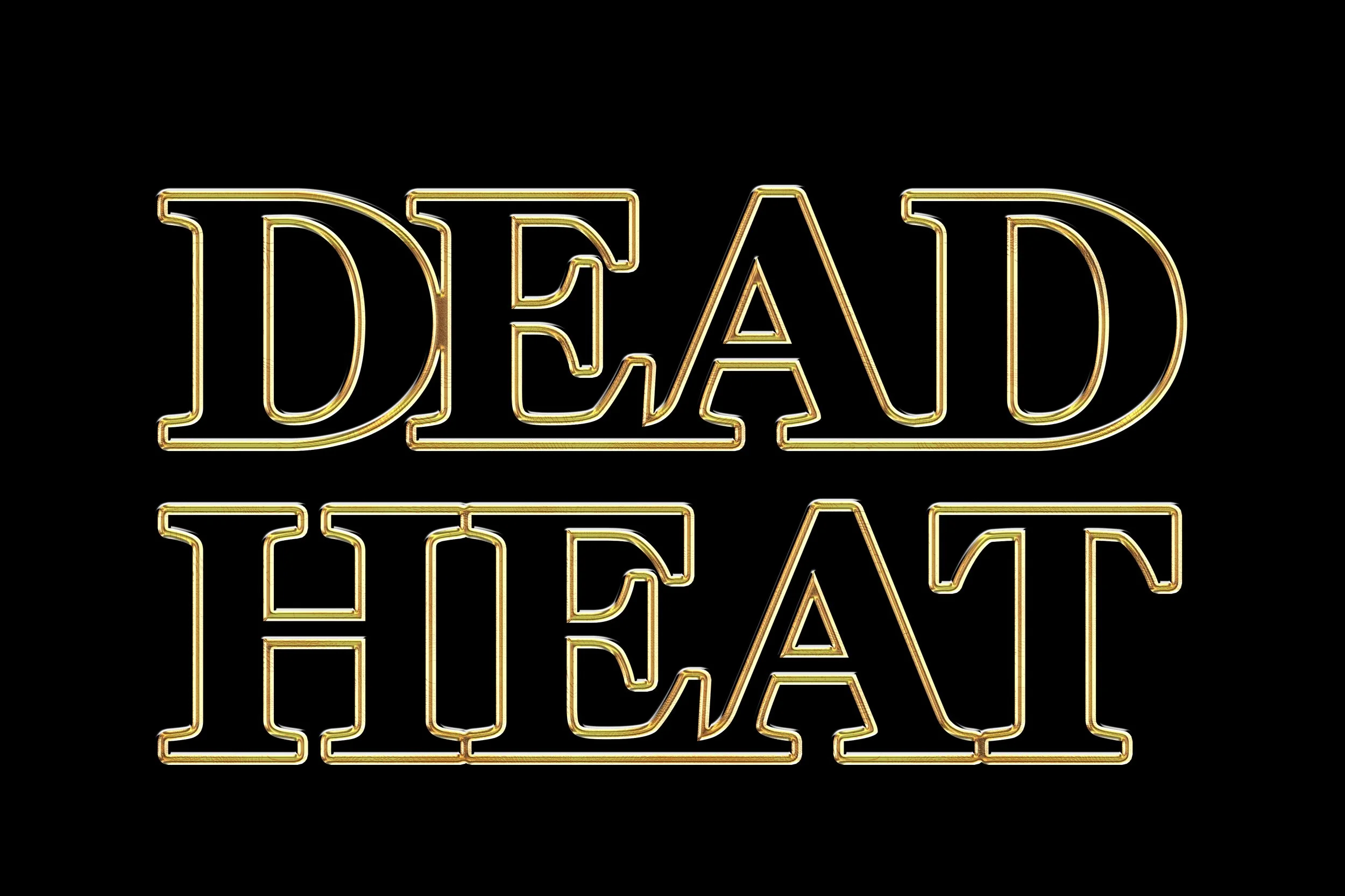
Typeface Selection
Georgia Pro Bold
Previous Options
Freight Display Pro, Neue Haas Grotesk
Typeface Study
Georgia Pro Bold was chosen for its weight and history. The bold serif structure gives Dead Heat a sense of authority that works across the wordmark, campaign type, and everything in between without ever feeling overdone.
Color Selection
Dead Black, Bone White, Sun Gold, Asphalt Red
Color Study
Dead Black is the foundation. Bone White keeps the brand mark clean and readable at any distance. Sun Gold ties back to the desert heat at the core of the identity. Asphalt Red brings aggression and energy to the street series graphics. Each color has a reason to be there and a job to do.
Dead Black
HEX #0D0D0D
RGB 13, 13, 13
CMYK 0, 0, 0, 95
Bone White
HEX #F2F0EB
RGB 242, 240, 235
CMYK 0, 1, 3, 5
Sun Gold
HEX #D4A017
RGB 212, 160, 23
CMYK 0, 25, 89, 17
Asphalt Red
HEX #C0392B
RGB 192, 57, 43
CMYK 0, 70, 78, 25
Final Deliverables
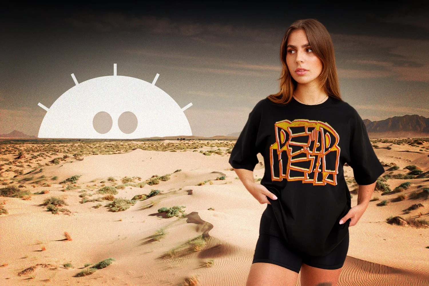
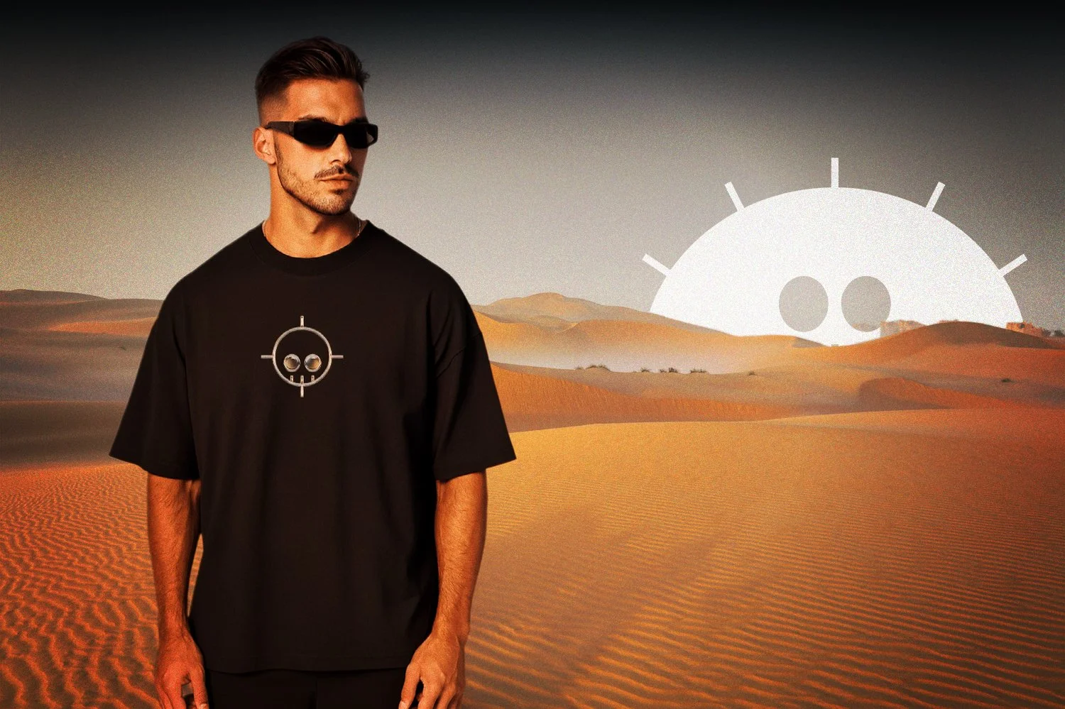
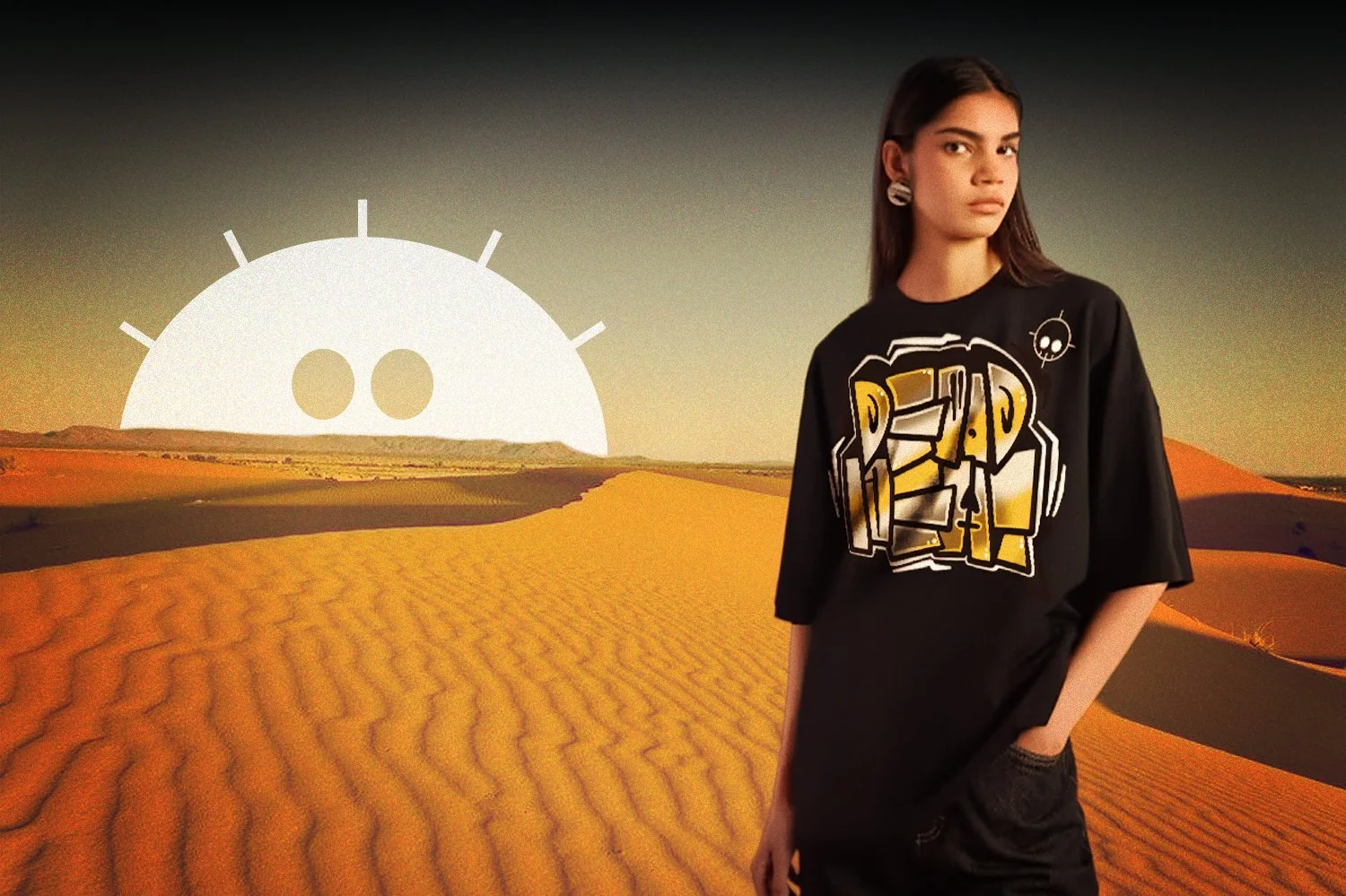
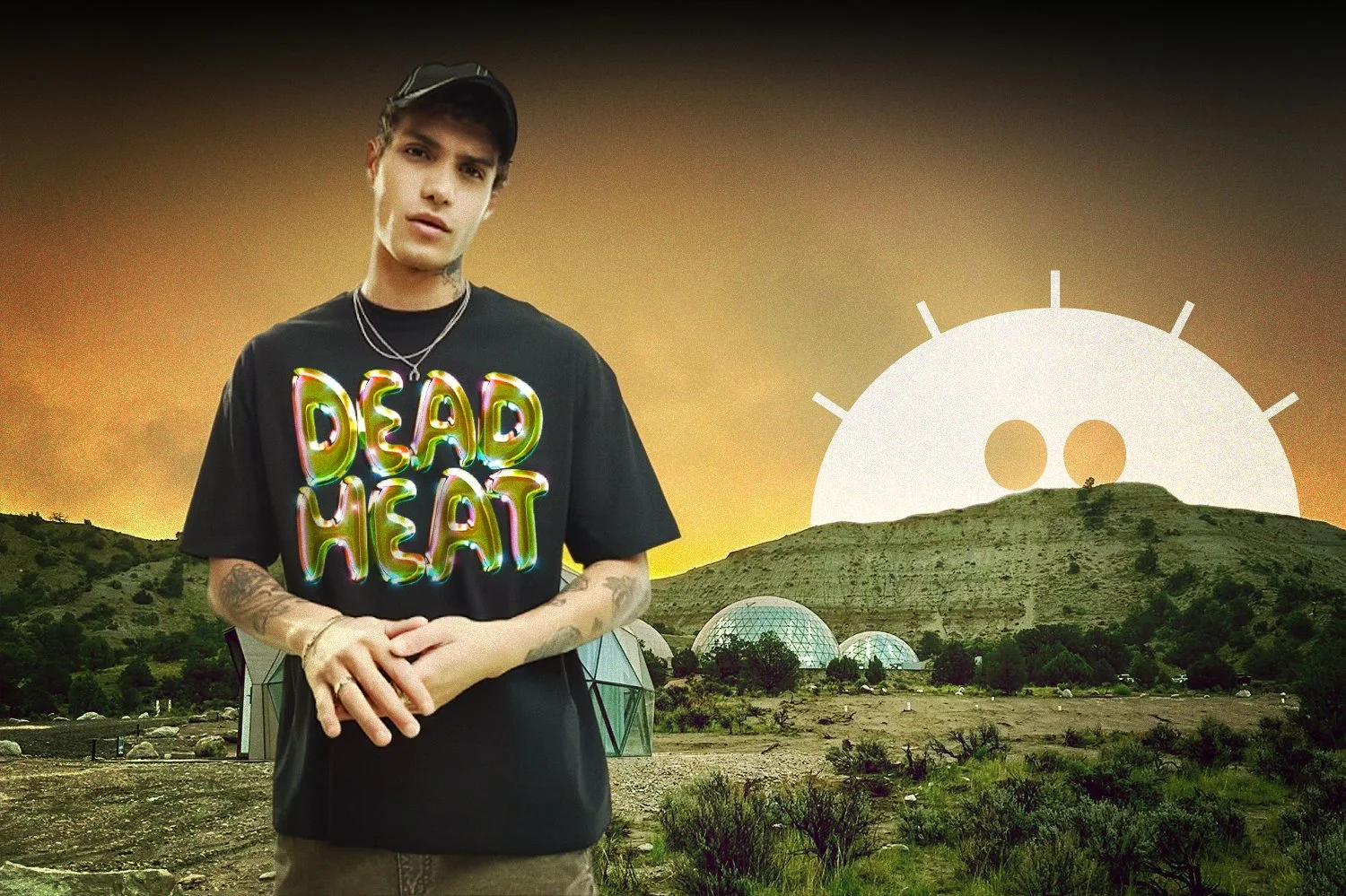
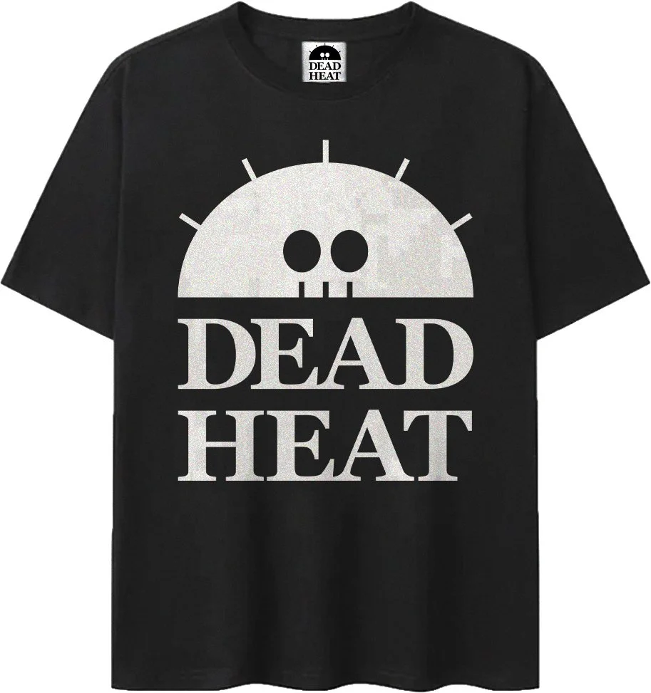
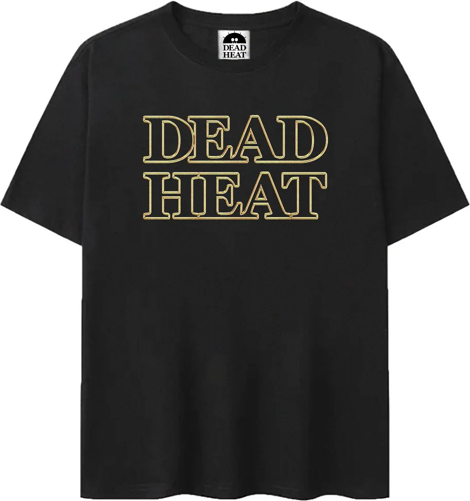
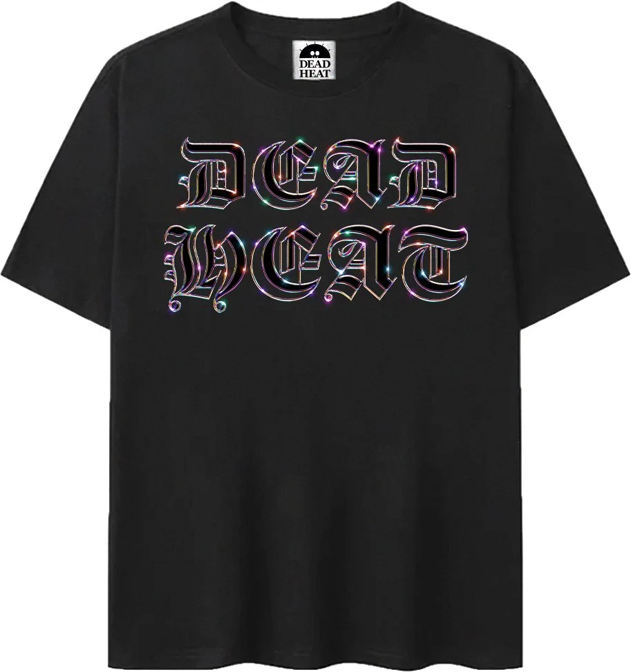
The logo marks work from embroidered hat patches all the way up to billboard scale. The apparel collection shows range within a single brand voice. The desert campaign ties everything into one visual world that feels like a real label with real history behind it. The billboard mockups are the closer, putting the brand at actual scale in the real world.

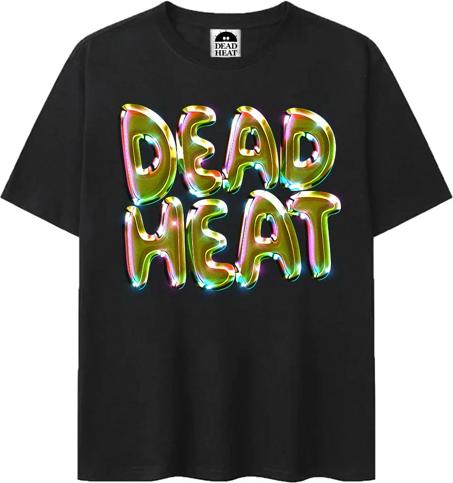
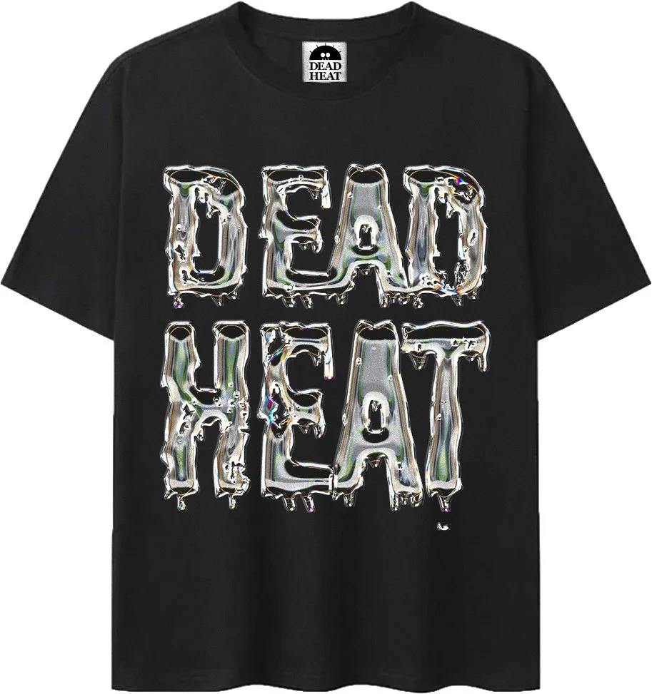
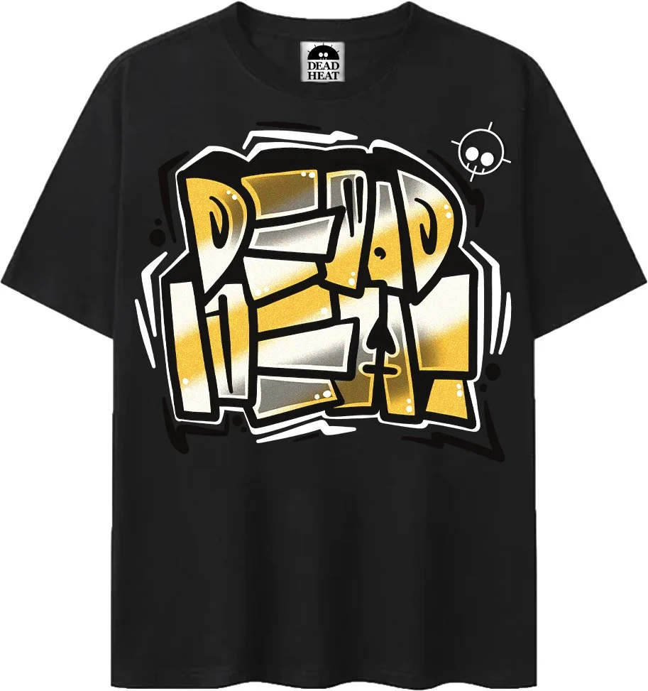
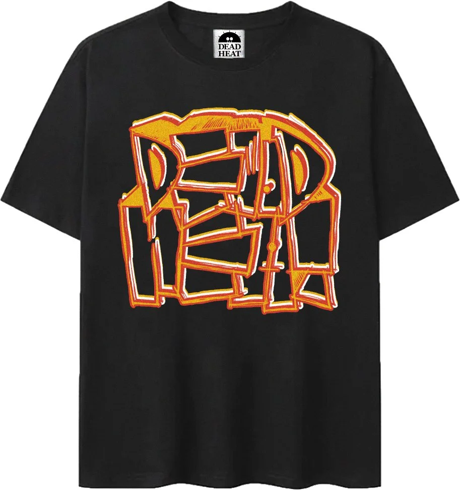
Merchandise Designs
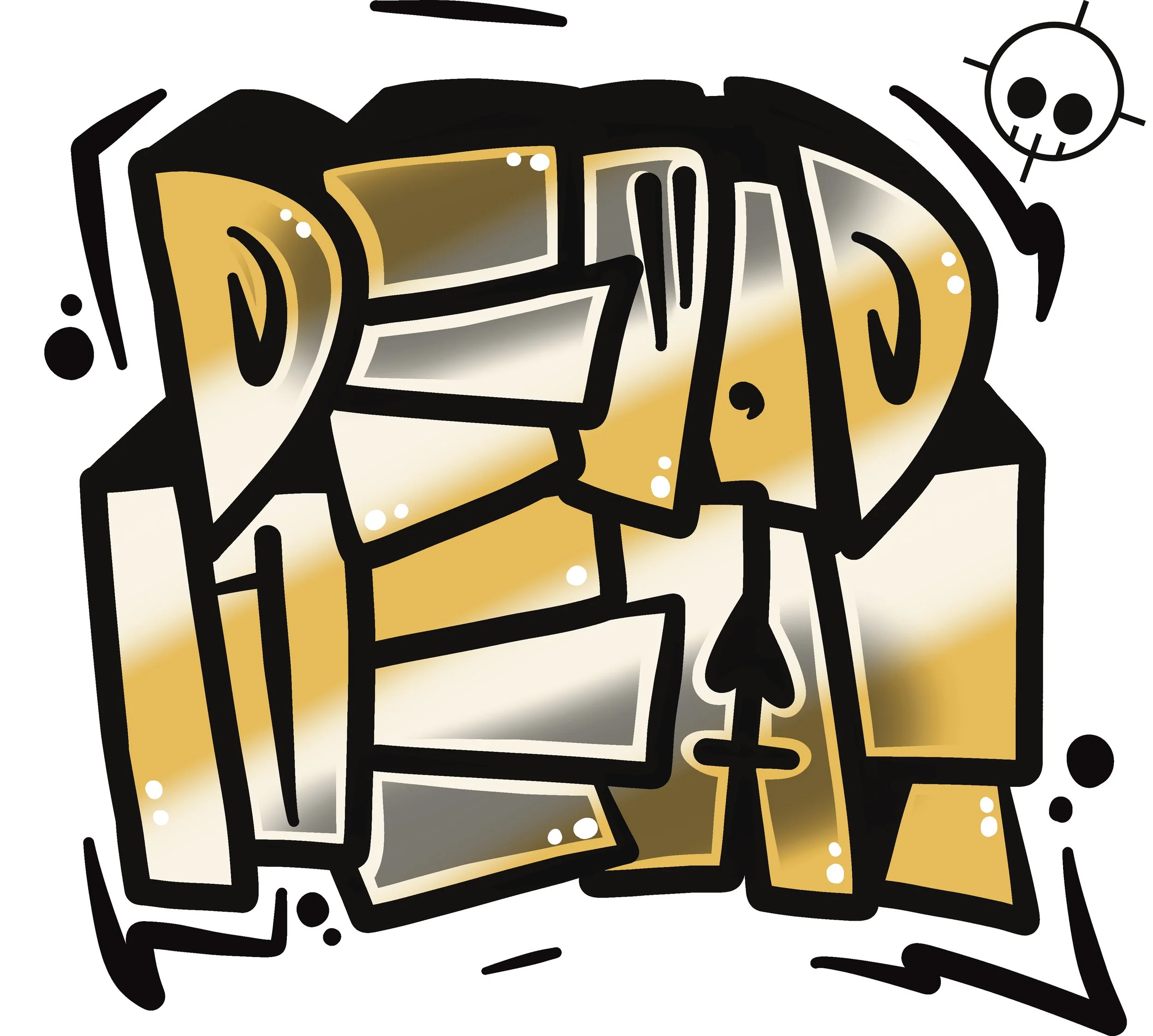
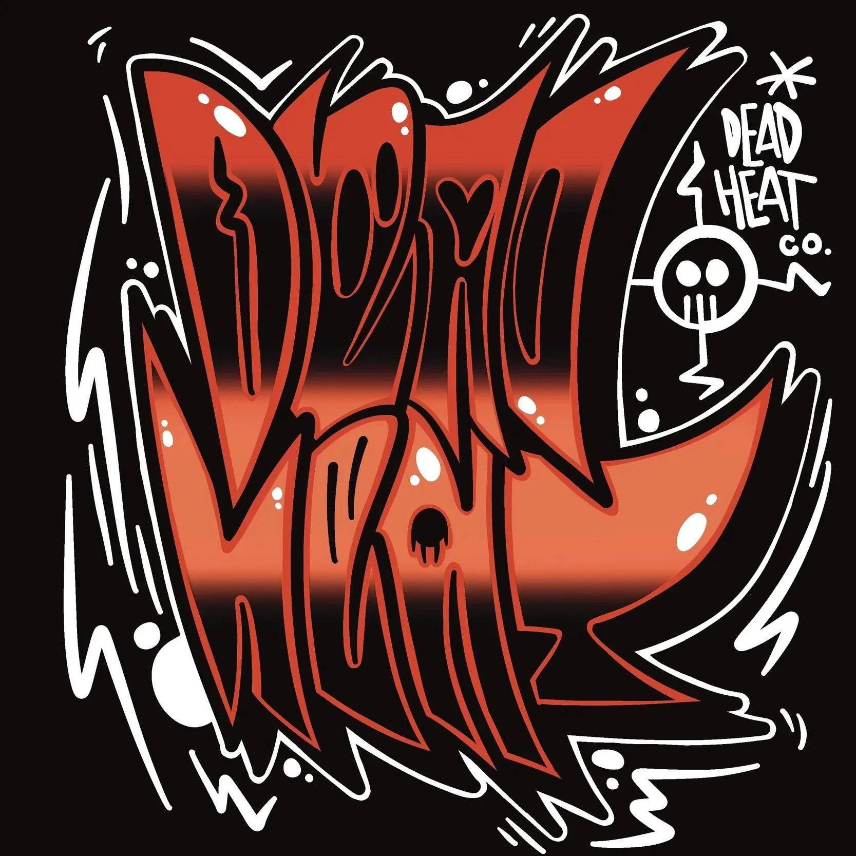
T-Shirts
Applications