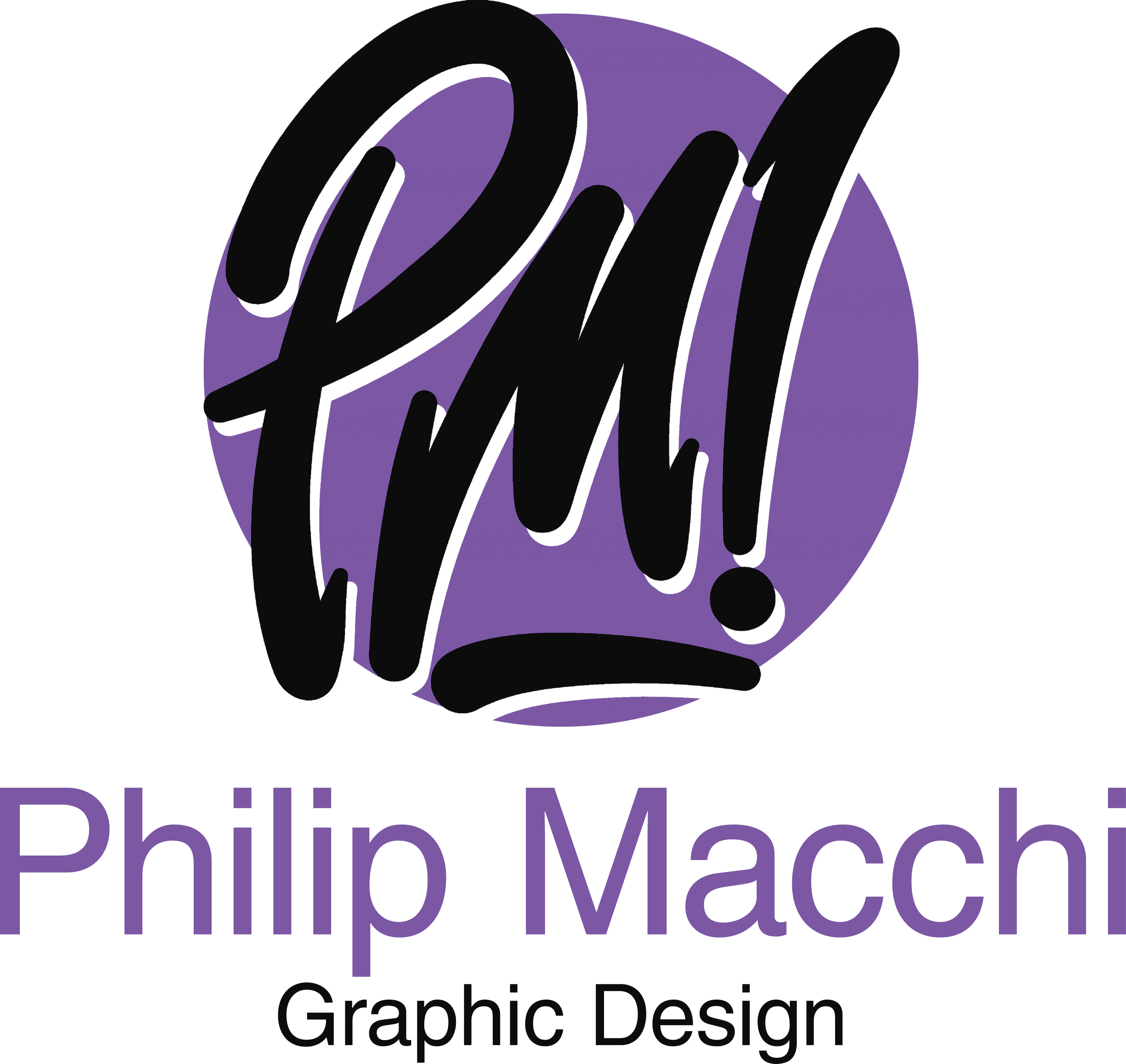
Philip Macchi Design
Brand Identity Package
Photoshop • Procreate • 2025
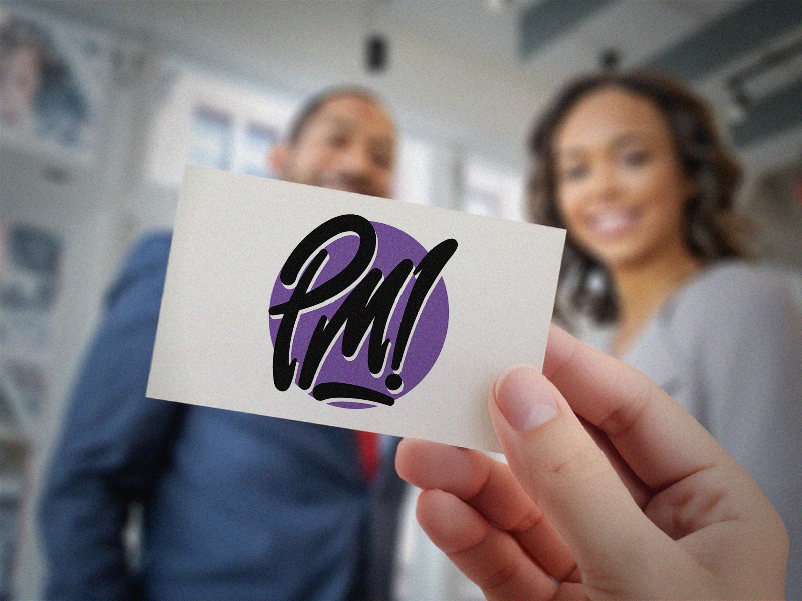
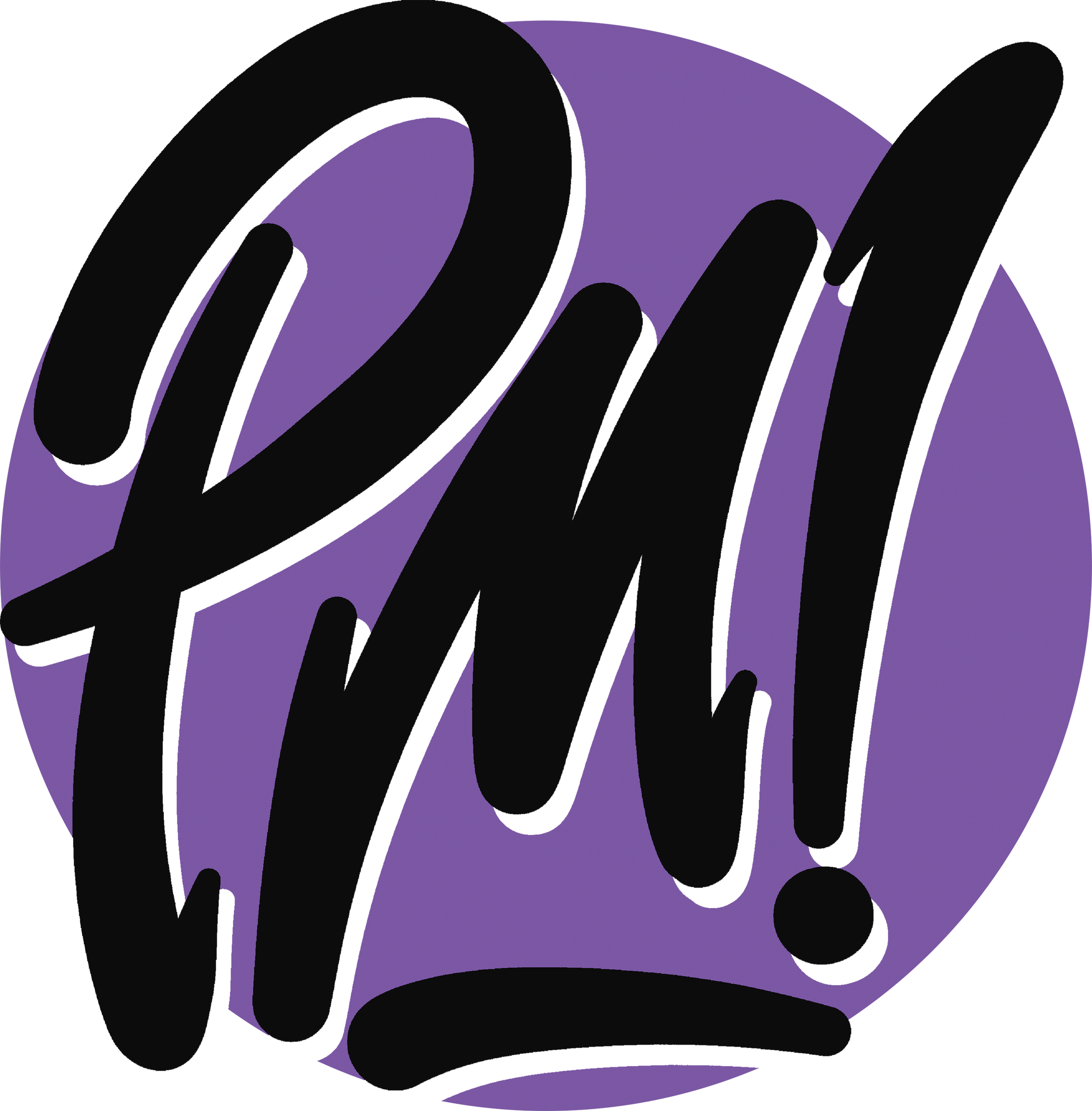
The PM monogram came from my lettering background. I wanted a mark that felt personal and energetic rather than something that could have belonged to anyone. It needed to work across print, motion, and branding work without losing its character at any size.
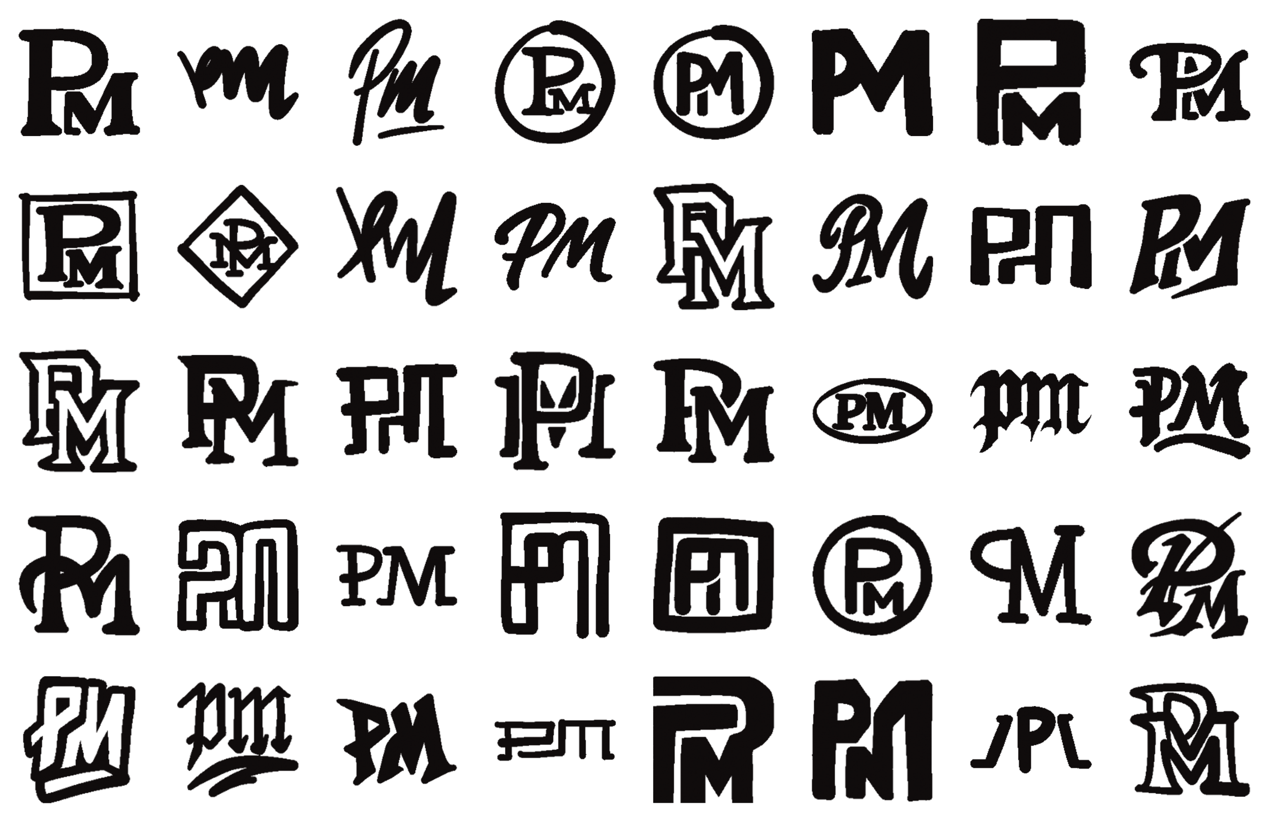
Sketch Development
I explored a wide range of structures including serif blocks, circular lockups, extended forms, script variations, and graffiti-influenced strokes. These sketches helped me develop the movement, rhythm, and personality of the monogram.
Typeface Selection
Helvetica LT Pro Roman
Previous Options
Source Sans Pro, Broadarce
Typeface Study
Helvetica LT Pro Roman was chosen for its clean proportions and neutral tone. The simplicity of the letterforms keeps the layout clear and allows the expressive logo to stay at the center of the system.
Color Selection
Royal Amethyst, Near Black, White
Color Study
The palette uses royal amethyst, near black, and white to create a clean and flexible foundation for the identity. Royal amethyst brings character and individuality, near black adds weight and structure, and white opens the layout and keeps everything readable. Together they create a simple but confident palette that supports the expressive hand-drawn logo.
Royal Amethyst
HEX #7B57A4
RGB 123, 87, 164
CMYK 58, 69, 0, 0
Near Black
HEX #0C0C0C
RGB 12, 12, 12
CMYK 0, 0, 0, 95
White
HEX #FFFFFF
RGB 255, 255, 255
CMYK 0, 0, 0, 0
First Drafts
My first digital drafts tested block logos, monograms, and handwritten marks to see what matched my style best. Seeing them side by side made it clear that the hand-drawn direction had the strongest personality and felt the most authentic to my work. These drafts helped narrow the focus before moving into final refinement.
Refinement
The early versions tested a bright yellow circle behind the mark which didn't fit. Switching to purple gave the hand-drawn letterforms the right amount of contrast. Helvetica LT Pro Roman replaced Source Sans Pro for the supporting type because the cleaner proportions let the logo stay at the center of the system. Scale, spacing, and color were adjusted until the whole thing felt balanced.
Final Identity System
The final shade of purple was locked in after testing multiple variations. The stroke was refined into a clean white shape that helps the mark pop without competing with the lettering. Everything was built on a grid so the system stays consistent across every application.


Animated Logo Reel
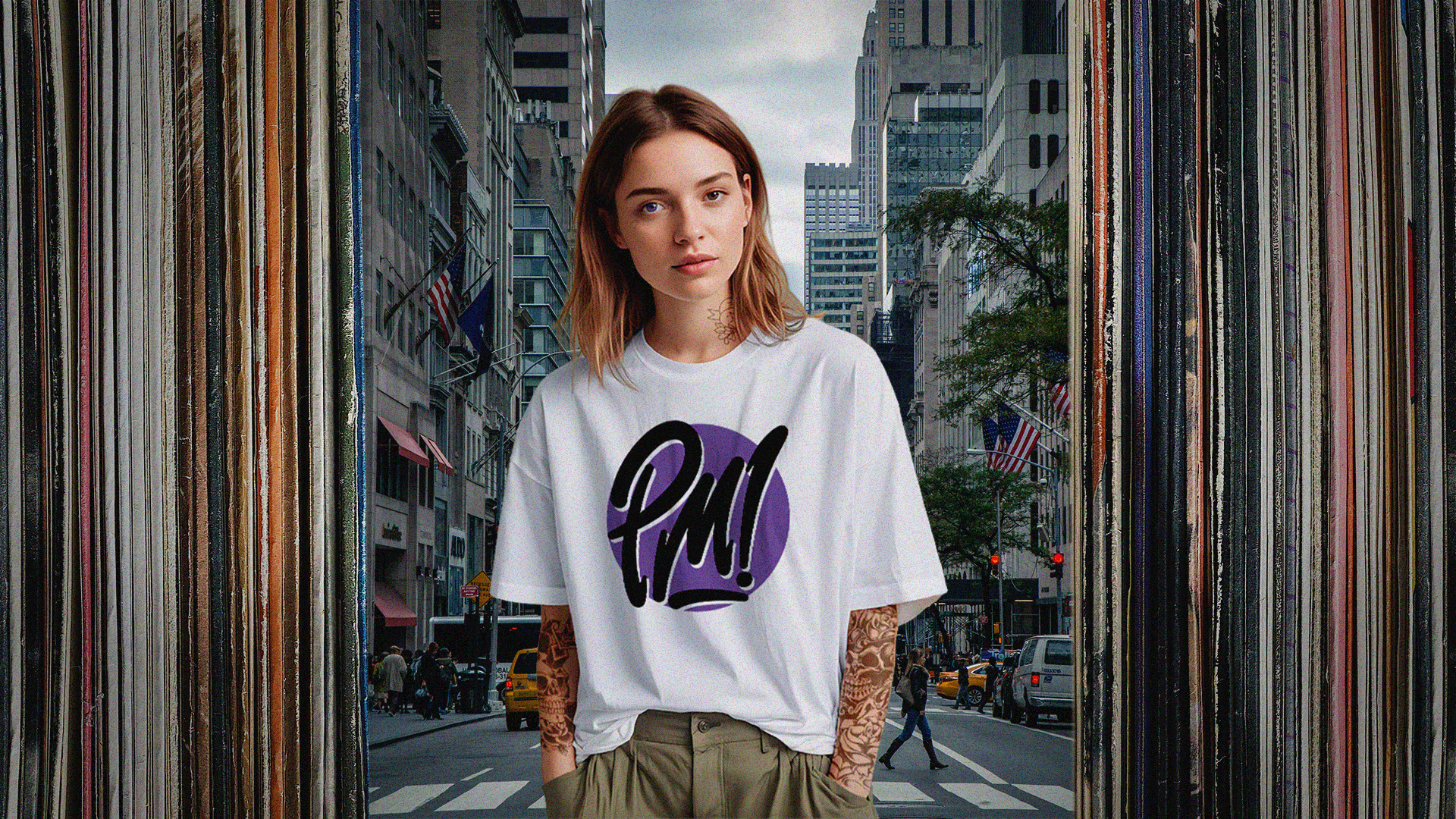
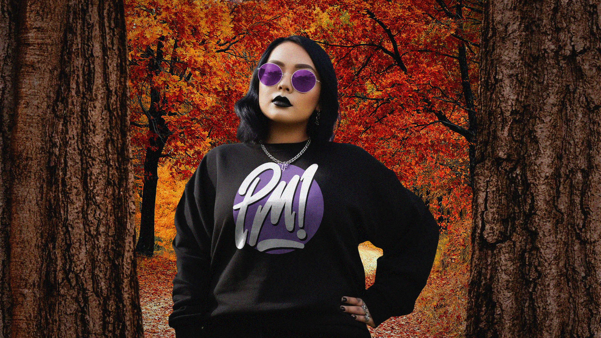
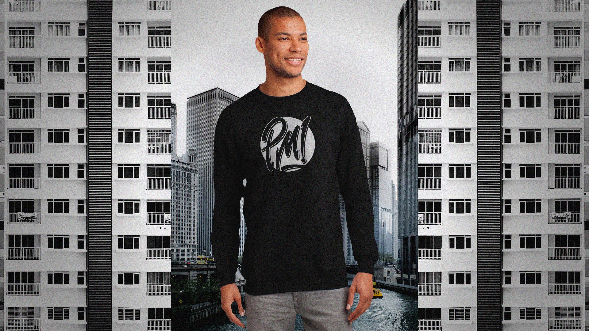
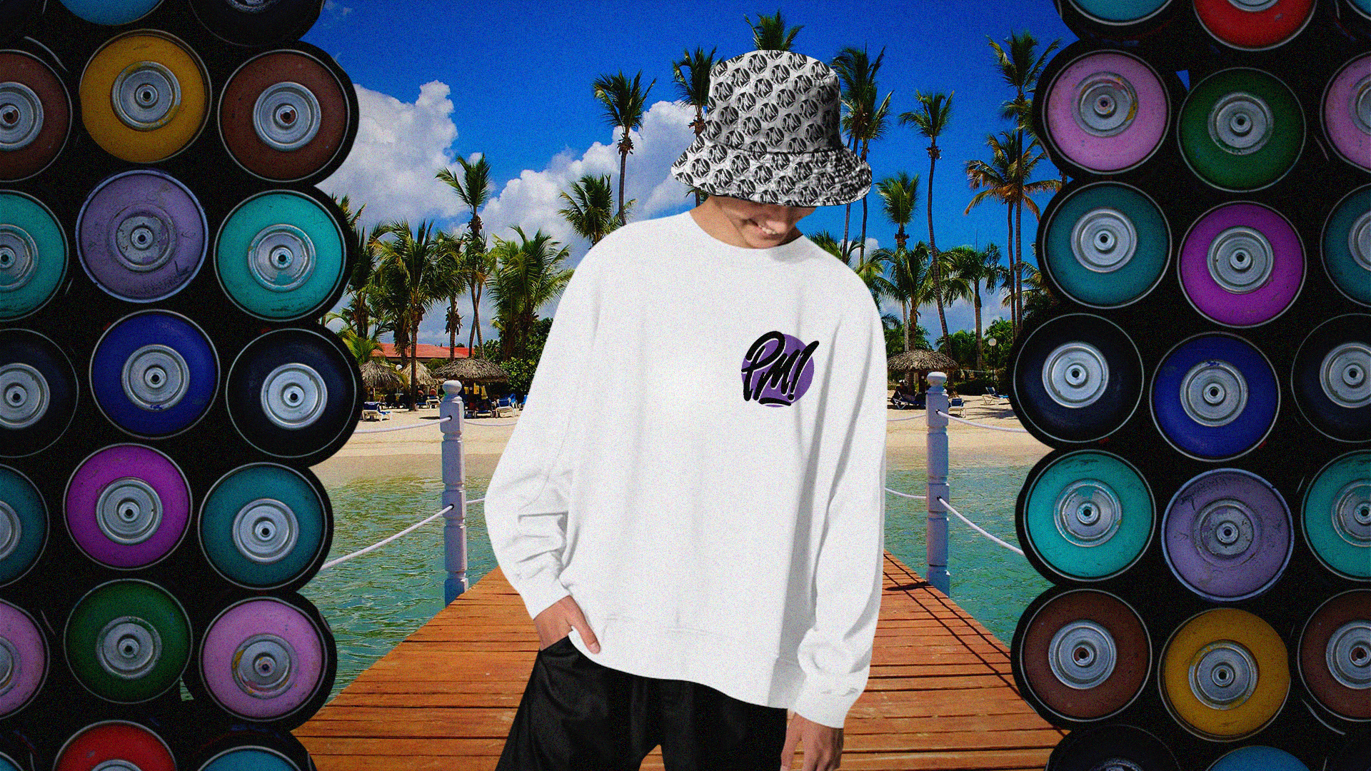
Applications